← All templates
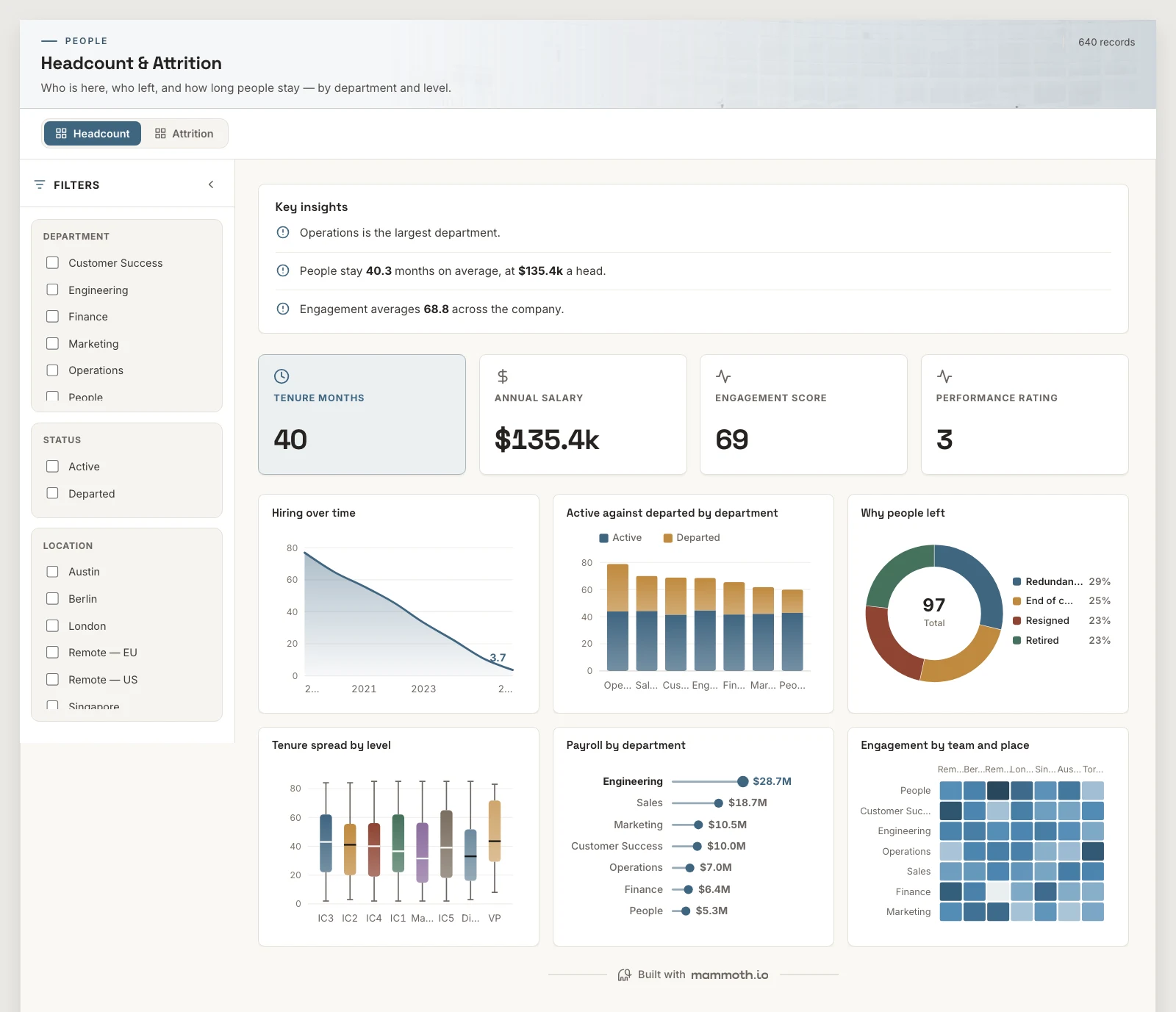
Shown on sample data. The figures are illustrative, not real business results — take the template and point it at your own.
Headcount & Attrition
Who is here, who left, and how long people stay — by department and level.
DashboardPeopleAny industryWhat it needs from your data
| Needs | a rate or percentage, a category (~7 values) |
|---|---|
| Optional | dates for trends, 9 more |
What is on it
Headcount shown above
- Hiring over time Area chart
- Active against departed by department Stacked bar chart
- Why people left Donut chart
- Tenure spread by level Box plot
- Payroll by department Ranking chart
- Engagement by team and place Heatmap
Attrition shown above
- Why people leave, ranked Pareto chart
- How long they stayed, by team Box plot
- Exits over time Area chart
- Leavers against stayers Dumbbell chart
- Reason by level Stacked bar chart
- From team to reason Sankey