Many businesses struggle when trying to understand how to create a Power BI dashboard.
They often find the implementation and maintenance time-consuming. While lacking the eye for an intuitive and good-looking Power BI dashboard design.
But more crucially, countless hours go into manual data preparation, wasting time from your teams and slowing the decision-making.
Sometimes, a whole team of data analysts and developers might be responsible for collecting the data from various stakeholders and putting it all together for reporting.
Even worse, the data in your Power BI dashboard isn’t accurate due to the difficulty of finding errors and discrepancies without sophisticated tools, and the company is making decisions based on incorrect information.
Here, we’ll walk you through how to create a Power BI dashboard with data you can trust and how brands like Arla, Bacardi, and Starbucks overcome some of the most typical challenges with careful planning and automated data preparation tools.
Also, we’ll share a step-by-step guide on creating your first Power BI dashboards using accurate and timely information.
How to Create A Power BI Dashboard: Things to consider first
An interactive Power BI dashboard is a fantastic way of visualizing and communicating your business-critical insights, and tens of thousands of companies in the U.S. and elsewhere in the world trust Power BI in their reporting.
However, creating a perfect Power BI dashboard serving various stakeholders needs careful planning. Here are some of the key questions to ask yourself before moving into implementation:
- Who are the end users of the dashboard? Different audiences will certainly have individual expectations for your dashboard. For example, an executive may want a high-level overview of the key metrics, while an analyst may want to drill down into the details. Consider creating multiple dashboards to serve different audiences.
- What are the primary goals of the dashboard? Gather a list of questions your dashboard should answer. For example, in addition to total volume, your dashboard might help identify the best-selling products, the most profitable countries, and the trends over time.
- Who should be responsible for the design and implementation? Does your team have experience in creating Power BI dashboards? Many brands partner with data experts from companies like Mammoth to make sure they avoid the most common pitfalls.
Once you’ve established clear goals, defined the primary users, and decided the best way to implement your Power BI dashboard, it’s time to ensure easy access to accurate data.
How to Create a Power BI Dashboard: Preparing your data

After setting the goals for your Power BI dashboard, your next task is to make sure you can combine data from various stakeholders and data sources quickly and accurately.
However, if your team has been responsible for consolidating, for example, sales reports from multiple countries, you’ve already noticed that data can be messy, incomplete, inconsistent, and inaccurate.
Too often, navigating through the mess and getting the data ready for Power BI dashboards is a time-consuming and error-prone manual process.
Many companies leave the process with developers, and as a result, stakeholders end up constantly fighting for resources – IT teams tend to have priorities other than serving internal business reporting.
But data preparation doesn’t have to be a black box built and maintained by IT teams.
With the right tools and services like Mammoth, business teams can take over and automate the data preparation work, discover unexpected insights through visual interfaces, and publish their findings via interactive Power BI dashboards.
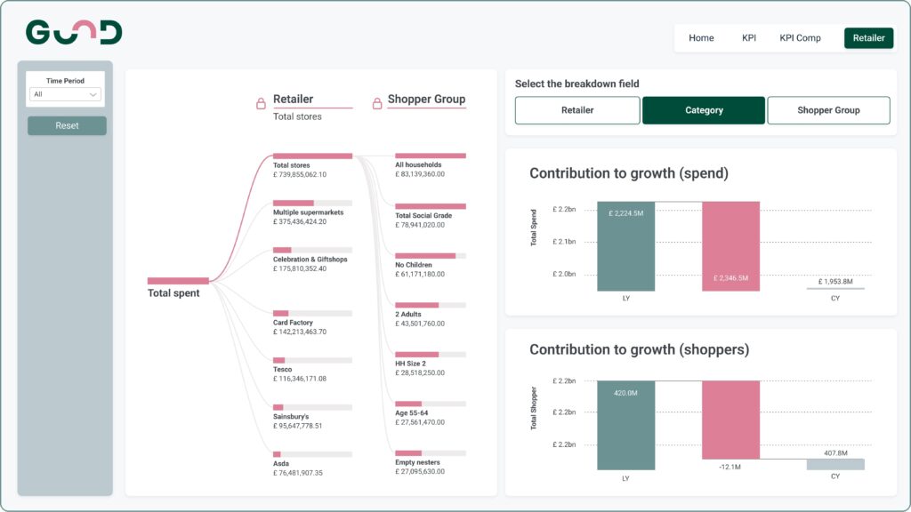
How to Create a Power BI Dashboard: A Case Study
Let me give you a concrete example.
Consumer brands like Starbucks typically rely on Nielsen for supermarket data.
Through the data, Starbucks can see how their products sell via various supermarket chains and compare their performance against competitors in the same category.
However, because supermarkets don’t use unified categorizations or even product names, the data needs a lot of preparation before it’s ready for presentation.
In the past, Starbucks had to wait six weeks for an external agency to compile reports consolidating the supermarket data into static spreadsheets and PowerPoints. That’s until they asked us for help.
Today, instead of the agency repeating the manual process of unifying, categorizing, and fixing discrepancies month after month, Mammoth’s visual automation builder allows Starbucks’s data analysts and sales managers to create automated rules that handle similar issues in the future – all without the help of developers.
Now, sales reports are automatically published via Power BI, and data-driven teams can drill down into details via Mammoth’s visual interface.
Does your team spend too much time consolidating information and putting together business reports? Get Started today to learn how to get rid of repetitive data transformation tasks.
How To Create a Power BI Dashboard: Step-By-Step Guide
Once your data is in shape, half the battle is won. Now, all you need is to set up a dashboard in Power BI.
Follow these 6 steps to create your Power BI dashboard:
- Get Power BI Desktop
- Load your data from Mammoth
- Build visualizations
- Define relationships
- Design your dream dashboard
- Share and collaborate
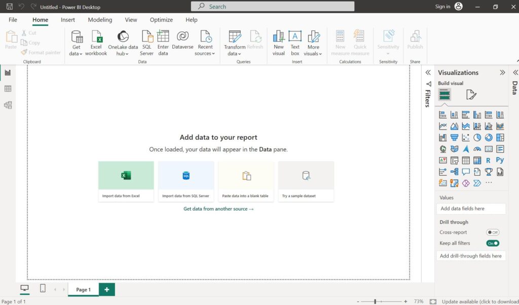
Step 1. Get Power BI Desktop
First, install the Power BI Desktop. You can also download it from the Microsoft Store if you’re on Windows. The Power BI desktop isn’t compatible with MacOS at the time of writing this post, but you can always use Power BI’s online service.
Step 2. Load your data from Mammoth
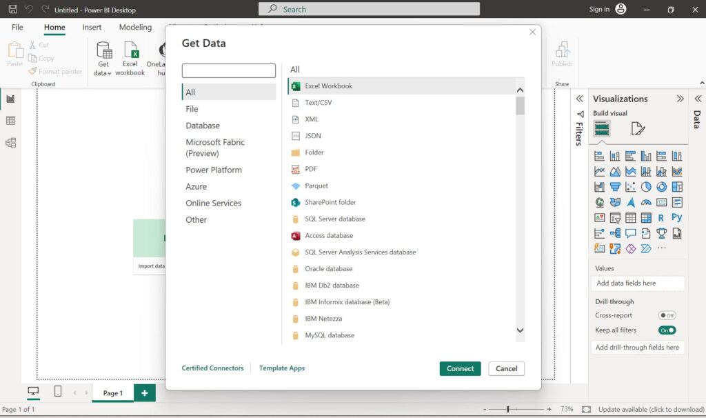
Next, launch Power BI Desktop and click on ‘Get Data’ to import data into Power BI. Power BI offers a multitude of data source options to bring data in, including Excel, various databases, and other files.
To bring you prepared data from Mammoth, you first need to export it. Mammoth offers several export options that are compatible with Power BI.
The easiest way to import your data into Power BI is to download your data from Mammoth as an Excel or CSV file and upload it directly into Power BI.
You can also export your data to Google BigQuery or any other database of your choice. Or create a live CSV link in Mammoth and fetch up-to-date data into Power BI.
Step 3. Build visualizations
After importing your transformed data from Mammoth, you can start visualizing it. You can use a wide array of tools in PowerBI to create your perfect report.
To get started, follow these steps:
- Click on the ‘Create’ button on the left panel
- Import data from a data source
- Choose a chart type, from bar graphs to tables, maps, and more.
- Tick the fields from the data you want to visualize.
- Customize these visuals using the formatting options until they look just right.
- To save the report, go to File>Save or Save as>Enter a name for the report, and Apply.
Are you looking to create a Power BI dashboard but need help getting it right? Get in touch with our data experts today.
Step 4. Define relationships
If your data comes from multiple sources, establish relationships between tables. Relationships are crucial for building meaningful insights across different datasets. Using the relationship diagram view, you can manage and create connections between tables.
Step 5. Design your dream dashboard
Once you have your reports ready, you can pin them as a tile on the canvas to design your Power BI dashboard. Check out these Power BI dashboard templates for some design inspiration.
Make your dashboard interactive by adding slicers, filters, and drill-through options. These features make a report more engaging for your stakeholders, allowing them to dynamically explore the data and focus on specific aspects of interest.
Step 6. Share and collaborate
After perfecting the design, you can publish and share the dashboard with your teammates. To publish a dashboard in Power BI, just click on the ‘Publish’ button, and it will get uploaded to the PowerBI service.
Sharing the dashboard is, again, very simple – either share a direct link to the dashboard or embed it on websites and other applications.
Are you looking to create Power BI dashboards and need help getting your data right? Get Started to learn how an automated data preparation process helps you streamline your team’s work and get rid of repetitive data transformation tasks.