Great Power BI dashboards help you make business-critical decisions.
They also care deeply about the users and are based on credible data.
Stick around as we discuss the principles of dashboard making, dissect the traits of winning Power BI dashboards, and showcase 6 eye-catching Power BI dashboard examples—from finance, sales, and marketing to healthcare, CPG, and operations— that stakeholders absolutely love.
Before we dive deeper into the best practices of Power BI visualizations, let’s address the foundation they stand upon: clean and structured data.
Clean data: The key ingredient for impactful dashboards
A dashboard can drive decisions only if it presents the true story.
The internet is rife with examples of Power BI dashboards built on dirty data. These dashboards often contain blank values, misspelled terms, duplicates, etc.
If acted upon, these dashboards may perpetuate misinformation at best and, at worst, lead to drastic business decisions.
Cleaning and structuring data is a tough nut to crack, though. It involves a bunch of tasks like fixing missing info, getting rid of copies, making labels consistent, and more.
Only after doing these tasks (often) over and over again you use the data effectively.
Most businesses find it challenging due to either a lack of sophisticated tools or skills. They end up draining resources and losing hours to extensive and manual data cleaning.
Some companies outsource their data processes only to introduce delays in implementation and decision-making.
Take consumer goods companies, for example. When they gather sales data from different retailers, they often find that the labels and logic don’t match up.
For instance, in one of the datasets, they might have Product IDs made up of numbers and letters, but in another set, the IDs might follow a different pattern. And sometimes, an item might be called “Donuts” in one dataset but “doNUTS” or “donuts” in another.
Fixing these small differences week after week can eat up hours.
The spirits mogul Bacardi faced a similar situation.
Bacardi is one of the largest family-owned drinks companies, best known for its eponymous white rum. Bacardi faced similar discrepancies in terminologies and categorizations when bringing together two very disparate datasets.
Rectifying this was a time-consuming process that stole time away from deeper analysis.
Things changed when Bacardi partnered with Mammoth.
With Mammoth, Bacardi moved away from manual data processing to an automated and scalable data processing model.
Now, Bacardi can combine different data flows to arrive at a single source of truth for its sales. The built-in automation in Mammoth’s data pipelines eliminates task repetitions every time new data comes in, saving Bacardi time and money.
Bacardi not only simplifies its processes with Mammoth but is also able to deliver faster output to key stakeholders.
Plus, Mammoth’s auto-updating, unified trade report using Power BI allows Bacardi easily to track its sales.
If you are facing similar challenges, Get Started to learn how to get rid of repetitive data cleaning tasks.
Now, clean data is not the only thing a Power BI dashboard needs. Excellent Power BI design and UX also make a difference when creating a dashboard in Power BI.
There are tricks you can apply to make your dashboards more inviting and user-friendly, which we will talk about in the next segment.
Best practices of Power BI dashboard design
Design and usability are two other critical aspects of a Power BI dashboard.
The winner dashboards not only drive decisions but also delight users. They guide users’ attention toward key metrics without ever overwhelming them.
At the same time, they enable deeper data exploration where necessary.
Here are a few data visualization best practices that an awesome dashboard stands by:
- Simplicity: Successful dashboards avoid clutter.
- Prioritization: They feature crucial information prominently using size, color, and positioning.
- Filtering options: Great dashboards are interactive and engaging. They offer filters/slicers and other drill-through options to explore data dynamically.
- Consistency: Best dashboards maintain consistency in colors, fonts, alignment, and layout.
- Meaningful visuals: They keep the visuals simple. Instead of using a fancier chart, they use their simpler counterparts, like bar charts, line charts, or matrices.
- Color palette: Professional Power BI dashboards use a cohesive color palette according to the brand. They use colors to highlight important elements without hijacking attention from the data.
- Whitespace: Winner dashboards use tons of whitespaces to improve readability. They don’t cram too much information into a small space.
- Legends and labels: Comprehensive dashboards provide clear labels for better understanding. They ensure all axes, titles, and legends are appropriately labeled.
Power BI offers unparalleled visualization and designing capabilities that differentiate it from its competition.
It empowers both non-designers and designers with its vast data visualization and designing tools.
If you’re new to Power BI and want a jumpstart, here are some of the most captivating templates of Power BI dashboards we have built for our clients.
Best Power BI dashboard examples
1. Power BI Finance dashboards
Financial dashboards give an overview of a company’s financial status. While these dashboards can vary based on business needs, they typically include P&L reports, revenue/budget reports, and expense reports.
Take a look at this exemplary PowerBI dashboard designed for financial services:
What we like about this dashboard
The interface is simple with a soft color palette. It shows essential metrics at the top as gauge charts, letting the user instantly know if the sales are up or down, or in the middle.
The dashboard has ample whitespace to give it a clean look. All reports are correctly labeled with enough context and don’t overwhelm at all.
2. Power BI Consumer Packaged Goods (CPG) dashboards
CPG dashboards primarily focus on sales and inventory reports to track their product performance and stock levels.
Sales reports also provide insights into sales across different channels and regions and trends. Similarly, inventory reports help them figure out replenishment needs as per stock levels and demand.
Here is a sales Power BI dashboard of a leading FMCG company:
What we like about this dashboard
First of all, this dashboard is aligned with business objectives and tailored to the needs of the stakeholders.
It provides a higher-level summary with a bunch of KPI charts as well as many drill-down options to go into detail. It also maintains a consistent visual style throughout that makes it pleasant on the eyes.
3. Power BI Healthcare dashboards
Healthcare Power BI dashboards typically include patient care data, clinical research data, and operational analytics of healthcare organizations.
This helps a healthcare organization to track and optimize the functioning of these arms.
Here’s an example of a healthcare dashboard:
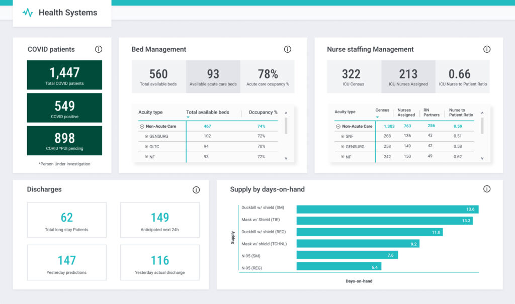
What we like about this dashboard
Again, this dashboard is easy to understand and navigate. It has a clean design that gives it a professional look.
The color scheme is not too loud or overpowering. And it doesn’t clutter the dashboard with loads of charts. KPI charts are smartly used to grab the user’s attention. All in all, it ticks all the boxes.
Tip: Since healthcare data is protected under HIPAA, it’s crucial to know what information you can display, to whom, and with what level of access.
4. Power BI Marketing dashboard
Marketing Power BI dashboards help an organization optimize its marketing strategies.
They provide a centralized view of different marketing activities, such as PPC campaigns, SEO performance, content engagement, and social media metrics.
Marketers can track and measure campaign effectiveness to make data-driven decisions to enhance these marketing activities.
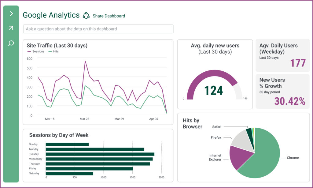
Check out these examples of Google Analytics and Facebook Ads dashboards:
What we like about this dashboard
It showcases the most important metrics prominently, like the Site Traffic graph or the Avg. Daily New Users gauge chart. It also breaks down certain other metrics, such as Hits by Browser.
The “Ask a question” bar on top adds a nice touch; it also depicts the thoughtfulness of the dashboard. The combination of color and chart makes it pop in an interesting way.
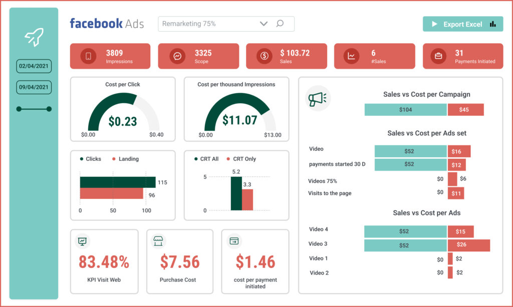
What we like about this dashboard
This dashboard highlights key KPIs with bright colors without looking tacky.
The impressive use of different charts and positioning makes it visually appealing. It also offers several filtering options for deeper data exploration.
It’s not a subtle design, yet it doesn’t shout at the user.
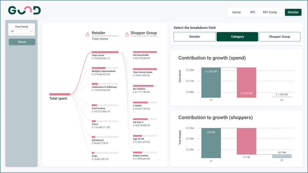
5. Power BI Sales dashboard
A Power BI sales dashboard helps businesses visualize and analyze sales data across different sales channels.
It usually tracks key metrics such as revenue, units sold, profit margins, customer demographics, best-selling products, under-selling products, and so on.
Here’s an example of a sales Power BI dashboard:
What we like about this dashboard
To appreciate this dashboard, we first need to understand how CPG companies naturally deal with complex data structures.
CPG companies offer their products worldwide to consumers. As a result, data comes from multiple sources, which must be combined to get a complete picture of the total sales and trends.
The sales dashboard above simplifies the complex channel information using a tree graph.
It also maintains granular details with a ton of data filtering options. The overarching graph is balanced by simpler charts elsewhere in the dashboard. Lastly, it uses brand colors throughout to make it look cohesive.
6. Power BI HR dashboards
Different HR dashboards are used for different purposes.
Some provide insights into employee metrics like headcount, gender ratio, age distributions, salary benchmarks, etc.
Some analyze recruitment and hiring processes with metrics like time-to-fill, cost-per-hire, applicant sources, etc.
Others visualize employee performance and track metrics such as ratings, goal attainment, and feedback scores.
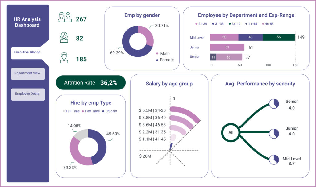
For example, the following HR dashboard displays employee metrics:
What we like about this dashboard
It gives you a comprehensive overview of all facets of the HR department using three tabs: executive glance, department view, and employee details.
It uses color to guide your attention towards essential KPIs like the Attrition Rate. There is also an exciting use of charts and icons that makes it stick with the users. It’s simple and never tries to be in your face.
To wrap it up, top Power BI dashboards are super important for making smart data-based decisions. However, their success hinges upon clean and structured data, which is the foundation for meaningful analysis.
Mammoth has helped companies like Starbucks, Arla, RethinkFirst, Bacardi, and more find insights from their data faster.
Get Started today to learn how to streamline your data transformation and cleaning work.