Power BI Templates: The 9 Best Ones, With Examples (in 2026)
Looking for Power BI templates to use? We've compiled a list of the best dashboard examples out there, and grouped them by department, use case, and industry.
A good template saves you the blank page. It does not save you the data work, and that is usually where dashboard projects stall.
Below are nine dashboard layouts worth copying, grouped by industry, department and use case. Each one comes with the KPIs it should carry and the chart types that suit it. At the end there is a section on what a template still leaves you to do, and how the same nine boards get built by describing them instead.
The short answer
A Power BI template (.pbit) carries a report's structure, pages, visuals, measures, theme and query definitions, without its data. Below are nine layouts worth copying, grouped by industry (financial services, CPG, healthcare), department (marketing, sales, operations, HR) and use case (web analytics, paid social), each with the KPIs it should carry and the chart types that suit it. A template saves you the blank page; connecting, cleaning and refreshing the data is still your job.
What are Power BI templates?
A Power BI template file (.pbit) carries a report’s structure without its data: the pages, the visuals, the measures, the theme and the query definitions. You open it, point it at your own source, and the report populates.
That is useful. It is also the smaller half of the job. A template assumes your data already arrives in the shape the report expects, which means the modelling, the joins, the cleaning and the refresh schedule are still yours to build. The design was never the hard part.
So use these as design references. Take the KPI selection and the layout logic, and judge separately whether Power BI is the right place to do the work behind them.
Power BI templates: by industry
Power BI templates for financial services
Financial dashboards show a company’s position: P/L, revenue against budget, expenses, liquidity and the ratios a board asks about.
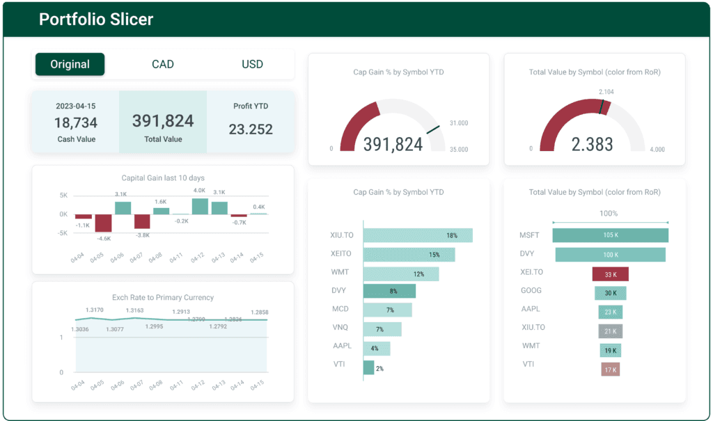
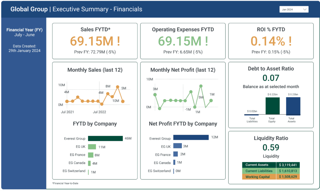
The second board is the better model of the two. Every headline figure carries its prior-year comparison in the same card, so a reader gets the number and the direction without clicking.
Both layouts have a built equivalent on our side: see financial dashboard examples for the same KPIs shown as real captures rather than mockups.
Tips for an effective financial dashboard
- Functionality: identify the key KPIs and present what matters most.
- User-friendliness: five reports beat twenty. Add drill-downs where detail is needed.
- Context: define every metric. A ratio with no definition invites three interpretations.
- Design: avoid loud and contrasting colours. Let the data tell the story.
Charts to use
- KPI indicators: profit margins, ROI, liquidity ratios
- Line charts: revenue, expenses or profit margins over time
- Column and bar charts: monthly revenues, expenses or budget comparisons
- Pie charts: distribution of expenses or revenue by category
- Tables: detailed and granular figures
Power BI templates for CPG
Consumer packaged goods dashboards cover sales and inventory, market share, and supply chain monitoring.
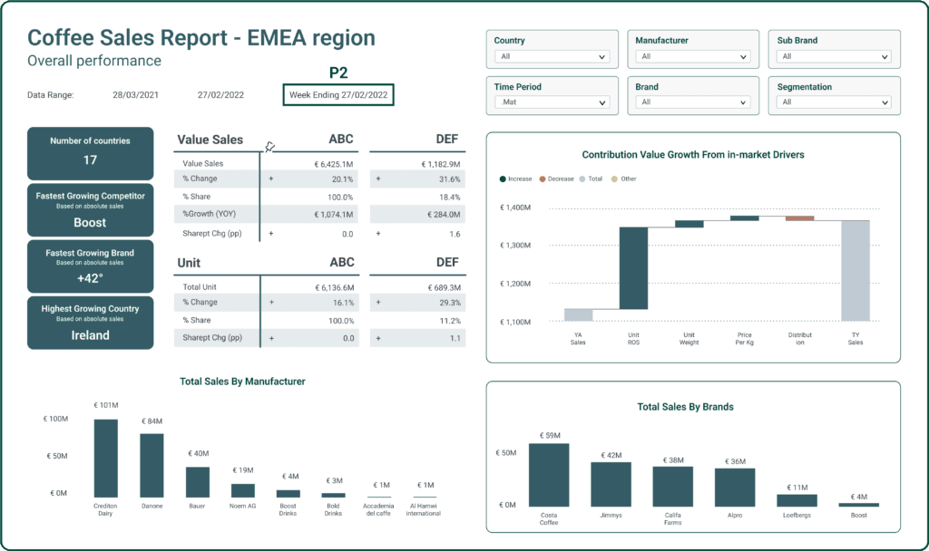
Note what the filter row at the top does here. Country, manufacturer, brand and time period sit above everything, so one board serves a global team and seventeen country teams instead of seventeen boards.
For the sell-through and stock-cover half of this, retail dashboard examples covers the same ground.
Tips for an effective CPG dashboard
- Relevance to stakeholders: tailor the metrics to the decision being made.
- Interactivity: filters and drill-downs, so one board covers many audiences.
- Visual consistency: hold the colour scheme and branding across pages.
Charts to use
- KPI indicators: key business performance metrics
- Line charts: sales and revenue trends
- Area charts: product category contributions
- Stacked bar charts: inventory distribution
- Map visualisations: supply chain geography
Power BI templates for healthcare
Healthcare dashboards cover patient care, clinical research, operational efficiency and resource allocation. They handle protected health information, so compliance is part of the design brief rather than an afterthought.
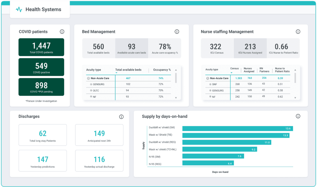
The panel worth stealing is supply by days on hand. It converts a stock count, which means nothing on its own, into a number a manager can act on before it runs out.
Tips for an effective healthcare dashboard
- Navigation: clinicians read these between other tasks. Make the path obvious.
- Security and compliance: HIPAA obligations are not negotiable.
- Forecasting: anticipated discharges and admissions are more useful than yesterday’s totals.
- Resource monitoring: beds, staffing ratios and supply, in one place.
- EHR integration: the board is only as current as the feed behind it.
Charts to use
- Line charts: admissions, discharge rates, bed occupancy trends
- Bar charts: metrics by department or diagnosis
- Pie charts: patient type distribution, inpatient against outpatient
- KPI indicators: satisfaction and compliance rates
- Heat maps: performance variation across departments and shifts
Power BI templates: by department
Power BI templates for marketing
Marketing dashboards consolidate PPC, SEO, content and social KPIs into one view.
Tips for an effective marketing dashboard
- KPI selection: conversion rate, CTR, ROI, cost per acquisition, segment.
- Variety: mix chart types so adjacent panels stay distinguishable.
- Narrative: connect channels into one story rather than five scoreboards.
Charts to use
- Line charts: traffic, leads and sales trends
- Segmentation charts: demographics and behaviour
- Funnel charts: customer journey stages
- Stacked column charts: promotional impact by category
- Heat maps: product relationships and co-purchases
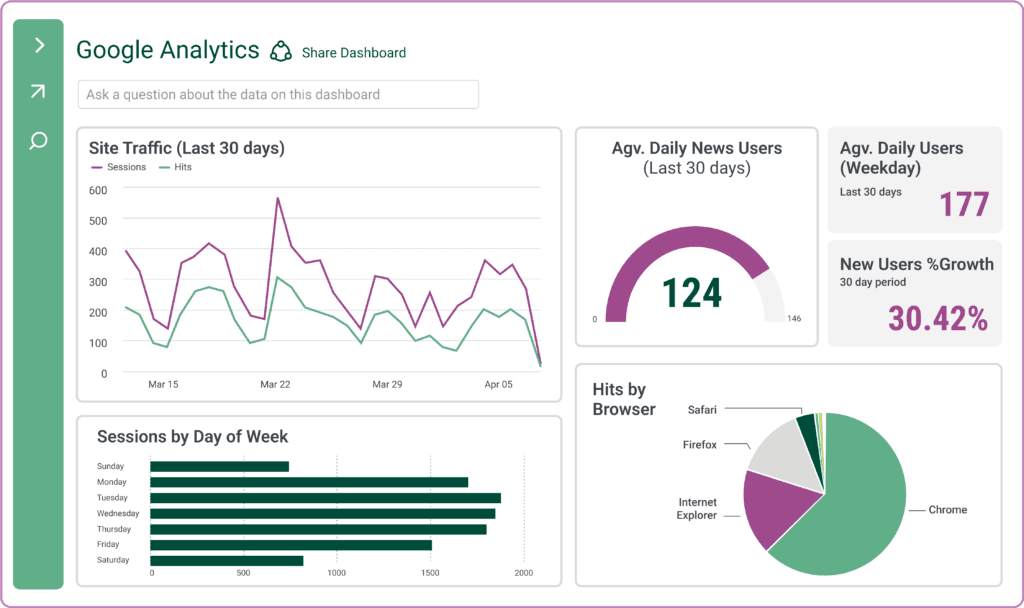
The recurring problem with this one is freshness rather than layout. By the time Google Analytics, the ad platforms and the CRM have been pulled together by hand, the board describes last week. If that is your failure mode, the fix is in the pipeline feeding the report, not in the report.
Built versions of this layout, with the channel and attribution panels populated: marketing dashboard examples.
Power BI templates for sales
Sales dashboards show gross sales, margin, revenue, customer interactions and pipeline status.
Tips for an effective sales dashboard
- Pipeline analysis: stages, conversion rates and where deals stall.
- Forecasting: historical performance set against current coverage.
- CRM integration: interactions and lead conversion in the same view as revenue.
Charts to use
- Line charts: sales trends over time
- Bar charts: comparisons by product, region or channel
- Funnel charts: process stages and conversion
- KPI indicators: quota attainment and coverage
- Map visualisations: geographic distribution
Build this one to survive a question. When someone asks why a region is down, a board that cannot break the number apart sends the answer back to the analyst, and the meeting moves on without it.
See sales dashboard examples for pipeline, quota attainment and rep-level views built this way.
Power BI templates for operations
Operations dashboards monitor cycle time, throughput, capacity, inventory, yield, downtime and efficiency.
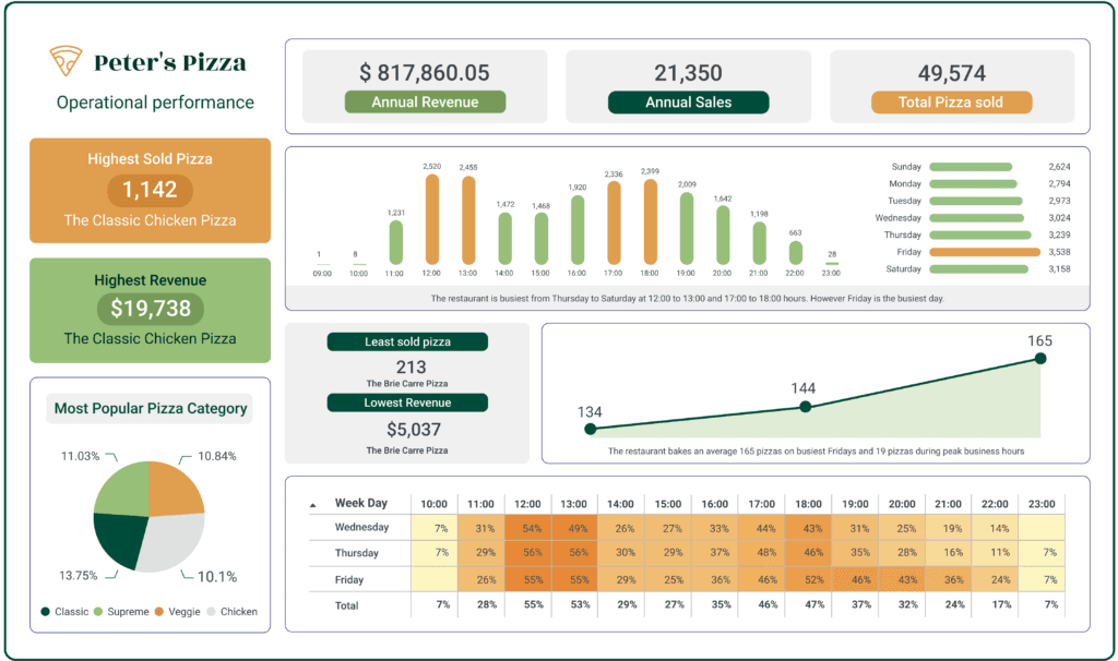
Two details here are worth copying. The written line under the hourly chart states the conclusion instead of leaving it to be read off the bars, and the heat table gives an hour-by-weekday view that a bar chart cannot.
For the stock side of operations, inventory dashboard examples covers stock cover, reorder points and stockouts.
Tips for an effective operations dashboard
- Supply chain analytics: procurement through to distribution.
- Quality control: defect and rework rates by line.
- Resource utilisation: efficiency against cost.
Charts to use
- Gantt charts: task timelines and durations
- Stacked bar charts: resource and workload distribution
- KPI indicators: performance at a glance
- Pie charts: component breakdowns
- Heat maps: variation by time, line or shift
Power BI templates for HR
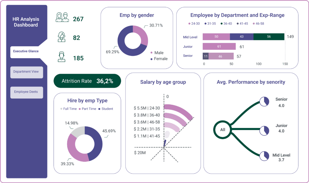
HR dashboards track engagement, performance, recruitment, attrition, compensation and departmental cost.
Tips for an effective HR dashboard
- Workforce analytics: turnover, performance and satisfaction together.
- Recruitment: time to hire, source effectiveness, offer acceptance.
- Engagement: survey results shown as trends, not single snapshots.
Charts to use
- Stacked bar charts: workforce demographics
- Line charts: turnover rates and headcount trends
- Donut charts: employee composition
- Treemap charts: organisational hierarchies
- Heat maps: performance ratings and engagement
One caution on this layout: a headline attrition rate with no denominator or time window invites the wrong reaction. Label the period and the population on the card itself. HR dashboard examples shows headcount, attrition and time-to-hire handled that way.
Power BI templates: by use case
Power BI templates for web analytics
Web analytics dashboards consolidate sessions, users, acquisition and behaviour into a view a marketing team reads weekly.
Tips for an effective web analytics dashboard
- Focus on KPIs: sessions, new users, conversion rate, cost per acquisition
- Segmentation: break down by channel, campaign and landing page
- Time-based analysis: trends and day-of-week patterns, not just totals
- Interactive elements: drill-downs, filters and slicers
Charts to use
- KPI indicators: scorecards, data cards, gauges
- Line charts: KPI trends over time
- Bar charts: channel and campaign comparisons
- Pie charts: browser, device and source share
- Scatter plots: metric correlations
Power BI templates for Facebook Ads data
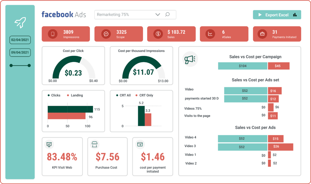
Paid social dashboards visualise reach, engagement, click-through rate, cost per click and campaign effectiveness.
Tips for an effective Facebook Ads dashboard
- Performance metrics: CTR, conversion rate and CPC tracked together
- Audience insights: demographics, interests and behaviours
- Spend and budget: utilisation against return
- A/B testing: variations compared on the same axis
Charts to use
- Line charts: KPI trends
- Bar charts: campaign comparisons
- Pie charts: budget allocation
- Scatter plots: metric correlations
- KPI indicators: performance gauges and scorecards
What a template does not give you
You have now seen nine layouts. Here is what still stands between the .pbit file and a dashboard your team uses on a Monday.
The data model. Templates carry query definitions, not your schema. Sources have to be connected, joined, cleaned and shaped before a visual resolves.
The measures. Anything beyond a plain sum is DAX. That is a language, and it is the point at which most self-serve attempts hand the file to an analyst.
The refresh. A template has no schedule. Gateways, credentials and refresh limits are configured per workspace, and a board nobody trusts to be current gets checked against the source anyway.
A licence for each person who looks at it. Viewing a report in the Power BI service is a paid seat, and the cost scales with your audience rather than your team. We break the tiers down in Power BI pricing.
The queue. The person with the question is rarely the person who can change the report, so every follow-up becomes a request. That is the constraint templates cannot touch, and it is why boards drift out of date faster than they get rebuilt.
If those five are what you are up against, more templates will not help. See Power BI alternatives for the wider set of options, or Mammoth against Power BI for a direct comparison.
The other way to get these nine boards
Mammoth builds the dashboard from a description. You connect your data, say what you want to see, and get a working board back: an artifact in a sitting, rather than a project with a ticket behind it. The entry skill is describing what you want, not learning a modelling tool.
If you would rather start from something than from a prompt, there are curated templates covering finance, sales, marketing, operations, people and inventory. The difference from a .pbit file is what happens when you open one. A Mammoth template opens on sample data, so you see the finished board before you commit anything. It states what it needs from your data, a money column, a category, dates for trends, and grades the fit with reasons once you point it at your own. Then it re-binds to your columns. Nothing to download, no model to build first, and the question "will this work on my data?" is answered before you start rather than three hours in.
The claim worth testing in a demo is this one: the model proposes the shape, it never authors a number. It picks the visuals and the bindings. Deterministic code compiles the query and your database computes the values, so every figure on the board traces back to your governed data. That is the difference between a dashboard and a plausible-looking picture, and it is checkable in a demo against your own data.
What comes with it:
- 100+ tested connectors, plus anything with a REST API, so the sources feeding a board are connected rather than exported
- Prep and dashboard in one place: the cleaning, joins and scheduled refresh live with the Data Engine that feeds the board
- Dashboards, presentations and documents as output formats, because not every answer belongs on a grid of charts
- Three sharing modes: public, password-protected and authenticated, with row-level security on Pro and above
- Free, unlimited viewers on every plan, so showing a board to a client or a board member costs nothing per head
- SOC 2 Type II, ISO/IEC 27001:2022, HIPAA and GDPR, audited independently
On evidence, the honest split is this. Dashboards are new enough that we have no named-customer dashboard study to point at yet, so we are not going to quote you a time saving on one. The reporting and prep layer underneath has been in production for years and does carry named numbers: Bacardi cut reporting time 70% across 170+ markets, Arla cut it 55% while processing over a billion rows a month across 17 countries, and RethinkFirst saved over 50 hours a month and reported a 94% cost reduction in data operations. Those are theirs, and they are the part of the story with receipts.
Power BI templates: conclusion
Nine templates, across finance, CPG, healthcare, marketing, sales, operations, HR, web analytics and paid social. Their KPI selection and layout logic are worth copying whatever tool you build in.
If you want to see the same boards built rather than described, dashboard examples carries real captures by function, every one of them a template you can open on your own data.
The one cut that is not by function is executive dashboard examples, which reads the same scorecards one altitude up: the layout the financial executive summary near the top of this post is an example of.
Stay with Power BI if you have analysts who know DAX, an enterprise semantic model worth protecting, and reporting needs that justify per-seat licensing for your readers.
Look at Mammoth if the people who need the answers are not the people who can build the report, your audience is larger than your team, or the prep work behind the board is where the time goes.
Try it on your own data
Open a template on sample data, then point it at yours. Free plan, or a 14-day trial of Pro. No credit card.
Or start from a description and see what comes back:
- “Show me revenue by region with monthly trends”
- “Track customer satisfaction scores by product line”
- “Display inventory levels with reorder point indicators”
- “Visualise marketing campaign performance by channel”
Then check a number against your source. That is the test worth running.
Prefer to talk it through first? Book a demo, or see pricing.