Retail dashboards
Store performance dashboard examples for retail
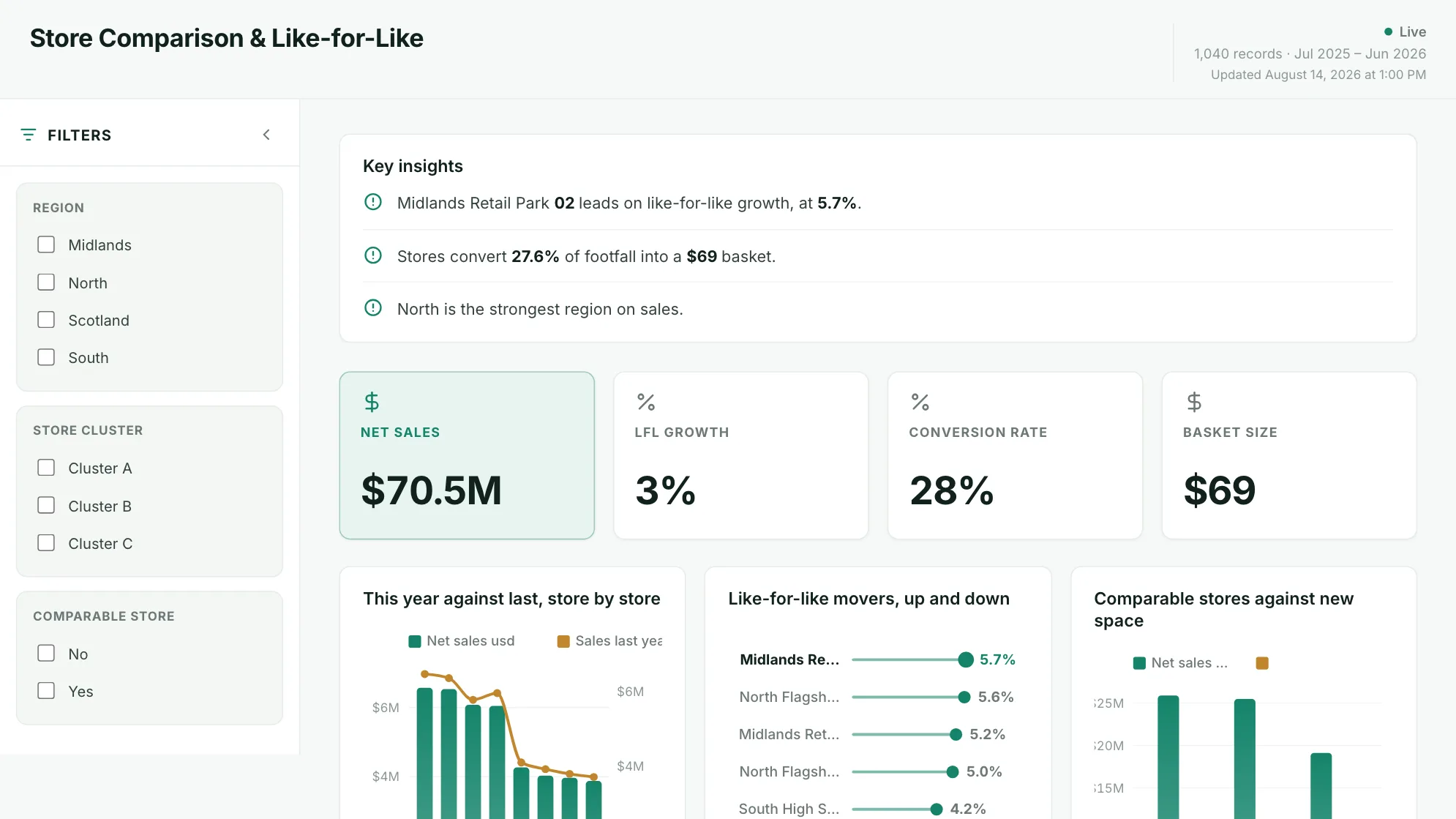
In short
What a retail dashboard is
A retail dashboard is a single screen showing how stores and products are trading: sales, margin, like-for-like growth and sell-through. Teams also call it a retail analytics, retail KPI or store performance dashboard. It answers where performance concentrates rather than what the total was: which store, which category, which promotion. A chain-level total hides the half-dozen locations doing something different. Each of the six below states the question it answers and the columns your data needs.
The examples
Six retail dashboard examples
Real Mammoth templates on sample data. Every figure is illustrative. Two datasets: store-by-week trading and product-by-week performance.
Example 01· Template: Store-Level Margin
Store margin dashboard
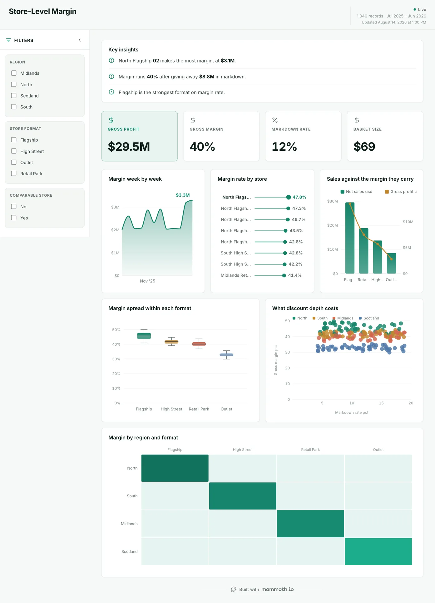
Two stores on the same margin rate: what is different about them?
Margin rate store by store, with what the discounting costs shown next to it rather than buried in the total. The spread within each store format is the chart to look at twice: two Outlets on the same margin rate can be running two completely different businesses, and a chain-level average hides both.
What is on it
- Margin week by week
- Margin rate by store
- Sales against the margin they carry
- Margin spread within each format
- What discount depth costs
- Margin by region and format
Your data needsDashboard
- a revenue or money column
- a category column
Sample data: illustrative figures, not business results. Example 02· Template: Store Comparison & Like-for-Like
Store performance dashboard
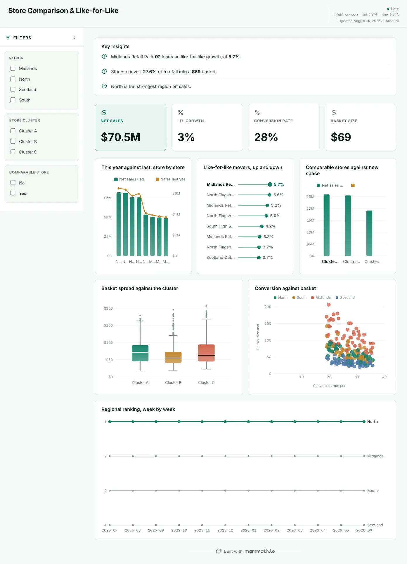
Which stores are improving, once new space is stripped out?
This year against last, store by store, with comparable stores separated from new space so growth that is really just more floor is not counted as growth. Conversion is plotted against basket underneath, because a store can lift sales by serving more people or by selling them more, and the two lead to different decisions.
What is on it
- This year against last, store by store
- Like-for-like movers, up and down
- Comparable stores against new space
- Basket spread against the cluster
- Conversion against basket
- Regional ranking, week by week
Your data needsDashboard
- a revenue or money column
- a category column
Sample data: illustrative figures, not business results. Example 03· Template: Sell-Through by Category
Sell-through dashboard
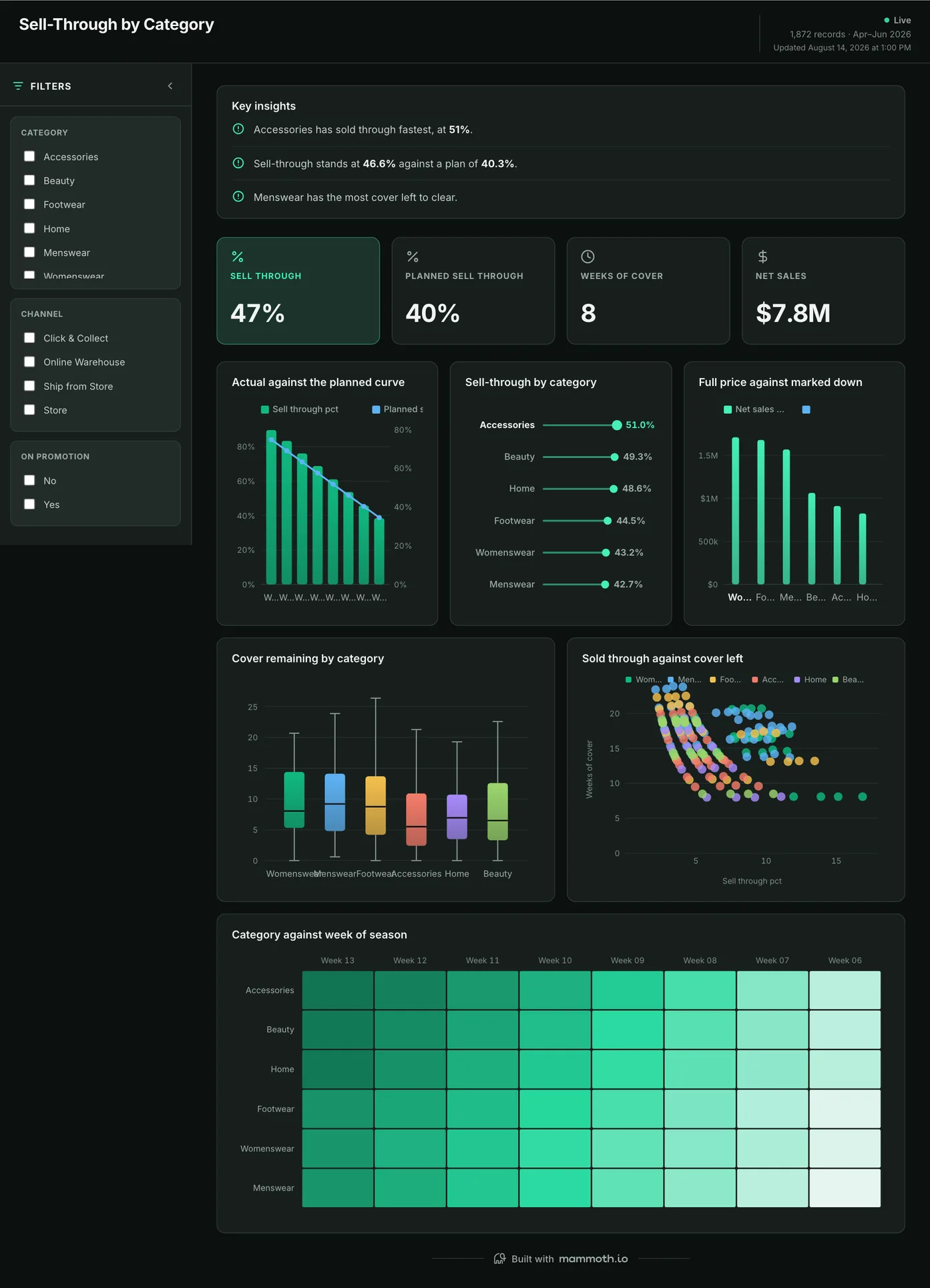
Is the season selling through at the rate the buy was planned on?
Actual sell-through against the planned curve, so a category that is behind shows up while there is still season left to act in. Full price is separated from marked down throughout: a category can hit its sell-through number entirely on discount, which is the same figure and a much worse result.
What is on it
- Actual against the planned curve
- Sell-through by category
- Full price against marked down
- Cover remaining by category
- Sold through against cover left
- Category against week of season
Your data needsDashboard
- a rate or percentage
- a category (~6 values)
Sample data: illustrative figures, not business results. Example 04· Template: Inventory & Stockouts
Retail inventory dashboard
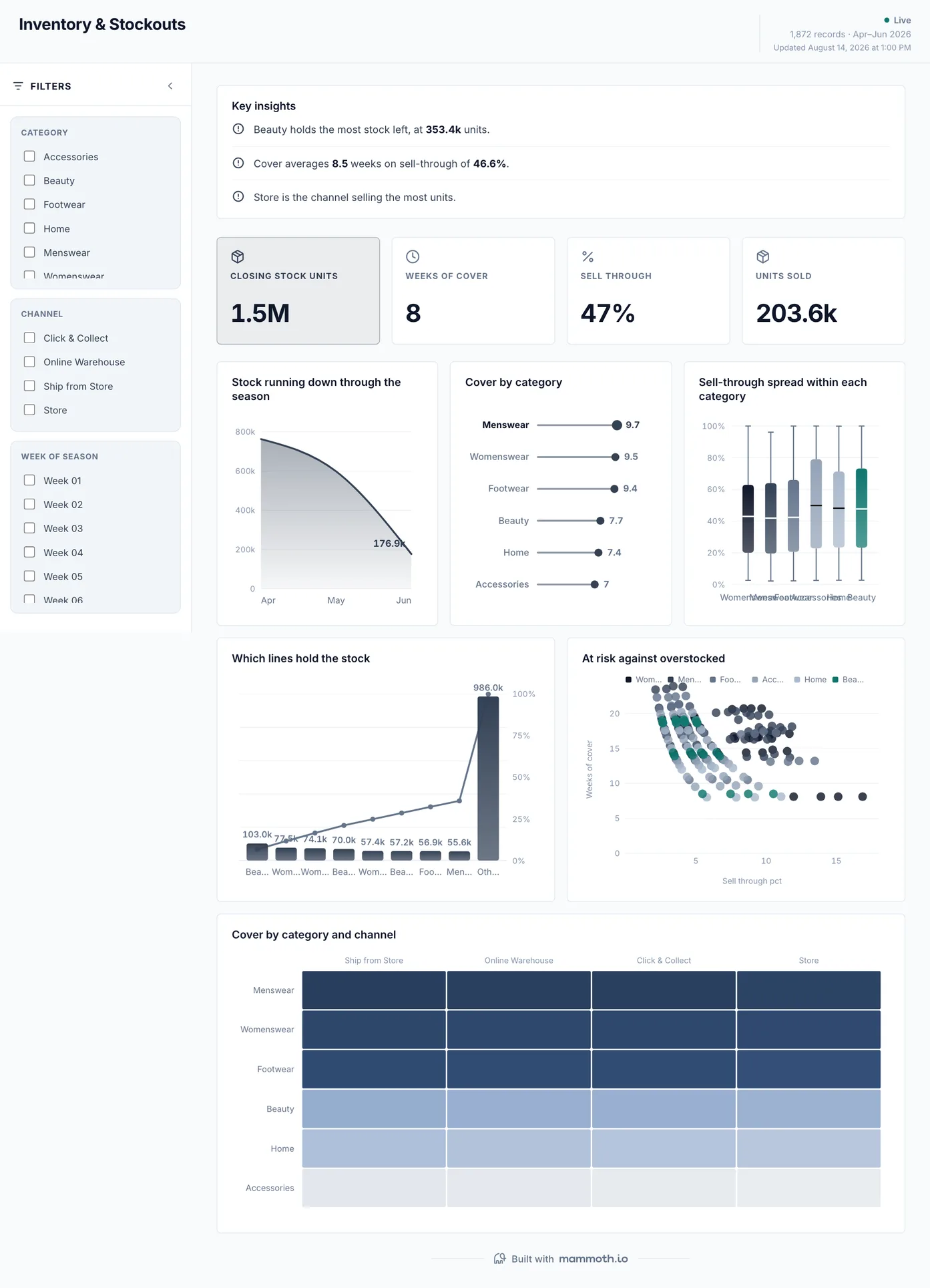
What is about to run out, and what has stopped moving?
Stock running down through the season, with weeks of cover by category and the lines holding the most stock ranked underneath. At-risk and overstocked are plotted against each other on one chart: they look identical on a stock-value report and need opposite responses.
What is on it
- Stock running down through the season
- Cover by category
- Sell-through spread within each category
- Which lines hold the stock
- At risk against overstocked
- Cover by category and channel
Your data needsDashboard
- a count column
- a category (~6 values)
Sample data: illustrative figures, not business results. Example 05· Template: Promotion & Discount Effectiveness
Promotion dashboard
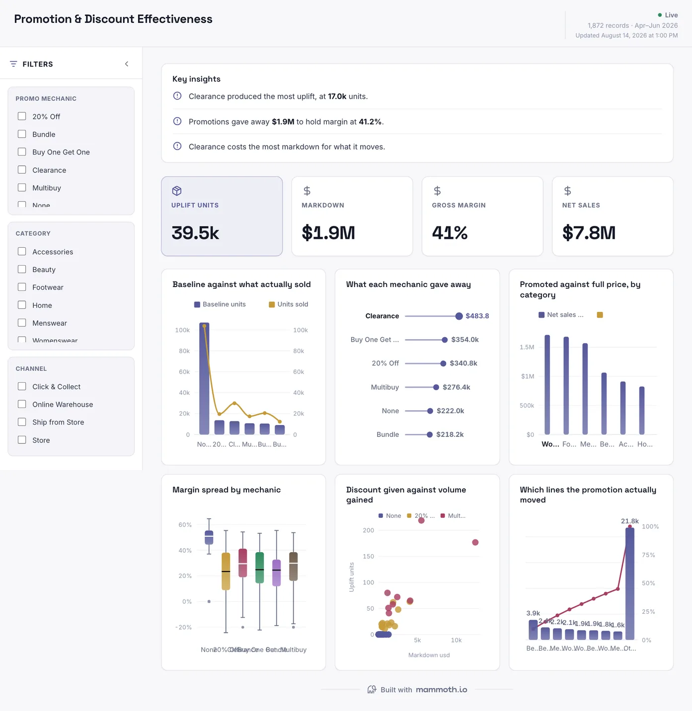
Did the promotion make money, or just move it?
What actually sold against the baseline, with the markdown each mechanic gave away set beside the volume it gained. Promoted and full-price lines are shown separately by category, which is the cut that says whether a promotion grew the category or just pulled sales down the price ladder.
What is on it
- Baseline against what actually sold
- What each mechanic gave away
- Promoted against full price, by category
- Margin spread by mechanic
- Discount given against volume gained
- Which lines the promotion actually moved
Your data needsDashboard
- a count column
- a category (~6 values)
Sample data: illustrative figures, not business results. Example 06· Template: Fulfilment & Returns
Fulfilment and returns dashboard
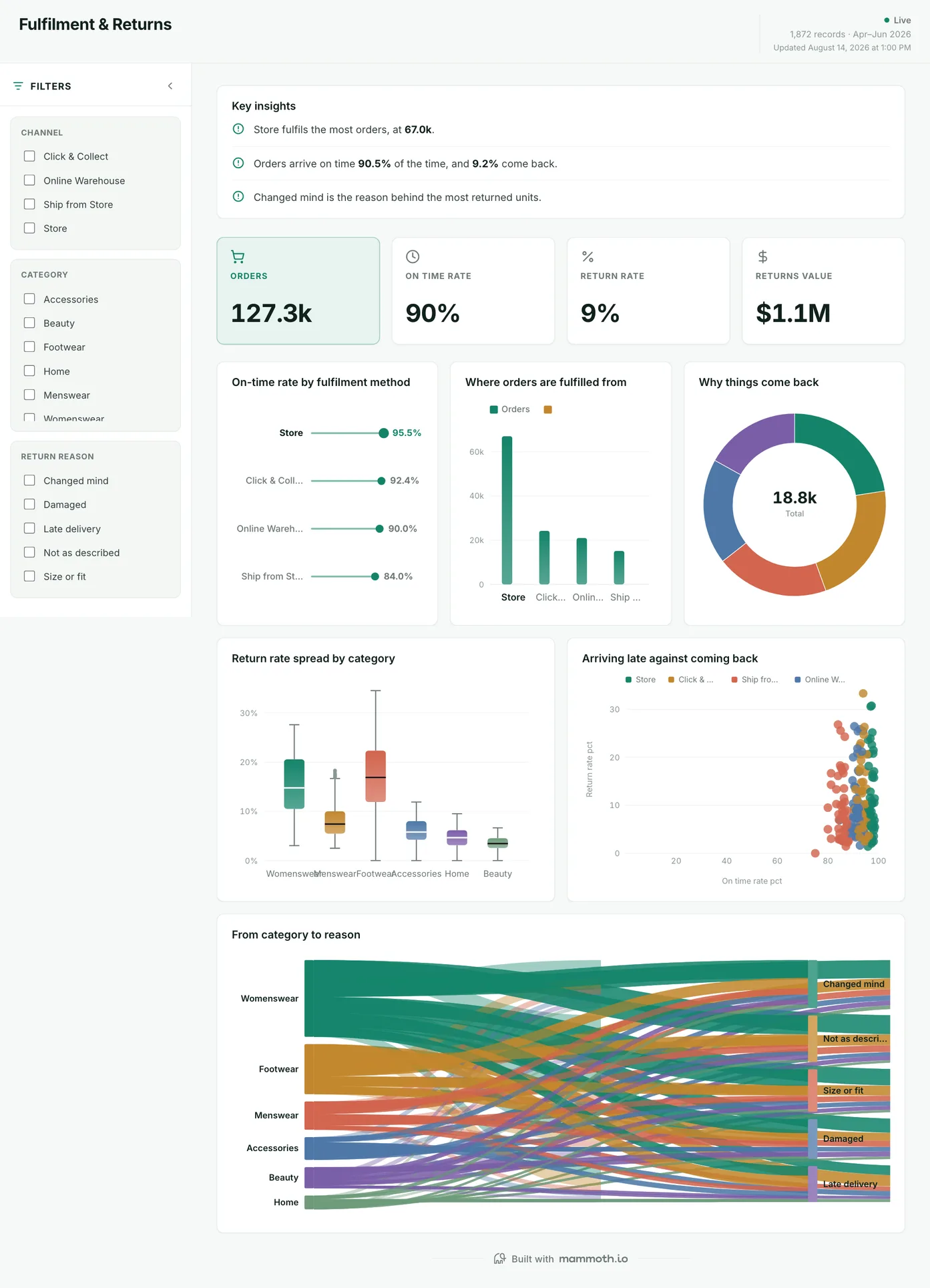
Are orders arriving on time, and how much is coming back?
On-time rate by fulfilment method with return rate beside it, and the two plotted against each other: late delivery and returns tend to be the same problem seen twice. Return reasons are traced back to category, so a sizing problem in one range is not averaged into an overall returns percentage.
What is on it
- On-time rate by fulfilment method
- Where orders are fulfilled from
- Why things come back
- Return rate spread by category
- Arriving late against coming back
- From category to reason
Your data needsDashboard
- a count column
- a category (~4 values)
Sample data: illustrative figures, not business results.
The metrics
The metrics a retail dashboard is built from
Eight numbers that say where trade concentrates. Every one of them can be made to look better by choosing the comparison badly, which is what the last column is about.
| Metric | What it answers | What your data needs |
|---|---|---|
| Like-for-like growth | Is the estate trading better, or is it just larger? | Only stores trading in both periods, with new openings, closures and refit weeks excluded. Leave them in and estate change reads as growth. |
| Sell-through rate | How much of what we took in has sold? | Units sold over units received for the same season or delivery batch. Measured against current stock instead of intake, it rises as stock runs out and looks best when there is nothing left to sell. |
| Gross margin by category | Which categories actually make money? | Sales and cost at line level, with markdowns and staff discounts applied to the line rather than netted off at the end. Netted at the end, the discounted categories look as profitable as the full-price ones. |
| Sales per square metre | Which stores earn their space? | Trading area per store, maintained after refits and reallocations. Estate files go stale quietly and this is the metric that quietly goes with them. |
| Basket size and units per transaction | Are people buying more, or are more people buying? | Transaction-level data with returns handled explicitly rather than as negative baskets, which drag the average down without telling you where. |
| Promotion uplift | Did the promotion sell more, or sell the same stock cheaper? | A baseline period per store and product, the promotion calendar, and the neighbouring products. Uplift against a chain average hides cannibalisation: the promoted line rises and the one beside it falls. |
| Conversion rate | Of the people who came in, how many bought? | Transactions and footfall per store for the same hours. A footfall counter that misses an entrance makes that store look like it converts brilliantly. |
| Average basket size | Are customers spending more per visit, or just visiting more? | Sales value and transaction count per store and week, with returns netted the same way everywhere. A store that books returns as negative sales has a basket that shrinks for no reason. |
Proof
Retail and CPG teams already running on Mammoth
Not dashboards from this page: these are published customer stories, and they are mostly about the unglamorous half: reconciling retailer feeds, matching SKUs, and getting a number that survives being questioned.
- StarbucksNielsen sales data from 17 countries reconciled into one format, taking report assembly from 20 days to hours.
- Arla FoodsSales data from 17 countries, previously hand-processed into static spreadsheets, moved onto one automated workflow.
- Golden Acre FoodsSKU matching against Nielsen data across four major retailers, by barcode, on a schedule the commercial team owns.
- BATCompetitor listings across six or more retailer and distributor feeds, collected by hand until the pipelines took it over.
From example to live dashboard
Pretty is easy. Current and true is the hard part.
Any of these can be drawn in a slide. What makes one worth keeping is the five steps underneath it, and they are the same five whichever example you start from.
- 01
Connect the source
The dashboard reads the system, not an export somebody saved to their desktop. 100+ tested connectors, plus anything with a REST API.
- 02
Prepare it once
Cleaning, joining and reshaping are recorded as steps you can read, change and re-run, not a formula buried three sheets deep.
- 03
Check it before anyone sees it
Data checks run with the refresh and flag the rows that fail, so a broken upstream file shows up as an alert rather than as a wrong number in a meeting.
- 04
Put it on a schedule
Refresh on a schedule and the dashboard stays current on its own. Starter refreshes weekly, Team daily, and Pro every three hours.
- 05
Publish it and send the link
Public, password-protected or sign-in only. Every sharing mode is available on every plan, including the free one.
Already have the data in a spreadsheet? Turn it into a dashboard with the AI dashboard generator.
Sharing
Everyone can see it.
Nobody pays to look.
Most dashboard tools charge for every person who opens one, which is why so many dashboards end up as a screenshot pasted into a message. Mammoth charges for the people who build. Viewers are unlimited and free on every plan, including the free one.
You pay for
The people who build
Anyone connecting a source, preparing data or publishing a dashboard counts as a platform user.
You never pay for
The people who look
Viewers are unlimited and free on every plan, including the free one. A board, a client list or a whole company: the number does not change the bill.
Plans differ in how many builders and published dashboards a workspace gets. Drafts, viewers and every sharing mode are unlimited and free on all four. Full pricing.
Retail dashboard questions
What goes on a retail dashboard?
What KPIs should a retail dashboard track?
How do I build a retail dashboard?
- Connect the till or EPOS data, the stock system and, if you sell online, the e-commerce platform.
- Agree the definitions once: which stores count as like-for-like, how markdown is charged, and the week the trading year starts.
- Build one board per question: store performance, store margin, sell-through and stock cover, rather than one screen holding all four.
- Put the exceptions underneath: stores below last year, lines selling slower than planned, stock about to run out.
- Schedule it before the meeting and give every store manager the link to their own numbers.
Can it combine EPOS, warehouse and e-commerce data?
How often should a retail dashboard refresh?
Can every store manager see their own store?
Are these real dashboards?
Last reviewed against the template catalogue.





Build the retail dashboard you actually need.
Connect a source, prepare it once, and publish. Everyone who needs to see it can, at no per-viewer cost.
- ✓ 14-day Pro trial
- ✓ No credit card
- ✓ Viewers always free