Dashboard examples
Dashboard examples, and the question each one answers
In short
What a dashboard is
A dashboard is one screen that answers a single question about how something is performing, and keeps answering it as the data behind it changes. The ones that survive carry a handful of numbers rather than everything available, give each number something to compare against, and end on where the exception is rather than on a total. What separates a good one from a pretty one is almost never the chart library: it is whether the number is current, and whether anyone had to touch it to make it so.
| Dashboards for | What is on the page | Examples |
|---|---|---|
| Executive dashboards | Finance, sales, people and project scorecards, the SaaS and investor views, plus the written quarter, the board pack and the programme review. | 11 |
| KPI dashboards | Finance, sales, HR, marketing, SaaS and project KPIs, each board opening on the four numbers its review starts with. | 6 |
| Financial dashboards | Performance, budget vs actual and a KPI scorecard, plus AR ageing, cash collection and vendor spend, and the same P&L as a report, a summary and a board pack. | 9 |
| Sales dashboards | Pipeline, sales performance, sales KPIs and retail sales, plus the written review and the QBR deck. | 6 |
| Marketing dashboards | Digital marketing, campaigns and ROI, SEO and content, and retail promotions, plus the monthly write-up and the recap deck. | 9 |
| HR dashboards | Headcount and attrition, an HR scorecard, HR analytics and a compensation review, plus the written people update. | 5 |
| Inventory dashboards | Stock on hand and what it is worth, reorder points, aged stock, and intake against despatch by site. | 5 |
| Retail dashboards | Store margin, like-for-like comparison, sell-through, stock and stockouts, promotions and fulfilment. | 6 |
| Project dashboards | Status across every workstream, overdue work by priority, and portfolio budget against actual, plus the steering-committee deck. | 3 |
| SaaS dashboards | MRR growth, retention and unit economics, plus the board report, the investor update and a fund's portfolio rollup. | 5 |
By team
Dashboard examples by team
- Executive dashboardsFinance, sales, people and project scorecards, the SaaS and investor views, plus the written quarter, the board pack and the programme review.11 examples
- KPI dashboardsFinance, sales, HR, marketing, SaaS and project KPIs, each board opening on the four numbers its review starts with.6 examples
- Financial dashboardsPerformance, budget vs actual and a KPI scorecard, plus AR ageing, cash collection and vendor spend, and the same P&L as a report, a summary and a board pack.9 examples
- Sales dashboardsPipeline, sales performance, sales KPIs and retail sales, plus the written review and the QBR deck.6 examples
- Marketing dashboardsDigital marketing, campaigns and ROI, SEO and content, and retail promotions, plus the monthly write-up and the recap deck.9 examples
- HR dashboardsHeadcount and attrition, an HR scorecard, HR analytics and a compensation review, plus the written people update.5 examples
- Inventory dashboardsStock on hand and what it is worth, reorder points, aged stock, and intake against despatch by site.5 examples
- Retail dashboardsStore margin, like-for-like comparison, sell-through, stock and stockouts, promotions and fulfilment.6 examples
- Project dashboardsStatus across every workstream, overdue work by priority, and portfolio budget against actual, plus the steering-committee deck.3 examples
- SaaS dashboardsMRR growth, retention and unit economics, plus the board report, the investor update and a fund's portfolio rollup.5 examples
By data source
Free dashboard templates by data source
Real Mammoth dashboards, each with the sentence that builds it. Connect the source, paste the template, and get the same dashboard on your data.
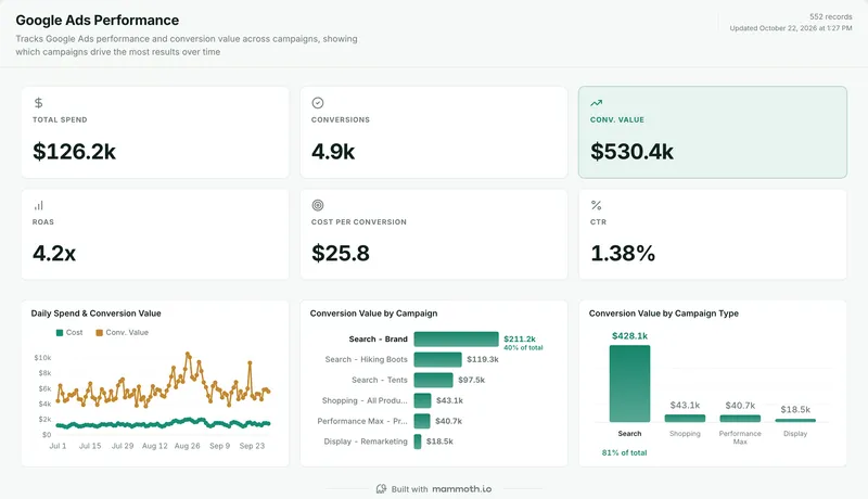 Google Ads dashboard templateSpend, conversions and ROAS by campaign and type.Free templateUse it
 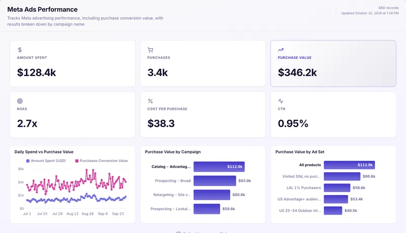 Meta Ads dashboard templateSpend, purchases and ROAS by campaign and ad set.Free templateUse it
 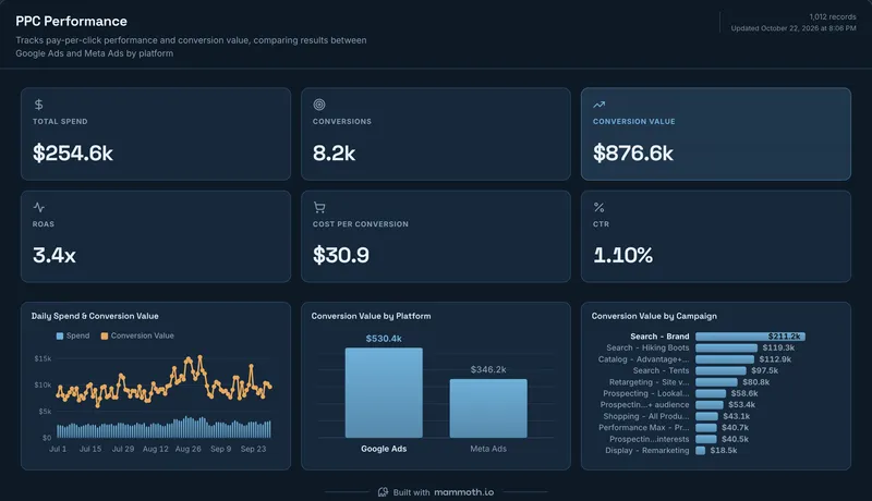 PPC report templateSpend, conversions and ROAS across Google Ads and Meta.Free templateUse it
 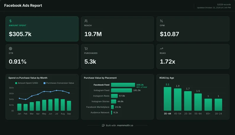 Facebook Ads report templateSpend, CPM, purchases and ROAS by placement and age.Free templateUse it
 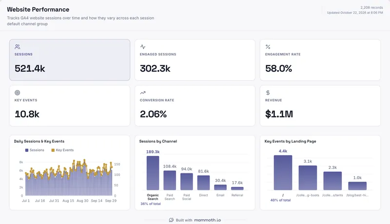 GA4 dashboard templateSessions, key events and revenue by channel and page.Free templateUse it
 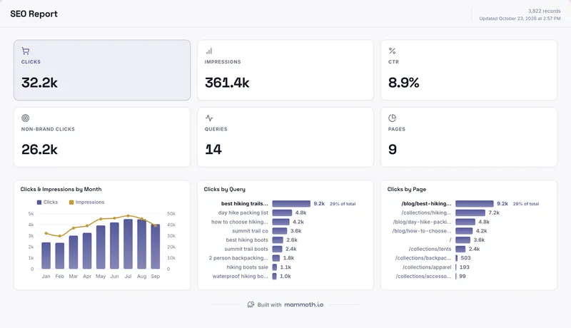 SEO report templateClicks, impressions and CTR by month, query and page.Free templateUse it


The examples
Nine dashboard examples, one from every function
Each captured as it renders on the sample dataset it ships with, so every figure on them is illustrative rather than a business result. The last one is deliberately not a dashboard. The same finance data as the first, rendered as a board pack instead.
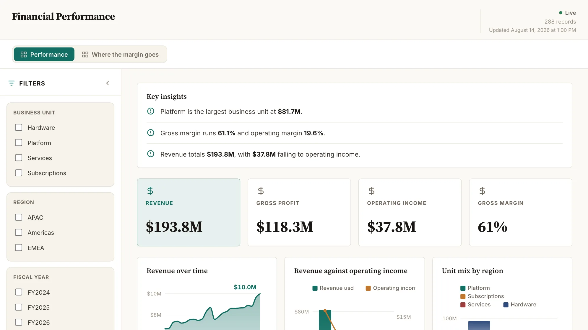
Sample data: illustrative figures, not business results. Financial Performance
Where is the money coming from, and what survives the trip to operating income?
Revenue, margin and operating income by business unit and region, month by month.
Finance · Dashboard
More financial examples →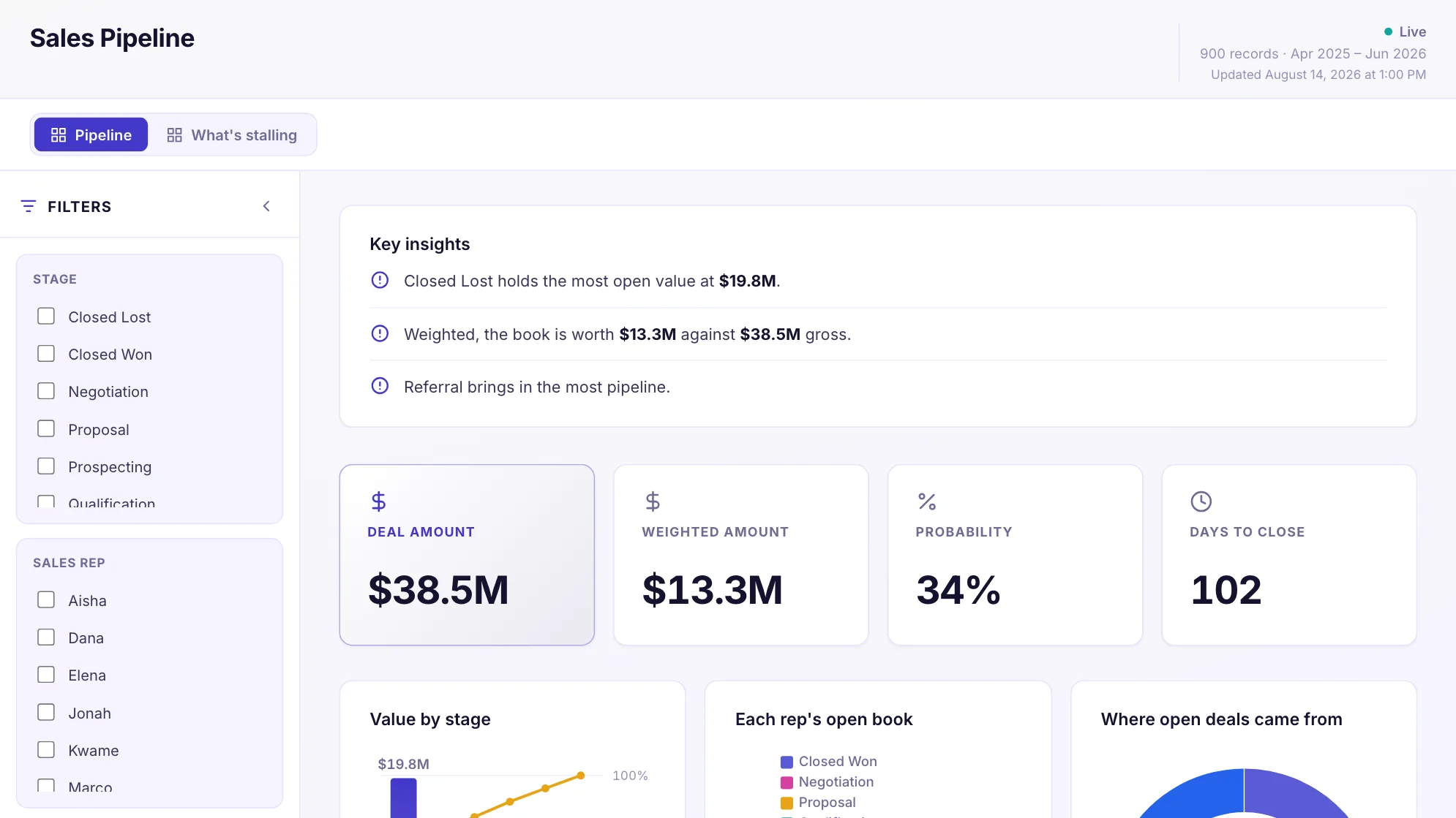
Sample data: illustrative figures, not business results. Sales Pipeline
Is the pipeline worth what the raw number says?
What is still open, which stage it sits in, and what it is worth weighted.
Sales · Dashboard
More sales examples →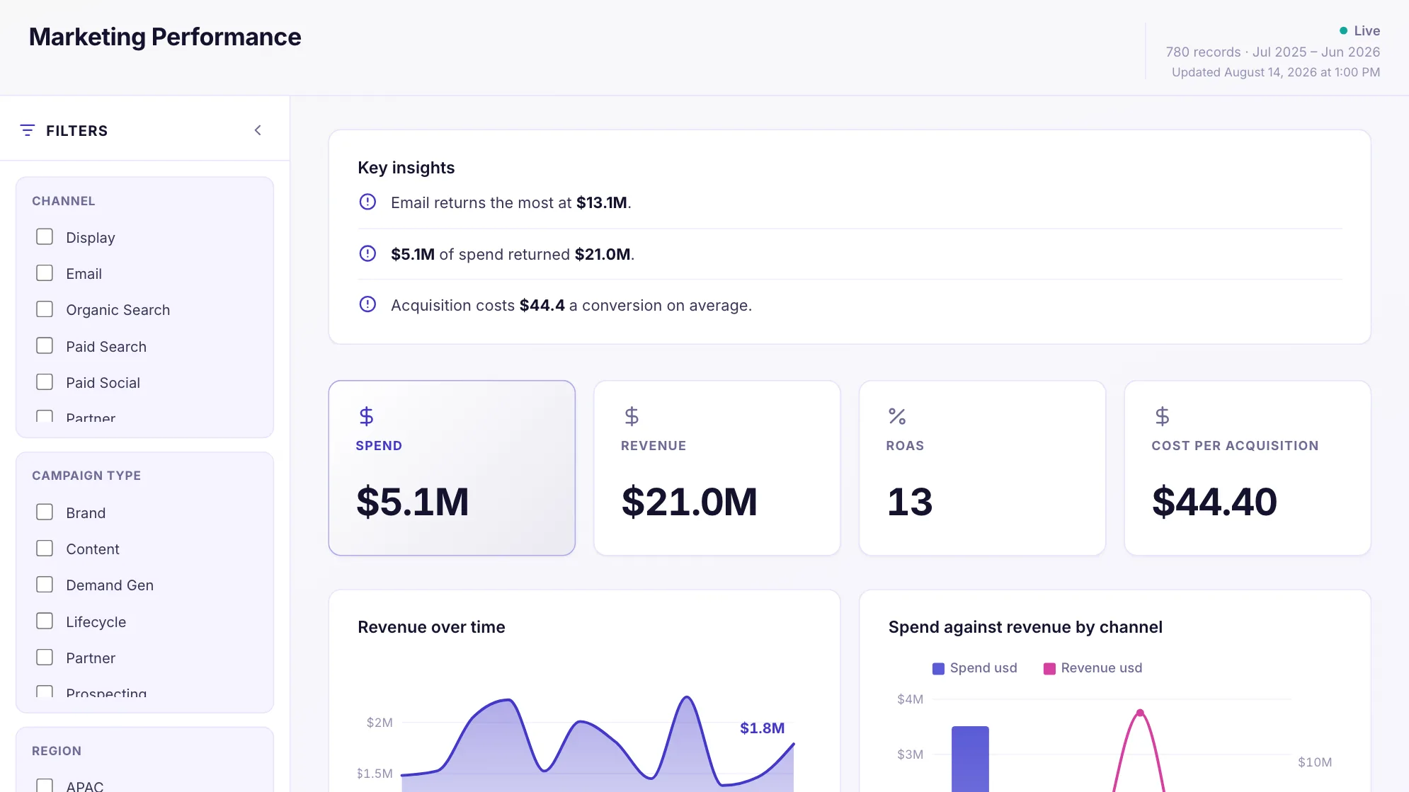
Sample data: illustrative figures, not business results. Marketing Performance
Which channels are worth the money, week by week?
Spend, conversions and return across every channel, week by week.
Marketing · Dashboard
More marketing examples →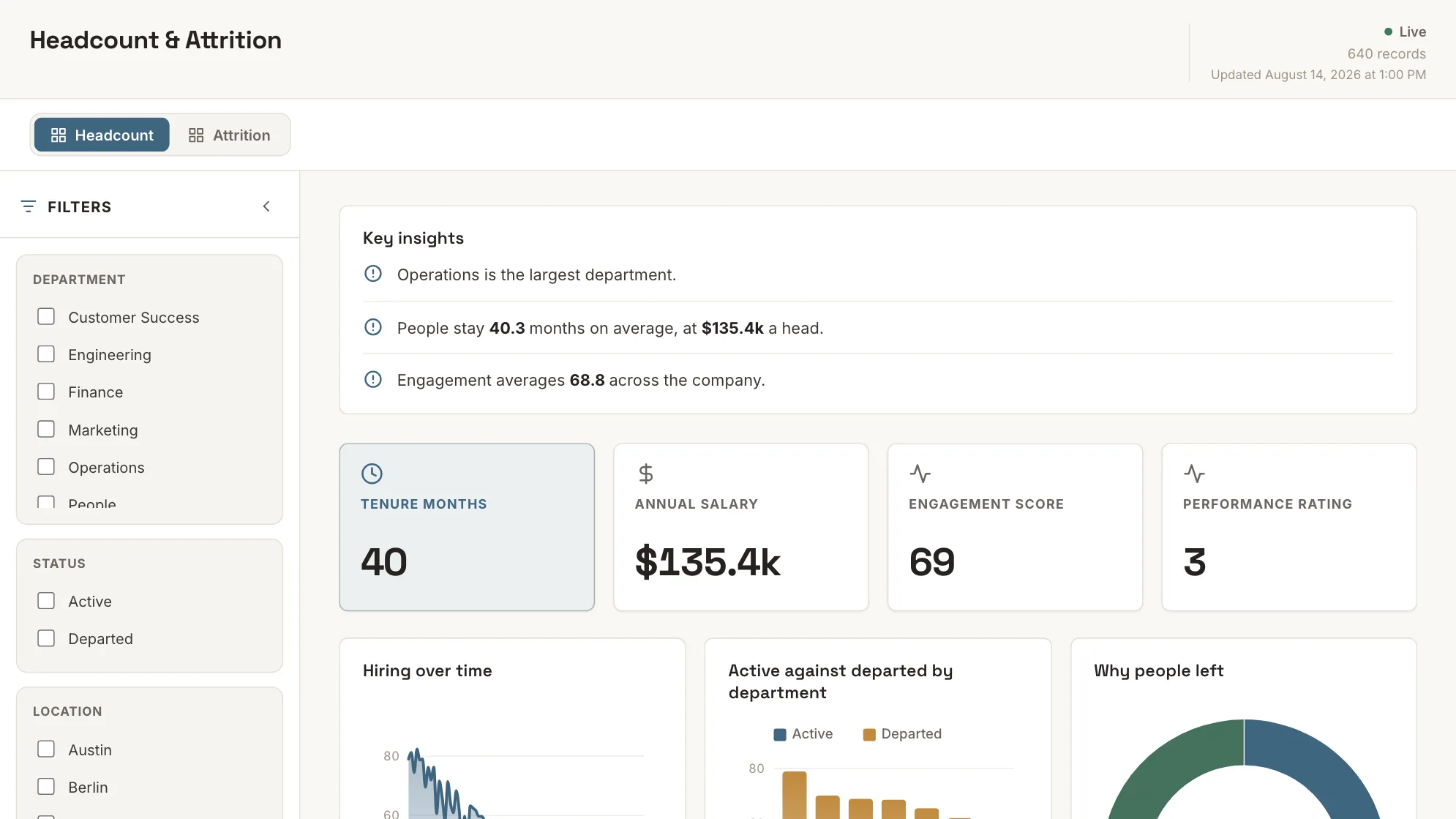
Sample data: illustrative figures, not business results. Headcount & Attrition
Is that attrition rate real, or is it one leaver on a small team?
Who is here, who left, and how long people stay — by department and level.
People · Dashboard
More HR examples →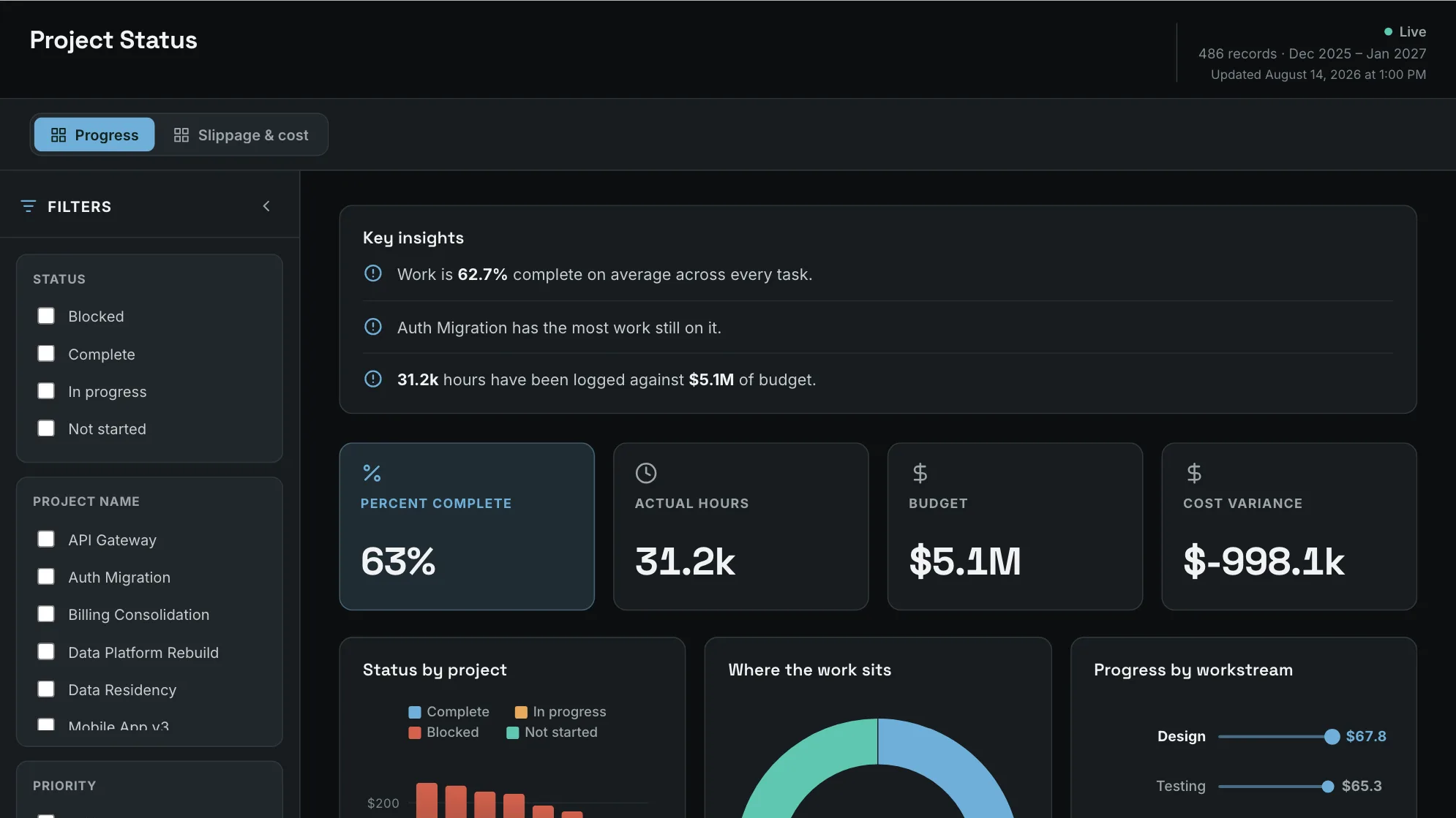
Sample data: illustrative figures, not business results. Project Status
What is actually stuck, before the status meeting starts?
What is done, in flight, blocked or late — across every workstream.
Project · Dashboard
More project examples →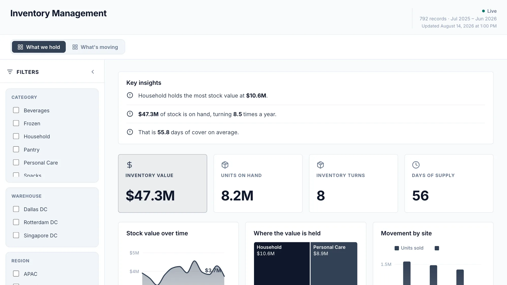
Sample data: illustrative figures, not business results. Inventory Management
Which of this stock is working, and which is money sitting still?
Stock on hand, what it is worth and how fast it moves, by category and site.
Inventory · Dashboard
More inventory examples →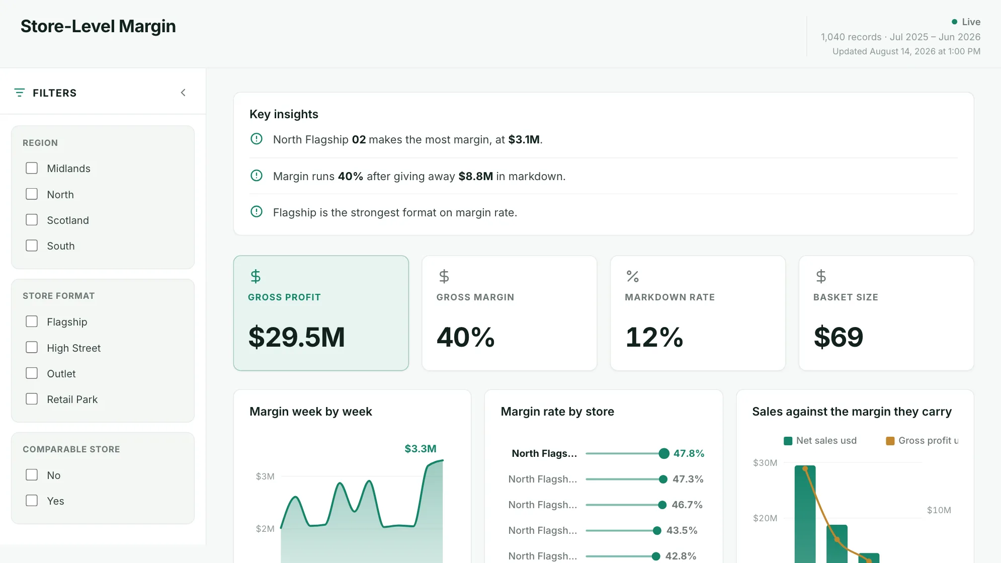
Sample data: illustrative figures, not business results. Store-Level Margin
Two stores on the same margin rate: what is different about them?
Which stores make money, and what is moving their margin.
Operations · Dashboard
More retail examples →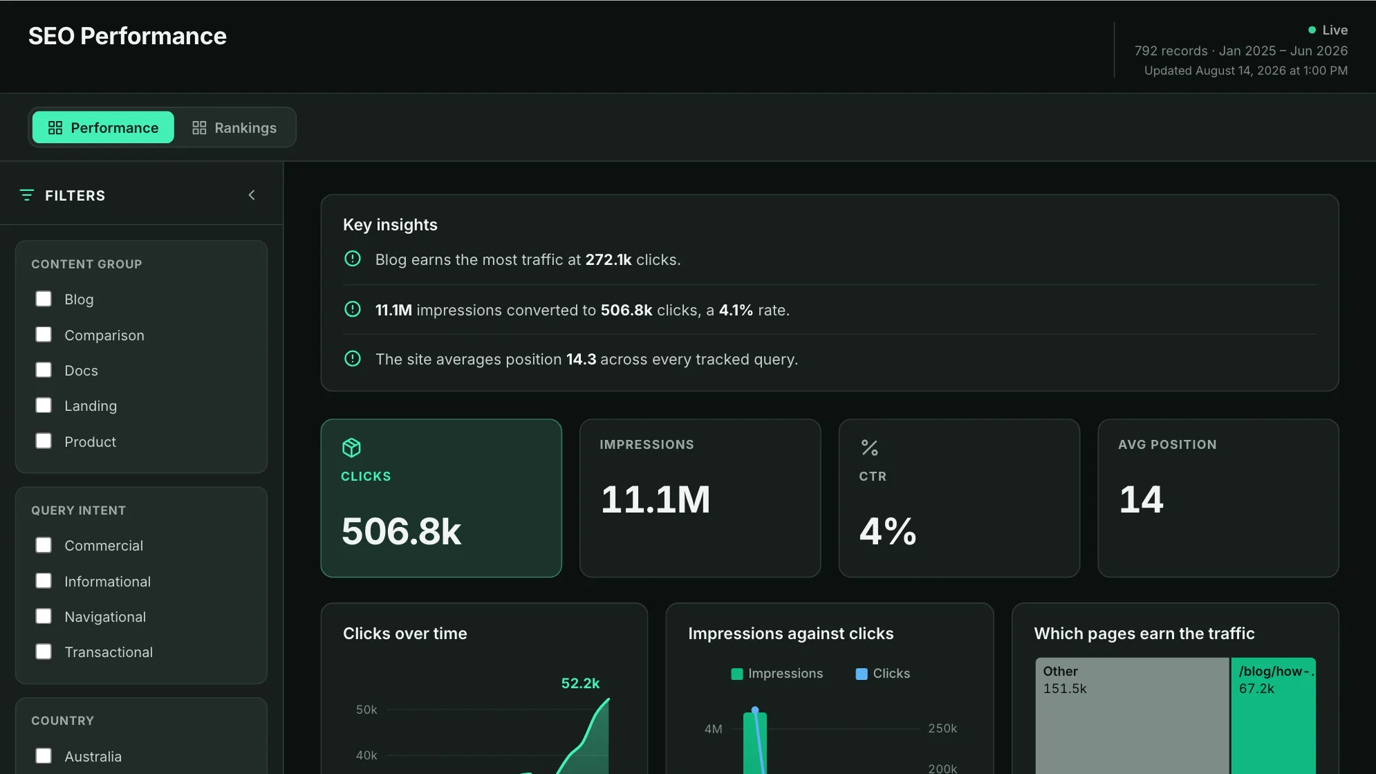
Sample data: illustrative figures, not business results. SEO Performance
Which queries are climbing, and which are quietly slipping?
Clicks, impressions and average position, and which queries are climbing.
SEO · Dashboard
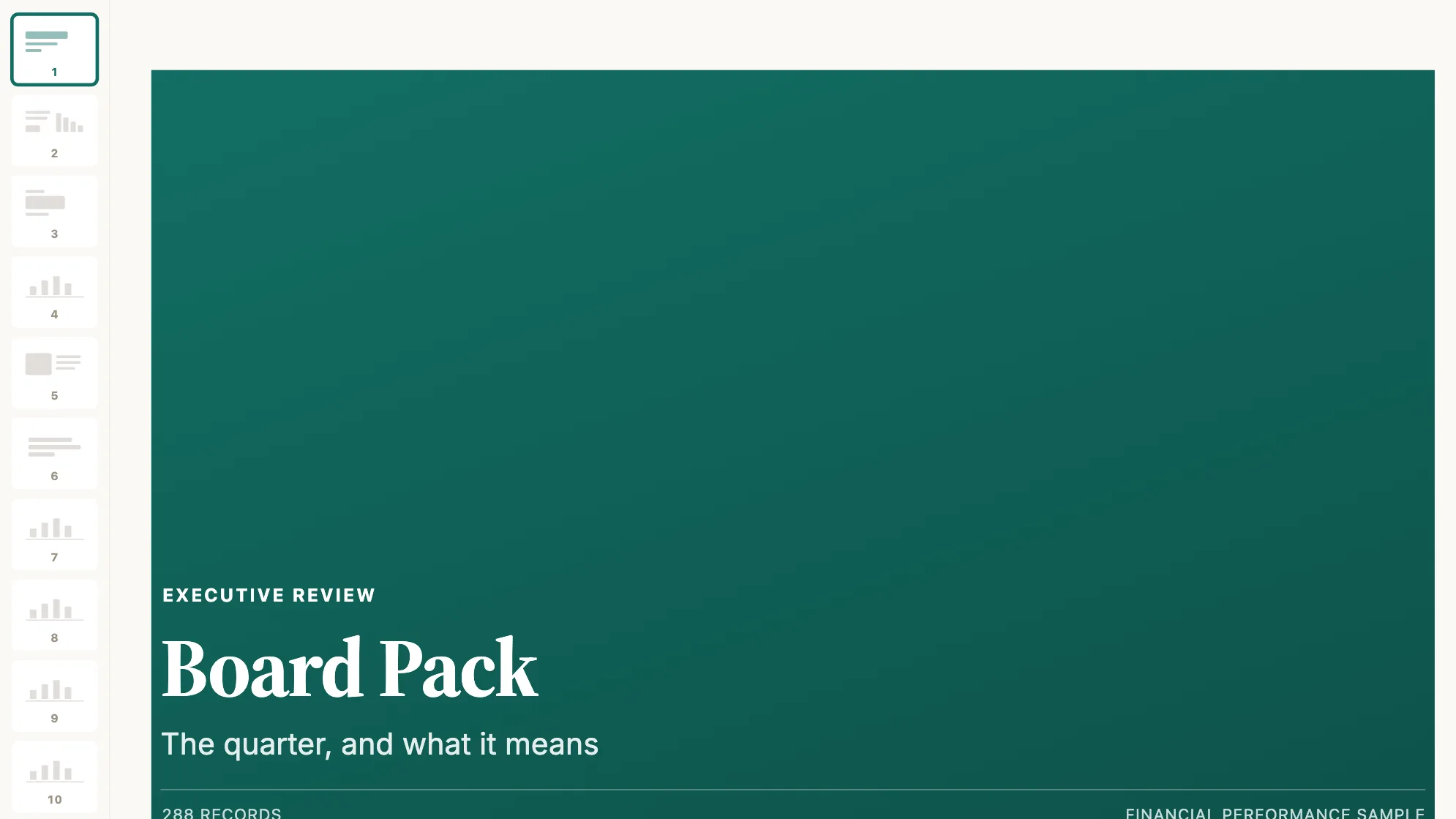
Sample data: illustrative figures, not business results. Board Pack
And what if the answer is not a dashboard at all?
The quarter for a board audience: revenue, margin, plan and what is next.
Finance · Presentation
More executive examples →
All of them
All 34 dashboard examples, by team
Every dashboard in the set, by the name people search for. Each links to the dashboard on its page, with the question it answers and what your data needs.
Retail dashboards
- Store margin dashboardTwo stores on the same margin rate: what is different about them?
- Store performance dashboardWhich stores are improving, once new space is stripped out?
- Sell-through dashboardIs the season selling through at the rate the buy was planned on?
- Retail inventory dashboardWhat is about to run out, and what has stopped moving?
- Promotion dashboardDid the promotion make money, or just move it?
- Fulfilment and returns dashboardAre orders arriving on time, and how much is coming back?
Financial dashboards
- Financial reporting dashboardWhere is the money coming from, and what survives the trip to operating income?
- Budget vs actual dashboardWhere did the plan hold, and where did it not?
- Financial KPI dashboardWhat are the four numbers this review opens with?
- Accounts receivable dashboardWho owes us, how old is it, and who is chasing it?
- Cash collection forecastWhen does the open ledger turn into cash?
- Spend dashboardWhere does the money go, and how few vendors does it go to?
Marketing dashboards
- Digital marketing dashboardWhich channels are worth the money, week by week?
- Campaign performance dashboardWhich campaigns worked, judged on the same terms?
- Marketing ROI dashboardWhat does each channel cost to run, and what does it return?
- SEO dashboardWhich pages and queries earn search traffic, and which are climbing?
- SEO reporting dashboardIs organic search turning into conversions, and in which markets?
- Content marketing dashboardWhich content earns its keep, and which is seen but not clicked?
HR dashboards
- Headcount and turnover dashboardIs that attrition rate real, or is it one leaver on a small team?
- HR scorecardWhat are the people numbers a leadership review opens with?
- HR analytics dashboardWhich teams are the outliers, and on what?
- Compensation dashboardWhat does each level cost, and where does pay sit against tenure?
Inventory dashboards
- Inventory management dashboardWhich of this stock is working, and which is money sitting still?
- Inventory valuation dashboardWhere is the money tied up, and what does a unit of it cost?
- Inventory tracking dashboardWhat needs reordering before it runs dry?
- Aged inventory dashboardWhat has stopped moving, and what is it costing to hold?
- Warehouse dashboardIs each site keeping up, and which one is running short?
Design notes
What goes on a dashboard worth keeping
Four things, and none of them is the chart library. They are the difference between a dashboard that survives a quarter and one that gets replaced by a screenshot in a message.
It answers one question
The dashboards people keep open have a single question at the top and nothing on them that does not help answer it.
The ones that get abandoned are an inventory of every metric the data happened to contain.
Every number carries a comparison
A figure on its own is unreadable.
Against plan, against last period, against the same week last year: the comparison is what turns a number into a decision.
It resolves to something to do
Totals say there is a problem.
The ranked list of exceptions, the deals that stalled, the stores below plan, the invoices in dispute, says what to do about it on Monday.
It is current without anyone maintaining it
A dashboard rebuilt by hand each week is a report with extra steps.
The preparation behind these is recorded once and re-run on a schedule, so the dashboard reflects the source rather than the last export.
From example to live dashboard
Pretty is easy. Current and true is the hard part.
Any of these can be drawn in a slide. What makes one worth keeping is the five steps underneath it, and they are the same five whichever example you start from.
- 01
Connect the source
The dashboard reads the system, not an export somebody saved to their desktop. 100+ tested connectors, plus anything with a REST API.
- 02
Prepare it once
Cleaning, joining and reshaping are recorded as steps you can read, change and re-run, not a formula buried three sheets deep.
- 03
Check it before anyone sees it
Data checks run with the refresh and flag the rows that fail, so a broken upstream file shows up as an alert rather than as a wrong number in a meeting.
- 04
Put it on a schedule
Refresh on a schedule and the dashboard stays current on its own. Starter refreshes weekly, Team daily, and Pro every three hours.
- 05
Publish it and send the link
Public, password-protected or sign-in only. Every sharing mode is available on every plan, including the free one.
Already have the data in a spreadsheet? Turn it into a dashboard with the AI dashboard generator.
Sharing
Everyone can see it.
Nobody pays to look.
Most dashboard tools charge for every person who opens one, which is why so many dashboards end up as a screenshot pasted into a message. Mammoth charges for the people who build. Viewers are unlimited and free on every plan, including the free one.
You pay for
The people who build
Anyone connecting a source, preparing data or publishing a dashboard counts as a platform user.
You never pay for
The people who look
Viewers are unlimited and free on every plan, including the free one. A board, a client list or a whole company: the number does not change the bill.
Plans differ in how many builders and published dashboards a workspace gets. Drafts, viewers and every sharing mode are unlimited and free on all four. Full pricing.
Dashboard questions
What counts as a good dashboard example?
What are some good examples of dashboards?
How do I create my own dashboard?
What are the four types of dashboards?
Are these real dashboards or mock-ups?
Where does the data come from?
How often can a dashboard refresh?
Does everyone who looks at a dashboard need a licence?
Last reviewed against the template catalogue.




Build the one you came here looking for.
Connect a source, prepare it once, publish it. Everyone who needs to see it can, at no per-viewer cost.
- ✓ 14-day Pro trial
- ✓ No credit card
- ✓ Viewers always free