Marketing dashboards
Marketing dashboard examples
In short
What a marketing dashboard is
A marketing dashboard is a single screen showing what each channel and campaign returns for what it costs. Teams also call it a marketing analytics or marketing KPI dashboard. For paid channels the useful ones resolve spend to an outcome, cost per acquisition, return on ad spend and pipeline sourced, because impressions and clicks move without meaning anything. Organic search is the exception: there the click is the first outcome you control, so the SEO boards below start from clicks and carry them through to conversions.
The examples
Seven marketing dashboard examples
Real Mammoth templates on sample data. Every figure is illustrative. None is a picture of one ad platform's own reporting, which cannot see past its own conversions.
Example 01· Template: Marketing Performance
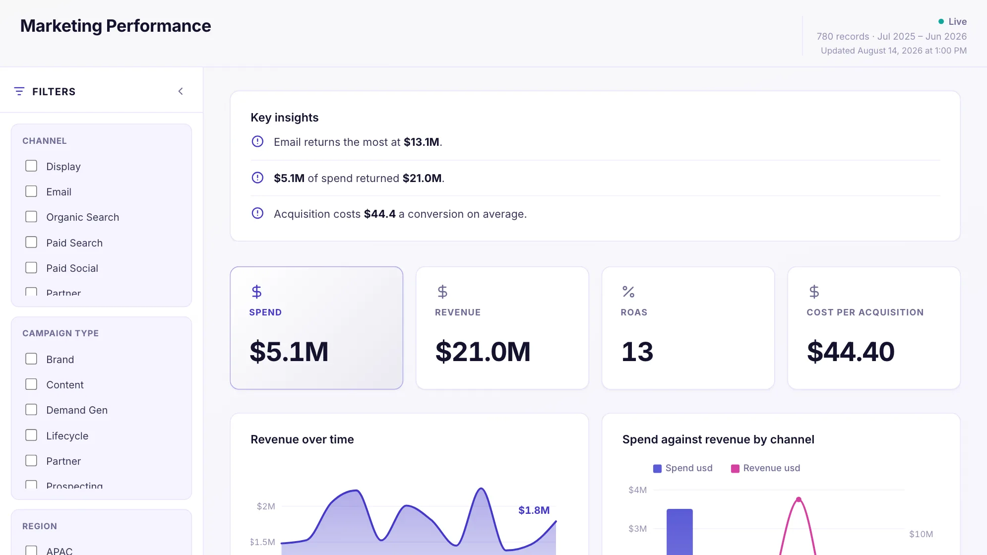
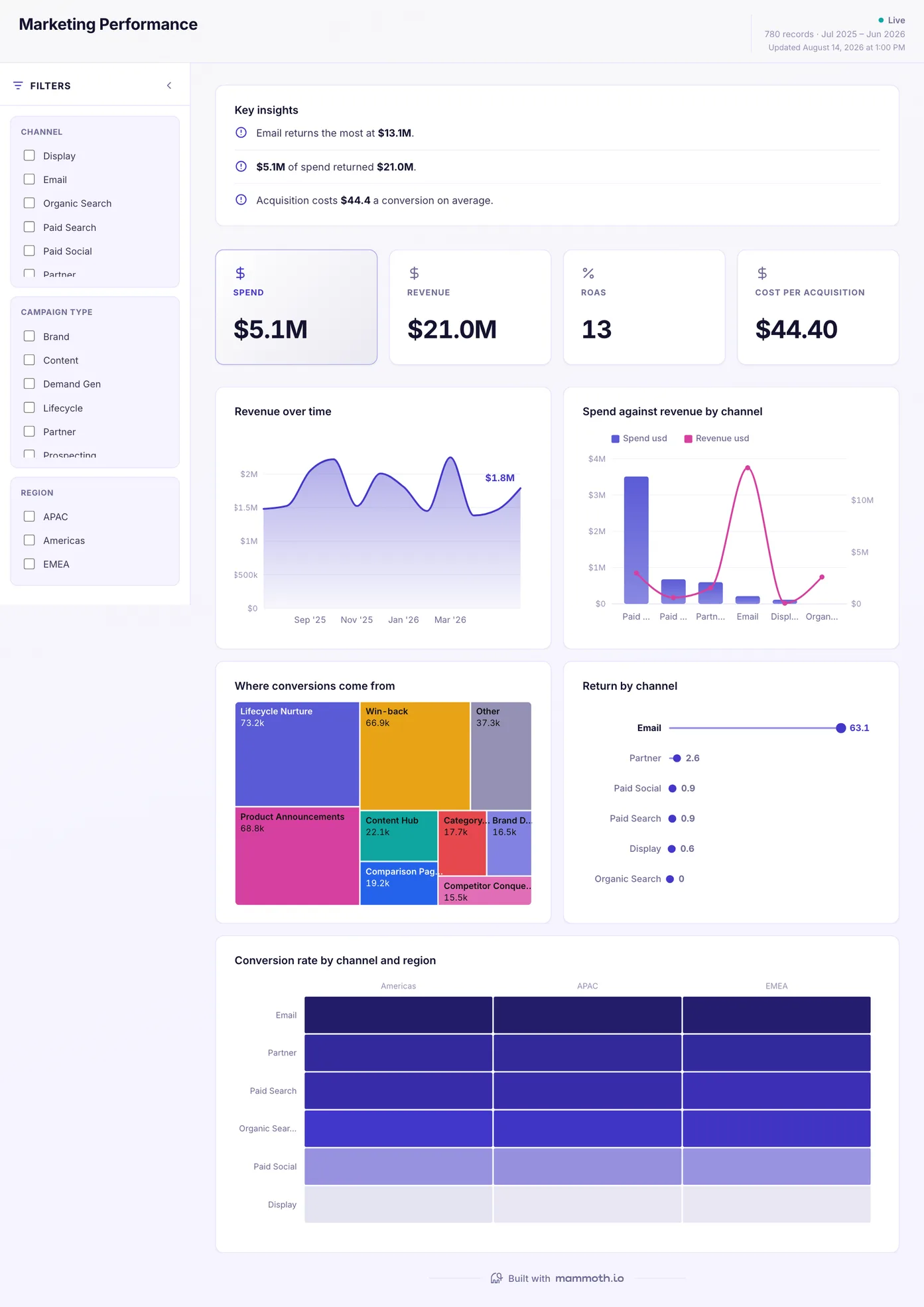
Digital marketing dashboard
Which channels are worth the money, week by week?
Spend, conversions and return for every channel on one view and one set of definitions. Three ad platforms will give you three different numbers for the same week because each defines a conversion differently; deciding that once, in the preparation, is what makes the columns comparable at all.
What is on it
- Revenue over time
- Spend against revenue by channel
- Where conversions come from
- Return by channel
- Conversion rate by channel and region
Your data needsDashboard
- a revenue or money column
- a category (~6 values)
Sample data: illustrative figures, not business results. Example 02· Template: Campaign Performance
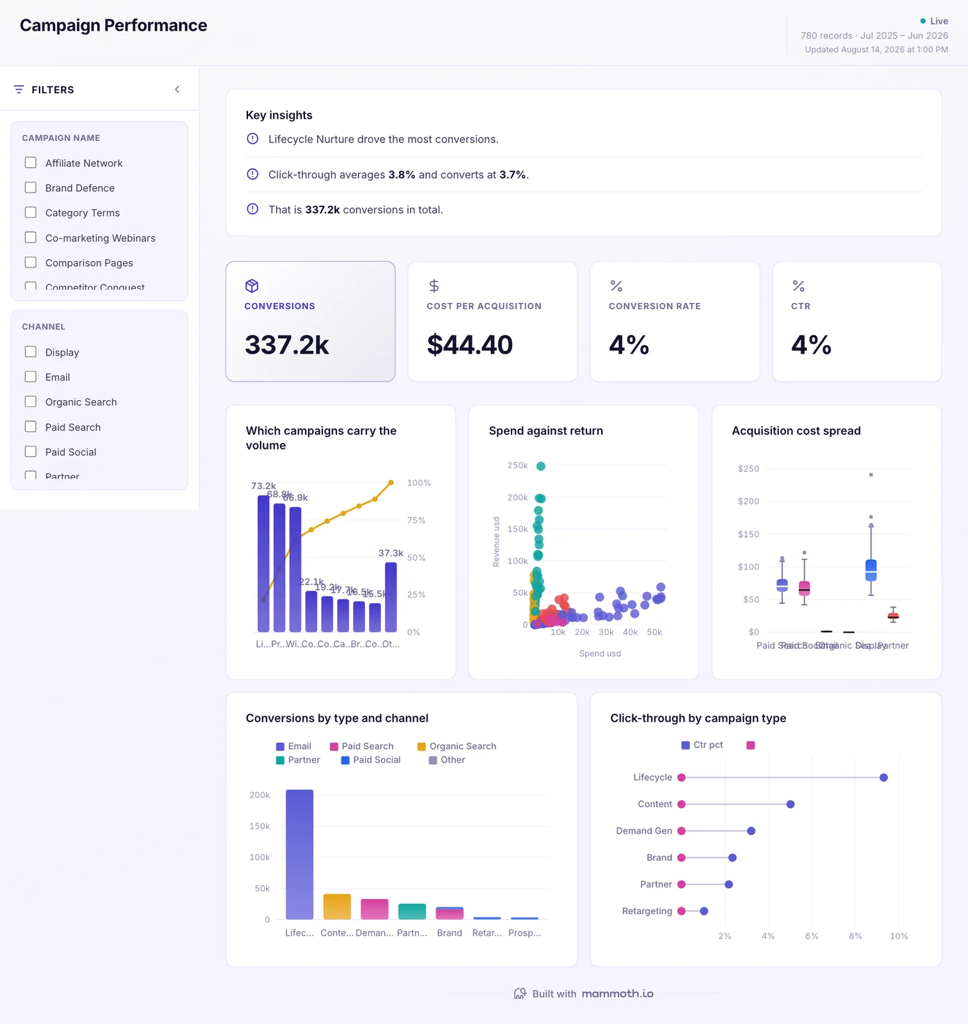
Campaign performance dashboard
Which campaigns worked, judged on the same terms?
Every campaign side by side on cost, conversion and return, rather than each one judged by whichever metric its platform happens to report. Ranked so the campaign that moved is at the top instead of the campaign that is biggest.
What is on it
- Which campaigns carry the volume
- Spend against return
- Acquisition cost spread
- Conversions by type and channel
- Click-through by campaign type
Your data needsDashboard
- a count column
- a category (~15 values)
Sample data: illustrative figures, not business results. Example 03· Template: Channel ROI
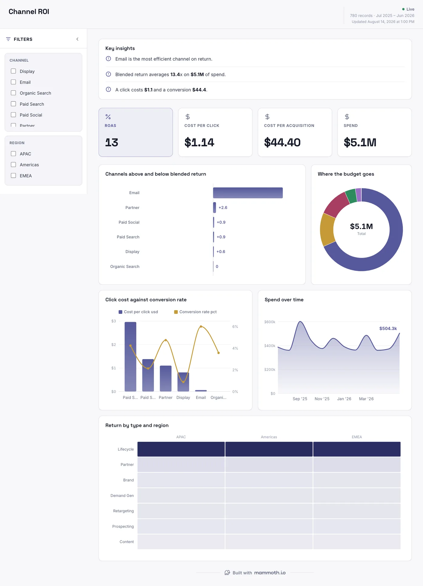
Marketing ROI dashboard
What does each channel cost to run, and what does it return?
Cost against return per channel, with the efficiency spread shown rather than averaged away. A channel with a good mean and a wide spread is a different decision from one that returns the same figure every week.
What is on it
- Channels above and below blended return
- Where the budget goes
- Click cost against conversion rate
- Spend over time
- Return by type and region
Your data needsDashboard
- a numeric amount
- a category (~6 values)
Sample data: illustrative figures, not business results. Example 04· Template: SEO Performance
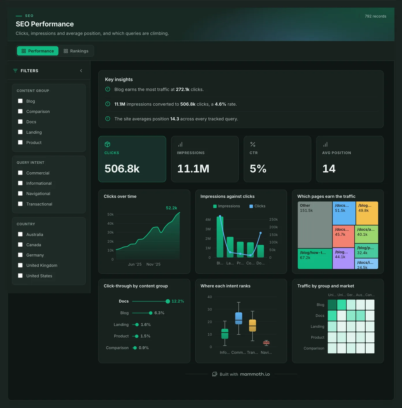
SEO dashboard
Which pages and queries earn search traffic, and which are climbing?
Clicks, impressions, click-through and average position on one strip, then traffic by page, content group and market, with a second page on where each search intent ranks. It runs on a search performance export, clicks and impressions by page and query as a CSV or a sheet, rather than a live connection.
What is on it· 2 pages · Performance / Rankings
- Clicks over time
- Impressions against clicks
- Which pages earn the traffic
- Click-through by content group
- Where each intent ranks
- Traffic by group and market
Your data needsDashboard
- a count column
- a category (~5 values)
Sample data: illustrative figures, not business results. Example 05· Template: SEO Reporting
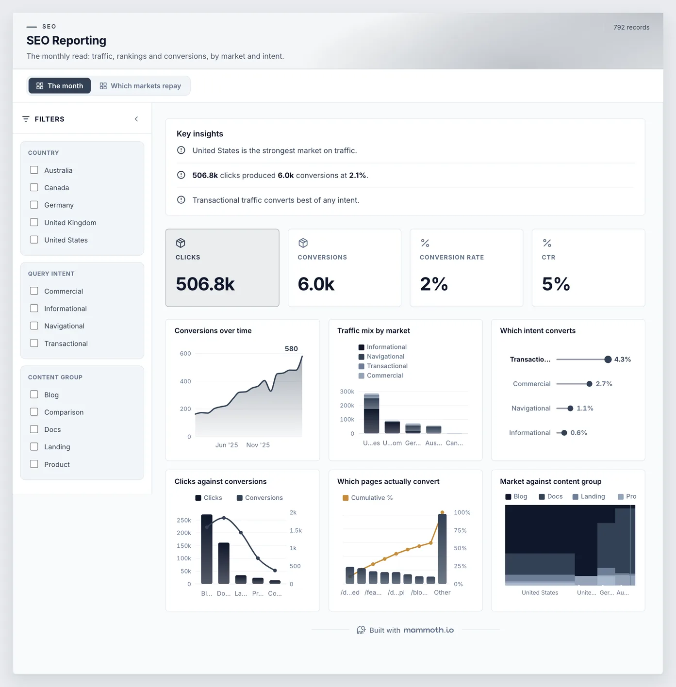
SEO reporting dashboard
Is organic search turning into conversions, and in which markets?
Conversions over time, clicks set against conversions, and which pages and search intents convert, cut by market. The monthly read an agency sends a client, with the conversion as the headline rather than the ranking.
What is on it· 2 pages · The month / Which markets repay
- Conversions over time
- Traffic mix by market
- Which intent converts
- Clicks against conversions
- Which pages actually convert
- Market against content group
Your data needsDashboard
- a count column
- a category (~5 values)
Sample data: illustrative figures, not business results. Example 06· Template: Content Performance
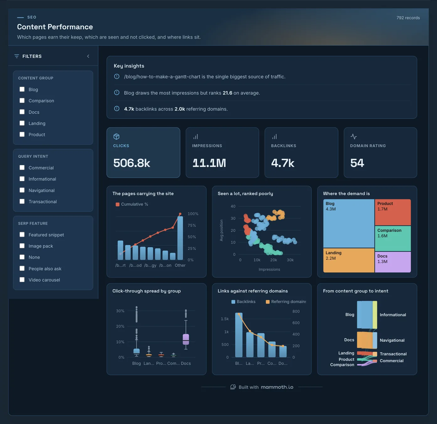
Content marketing dashboard
Which content earns its keep, and which is seen but not clicked?
The pages carrying the site's traffic, the ones seen often but ranked too low to be clicked, and where links sit against referring domains. A content team's working view: what to refresh, what to leave, and where demand is going unserved. Link counts come from an SEO tool's export.
What is on it
- The pages carrying the site
- Seen a lot, ranked poorly
- Where the demand is
- Click-through spread by group
- Links against referring domains
- From content group to intent
Your data needsDashboard
- a count column
- a category column
Sample data: illustrative figures, not business results. Example 07· Template: Promotion & Discount Effectiveness
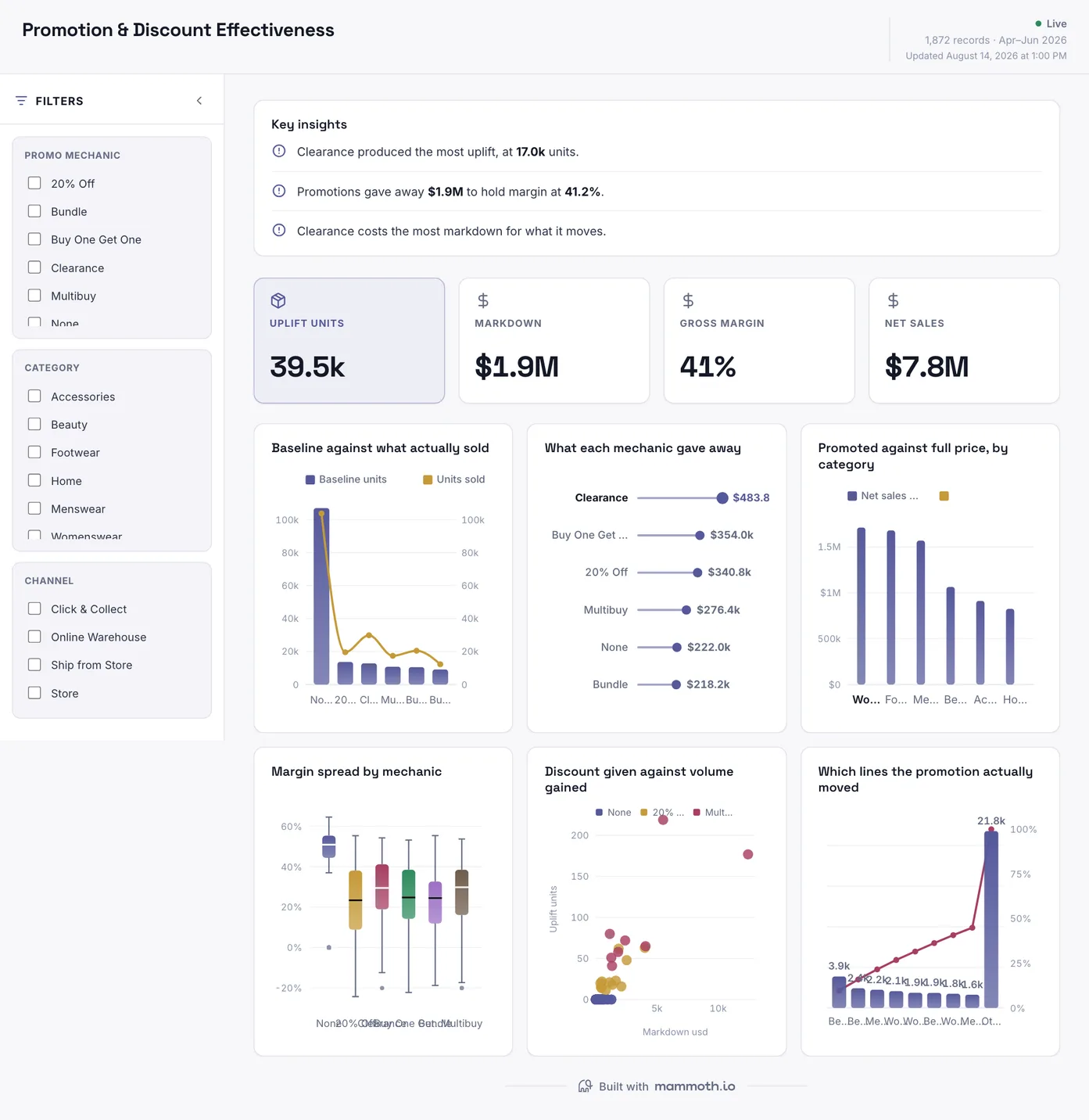
Retail promotion dashboard
Did the promotion make money, or just move it?
What sold against the baseline that would have sold anyway, what each mechanic gave away in markdown, and the margin left once the discount is paid for. The last chart names the lines the promotion moved, which is where a promotion that looked like a win turns out to have cannibalised full-price sales.
What is on it
- Baseline against what actually sold
- What each mechanic gave away
- Promoted against full price, by category
- Margin spread by mechanic
- Discount given against volume gained
- Which lines the promotion actually moved
Your data needsDashboard
- a count column
- a category (~6 values)
Sample data: illustrative figures, not business results.
The metrics
The metrics a marketing dashboard is built from
Eight numbers. Six resolve paid spend to an outcome, and impressions and clicks are not among those: for paid channels they move without meaning anything. The last two are organic, where the click is the first outcome you control.
| Metric | What it answers | What your data needs |
|---|---|---|
| Cost per acquisition | What does one new customer cost, by channel? | Spend per channel and conversions counted on one attribution model over one window. Three ad platforms will each claim the same conversion, so the count has to come from one place rather than be added up across dashboards. |
| Return on ad spend | What came back for what went out? | Revenue from the order system rather than the ad platform's own reported conversions, matched to spend for the same period. A platform grading its own homework is the single most common inflation here. |
| Pipeline sourced | How much of the open pipeline did marketing originate? | Lead source held on the opportunity, not only on the contact, plus a stated rule for deals with several touches. Without the rule, first-touch and last-touch reports disagree and both get quoted. |
| Conversion rate by stage | Where in the funnel does it fall over? | One set of stage definitions shared by the website analytics and the CRM. Two systems with their own idea of a qualified lead produce a rate that cannot be acted on. |
| Blended acquisition cost | What does growth cost once everything is counted? | Total sales and marketing cost, salaries included, over new customers in the same period. Paid-media-only CAC flatters, sometimes by a multiple. |
| Channel mix over time | Is the return coming from more places or fewer? | Spend and outcome per channel per period, with channel names normalised across platforms first. Unnormalised UTMs split one channel into five and make the mix look diversified. |
| Organic conversions | Is search traffic turning into customers, or only visits? | Landing page on every conversion, joined to the search export by page. Conversions credited to the last click alone make organic look smaller than it is. |
| Click-through rate by query group | Where do people see the page and not click it? | Clicks and impressions by query or page, grouped by intent or topic before the rate is taken. A site-wide click-through rate averages pages that rank first with pages nobody sees. |
Other formats
The same numbers, two other ways
The monthly write-up and the recap deck are the two artifacts an agency rebuilds by hand for every client, every period. Both are built here from the same 780 rows as the first three dashboards above.
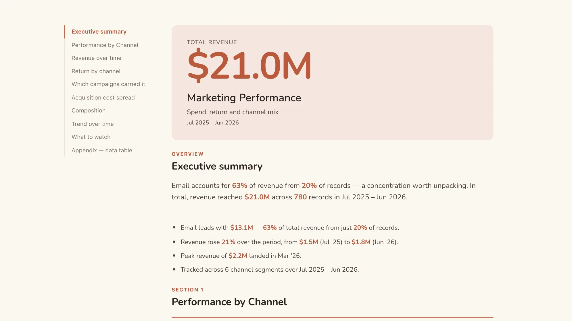
Sample data: illustrative figures, not business results. Marketing Performance Report
Can the monthly write-up produce itself?
The period's marketing written up: spend, return and what each channel did.
Marketing · Document
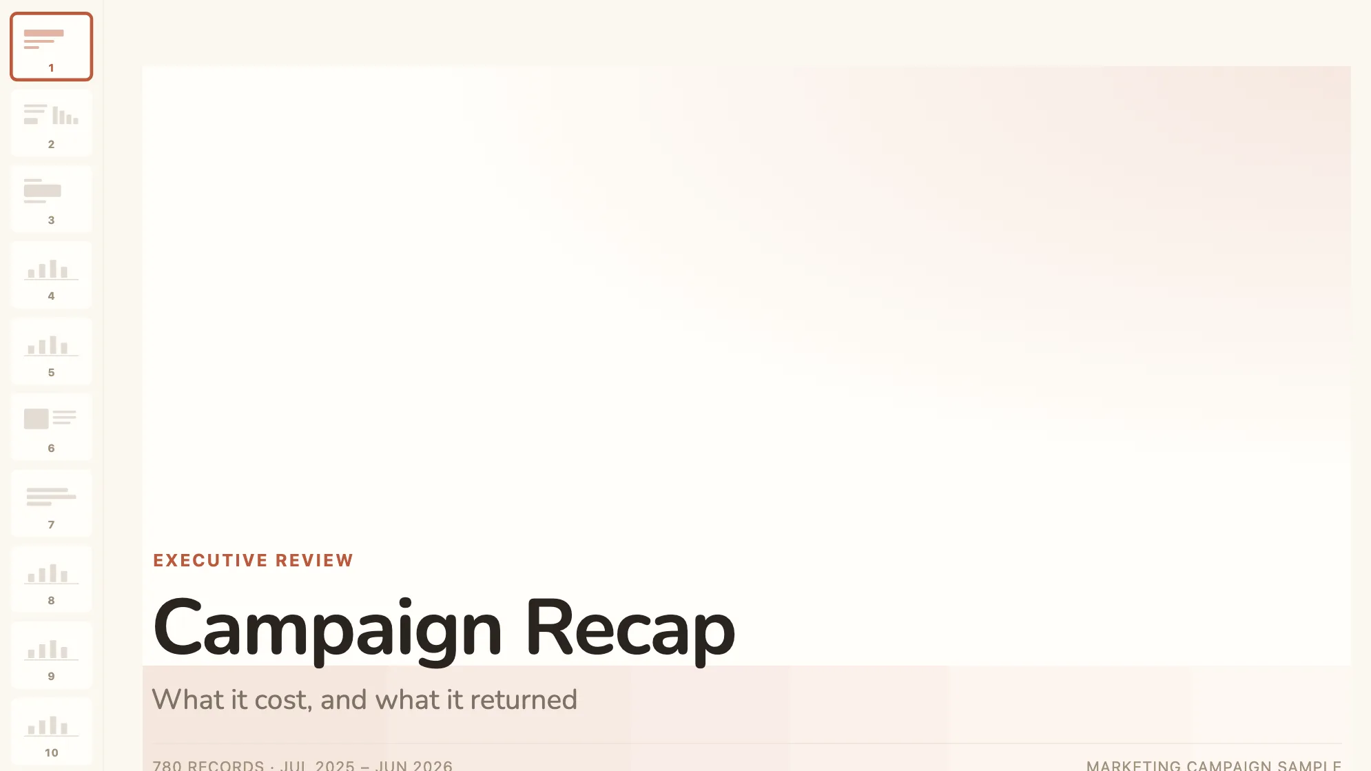
Sample data: illustrative figures, not business results. Campaign Recap Deck
How did that campaign go, for an audience that was not in it?
A campaign told as a story: what it cost, what it returned, what to keep.
Marketing · Presentation
Proof
Agencies and client-reporting teams already running on Mammoth
Published customer stories, linked rather than summarised. All three have the problem this page keeps returning to: the same report, across many channels and many clients, assembled by hand.
- The Specialist WorksCampaign data arriving in a different format from every channel and every client, with analysts spending their time cleaning it before anyone could read it.
- KantarHigh volumes of strictly templated client reports built almost entirely by hand, where the formatting errors that crept in cost trust.
- PTI DigitalA data service productised by making client workflows repeatable, so setting up a new client stopped being an engineering job.
From example to live dashboard
Pretty is easy. Current and true is the hard part.
Any of these can be drawn in a slide. What makes one worth keeping is the five steps underneath it, and they are the same five whichever example you start from.
- 01
Connect the source
The dashboard reads the system, not an export somebody saved to their desktop. 100+ tested connectors, plus anything with a REST API.
- 02
Prepare it once
Cleaning, joining and reshaping are recorded as steps you can read, change and re-run, not a formula buried three sheets deep.
- 03
Check it before anyone sees it
Data checks run with the refresh and flag the rows that fail, so a broken upstream file shows up as an alert rather than as a wrong number in a meeting.
- 04
Put it on a schedule
Refresh on a schedule and the dashboard stays current on its own. Starter refreshes weekly, Team daily, and Pro every three hours.
- 05
Publish it and send the link
Public, password-protected or sign-in only. Every sharing mode is available on every plan, including the free one.
Already have the data in a spreadsheet? Turn it into a dashboard with the AI dashboard generator.
Sharing
Everyone can see it.
Nobody pays to look.
Most dashboard tools charge for every person who opens one, which is why so many dashboards end up as a screenshot pasted into a message. Mammoth charges for the people who build. Viewers are unlimited and free on every plan, including the free one.
You pay for
The people who build
Anyone connecting a source, preparing data or publishing a dashboard counts as a platform user.
You never pay for
The people who look
Viewers are unlimited and free on every plan, including the free one. A board, a client list or a whole company: the number does not change the bill.
Plans differ in how many builders and published dashboards a workspace gets. Drafts, viewers and every sharing mode are unlimited and free on all four. Full pricing.
Marketing dashboard questions
What makes a marketing dashboard useful rather than decorative?
How do I build a marketing dashboard?
- Connect the ad platforms, the analytics tool and the CRM, and bring search data in as an export.
- Agree one definition of a conversion across every platform, because each one counts its own way.
- Build spend against return by channel, then by campaign, with cost per acquisition and return on ad spend on top.
- Add organic search as its own board: clicks carried through to conversions, by page and market.
- Schedule the refresh and share the link with the team or the client, so the monthly report stops being rebuilt by hand.
Which marketing sources can Mammoth read?
We report to clients monthly. Does this work for an agency?
How often should it refresh?
Last reviewed against the template catalogue.




Build the marketing dashboard you actually need.
Connect a source, prepare it once, and publish. Everyone who needs to see it can, at no per-viewer cost.
- ✓ 14-day Pro trial
- ✓ No credit card
- ✓ Viewers always free