Sales dashboards
Sales dashboard examples
In short
What a sales dashboard is
A sales dashboard is a single screen showing the state of the pipeline and what is likely to close. Teams also call it a sales analytics or sales metrics dashboard. The useful ones answer whether the book is getting healthier rather than merely bigger, which takes deal size, cycle length and win rate. A pipeline total on its own cannot say it. Each of the four below states the question it answers and the columns your data needs before it will bind.
The examples
Four sales dashboard examples
Real Mammoth templates on sample data. Every figure is illustrative. Each is built around the meeting it serves.
Example 01· Template: Sales Pipeline
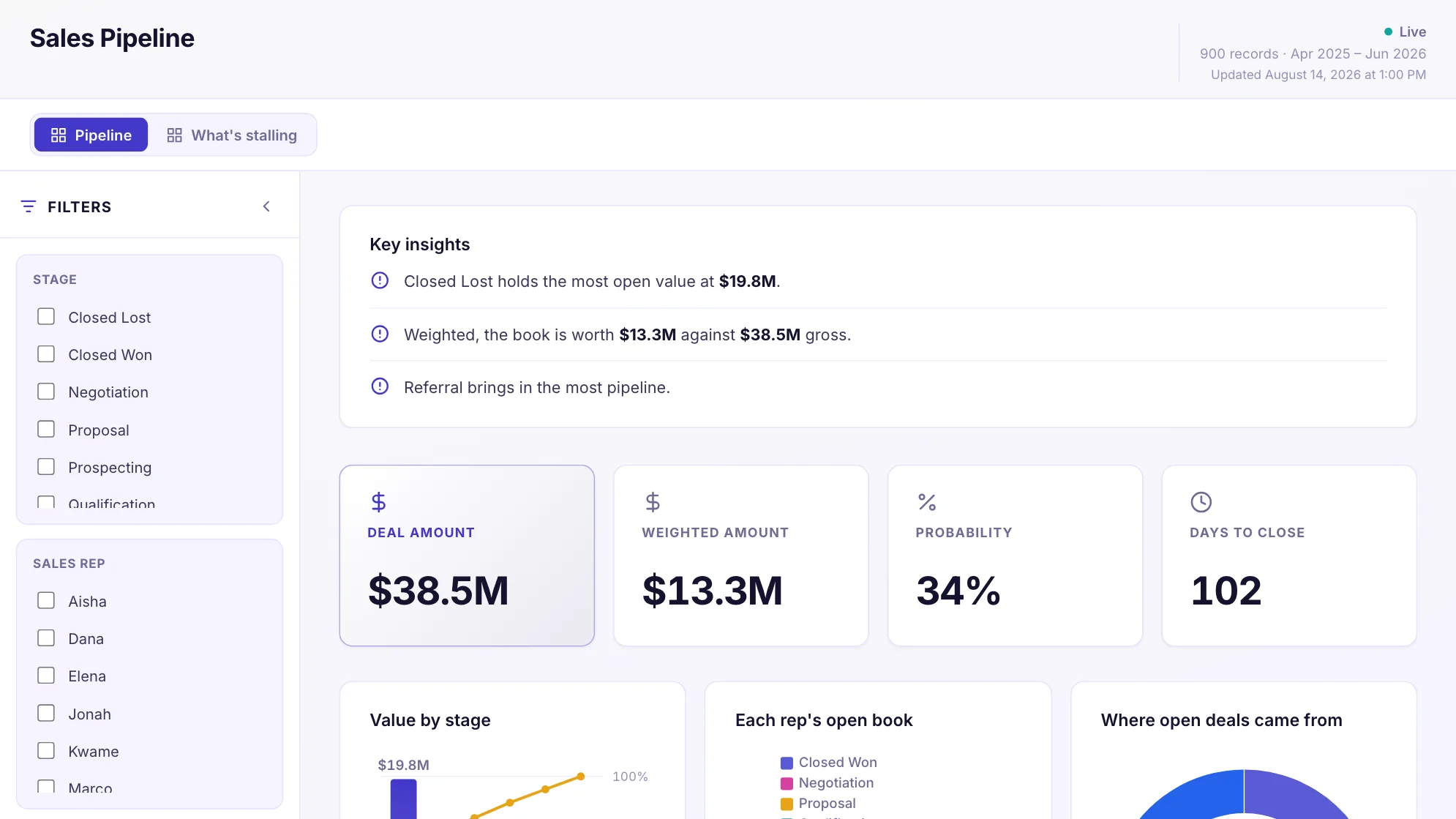
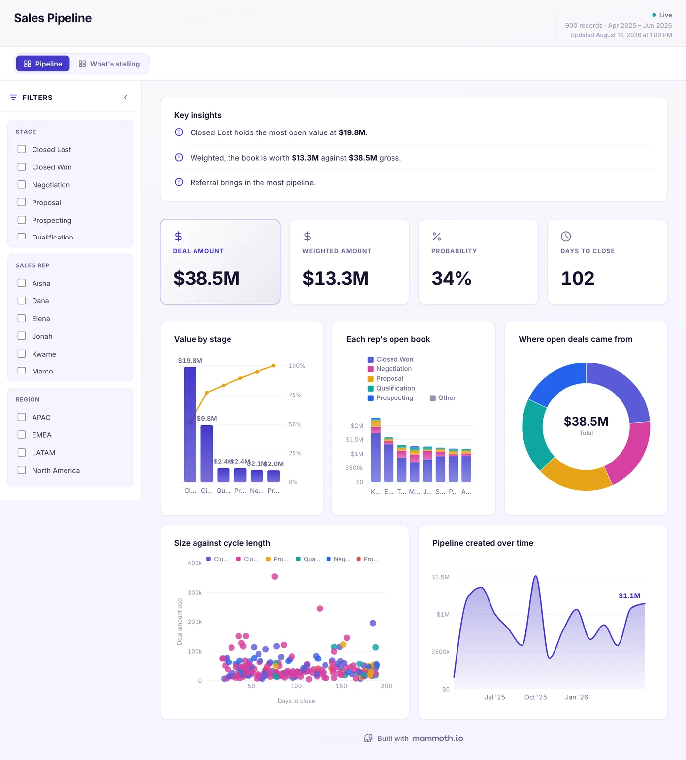
Sales pipeline dashboard
Is the pipeline worth what the raw number says?
Open pipeline by stage, with the weighted value alongside the raw one. The gap between those two numbers is the whole argument in most pipeline reviews, and showing only the first is how a forecast ends up being defended rather than discussed.
What is on it· 2 pages · Pipeline / What's stalling
- Value by stage
- Each rep's open book
- Where open deals came from
- Size against cycle length
- Pipeline created over time
Your data needsDashboard
- a revenue or money column
- a category (~6 values)
Sample data: illustrative figures, not business results. Example 02· Template: Sales Performance
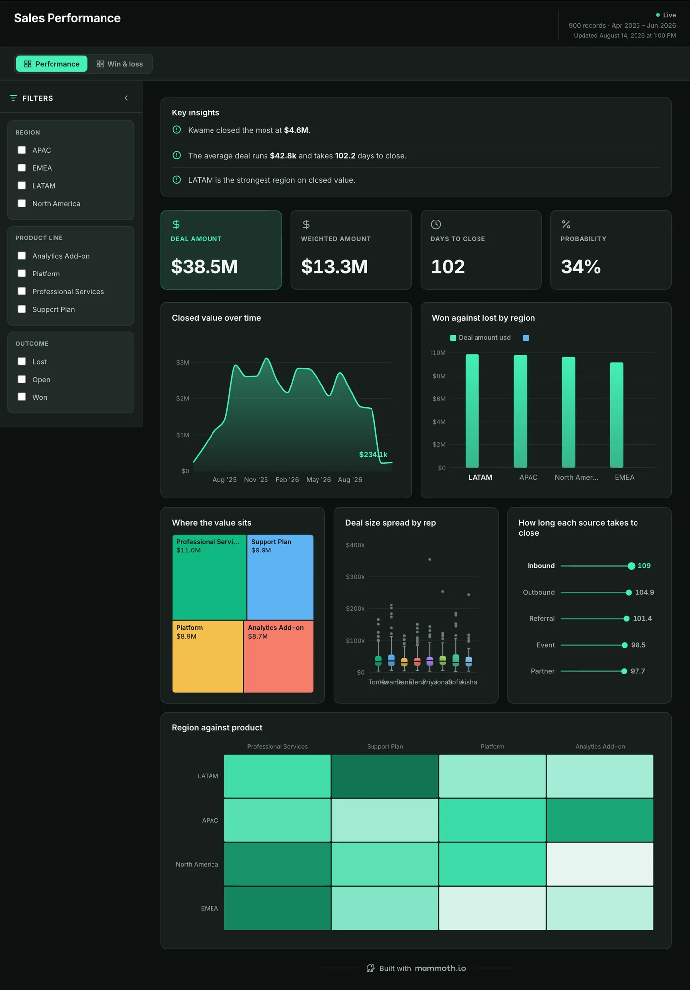
Sales performance dashboard
What closed, who closed it, and which way is the book trending?
Closed revenue cut by rep, region and product, with the trend underneath rather than a single period in isolation. Cut three ways because a flat quarter is usually one region carrying and another sliding, and the total hides both.
What is on it· 2 pages · Performance / Win & loss
- Deal value over time
- Won against lost by region
- Where the value sits
- Deal size spread by rep
- Region against product
- How long each source takes to close
Your data needsDashboard
- a revenue or money column
- a category (~10 values)
Sample data: illustrative figures, not business results. Example 03· Template: Sales KPI Scorecard
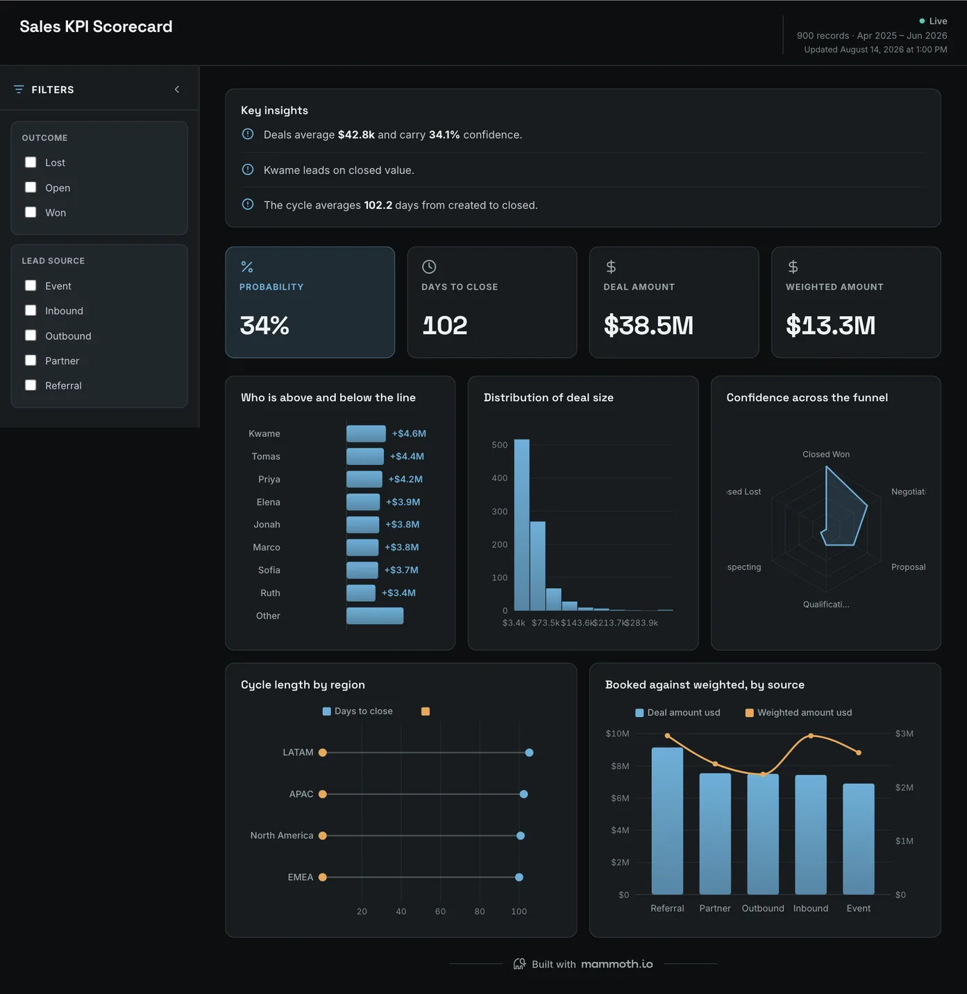
Sales KPI dashboard
Are we closing bigger, or just closing slower?
Deal size, cycle length and forecast confidence on one screen, with reps set above and below the line and booked value against weighted by source. Three numbers that move independently: rising confidence on a lengthening cycle is a different business from the reverse, and only one of them is good news.
What is on it
- Who is above and below the line
- Distribution of deal size
- Confidence across the funnel
- Cycle length by region
- Booked against weighted, by source
Your data needsDashboard
- a revenue or money column
- a category (~3 values)
Sample data: illustrative figures, not business results. Example 04· Template: Store Comparison & Like-for-Like
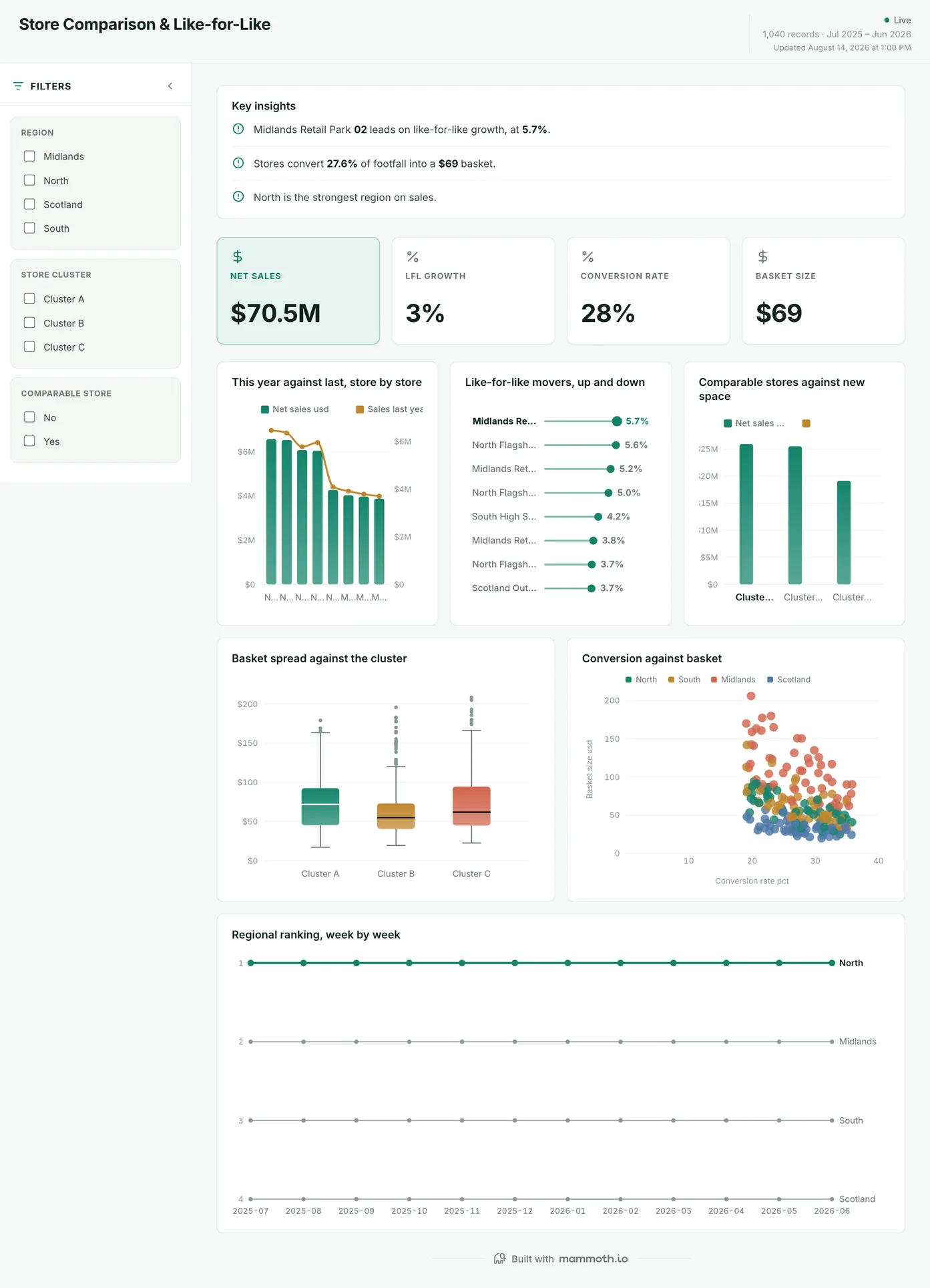
Retail sales dashboard
Which stores are selling more, once new space is stripped out?
Net sales store by store against last year, with like-for-like growth separating stores that are improving from stores that are only bigger. Conversion and basket size sit underneath, because the same sales number can come from more shoppers or from bigger baskets, and those call for different actions.
What is on it
- This year against last, store by store
- Like-for-like movers, up and down
- Comparable stores against new space
- Basket spread against the cluster
- Conversion against basket
- Regional ranking, week by week
Your data needsDashboard
- a revenue or money column
- a category column
Sample data: illustrative figures, not business results.
The metrics
The metrics a sales dashboard is built from
Ten numbers cover most sales dashboards. The column that matters is the last one: a metric is only as good as the field it is computed from, and the ones that go wrong go wrong there rather than in the chart.
| Metric | What it answers | What your data needs |
|---|---|---|
| Pipeline coverage | Is there enough open pipeline to hit the number, at the rate we normally win? | Open deal value by stage, the target for the period, and a historical win rate to divide by. |
| Weighted pipeline | What is the open book worth once probability is applied? | Deal amount plus a probability per stage. Stage probabilities set by the CRM's defaults rather than by your own win rates will flatter the total. |
| Win rate | What share of the deals that reached a decision were won? | Closed-won and closed-lost counts over the same window, from one definition of closed. Deals that went quiet and were never marked lost inflate this every time. |
| Average deal size | Are we closing bigger or smaller than we were? | Closed-won amount, deal count and a close date, so the average is per period rather than for all time. |
| Sales cycle length | How long does a deal take from created to closed? | A created date and a close date on won deals. Median rather than mean, because one twelve-month enterprise deal moves an average and does not move the experience. |
| Quota attainment by rep | Who is on track, and is the team average being carried by two people? | Closed-won by owner against each rep's own target. A team figure cannot answer this, which is the argument for showing the metric per rep at all. |
| Stalled deals | Which open deals have stopped moving? | The date a deal entered its current stage, and a threshold per stage. Last-modified will not do it: a note added to a dead deal resets it. |
| Stage conversion rate | Where in the funnel do deals stop? | Stage history per deal, not only the current stage, over one window. A CRM that overwrites the stage loses every conversion the moment a deal moves. |
| Sales velocity | How much revenue is the pipeline turning into per day? | Open deal count, win rate, average deal size and cycle length, all from the same window and the same definition of closed. Mix two definitions and the number moves for no reason. |
| Like-for-like sales | Is a store selling more, or just bigger? | Sales by store for this year and last, with an opening date per store, so stores that were not trading for the full comparison period are left out. Count new space in and growth is mostly openings. |
Other formats
The same numbers, two other ways
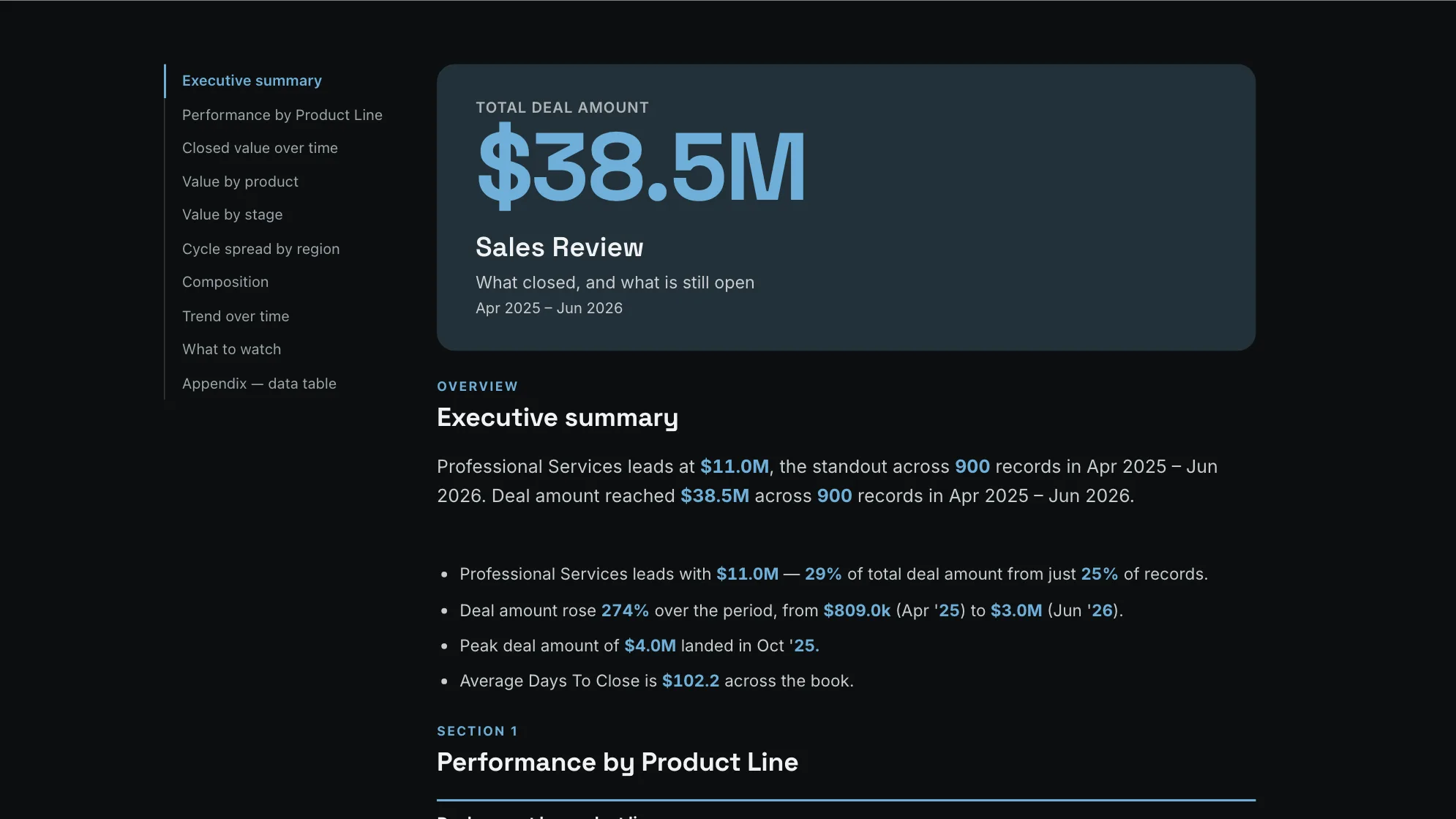
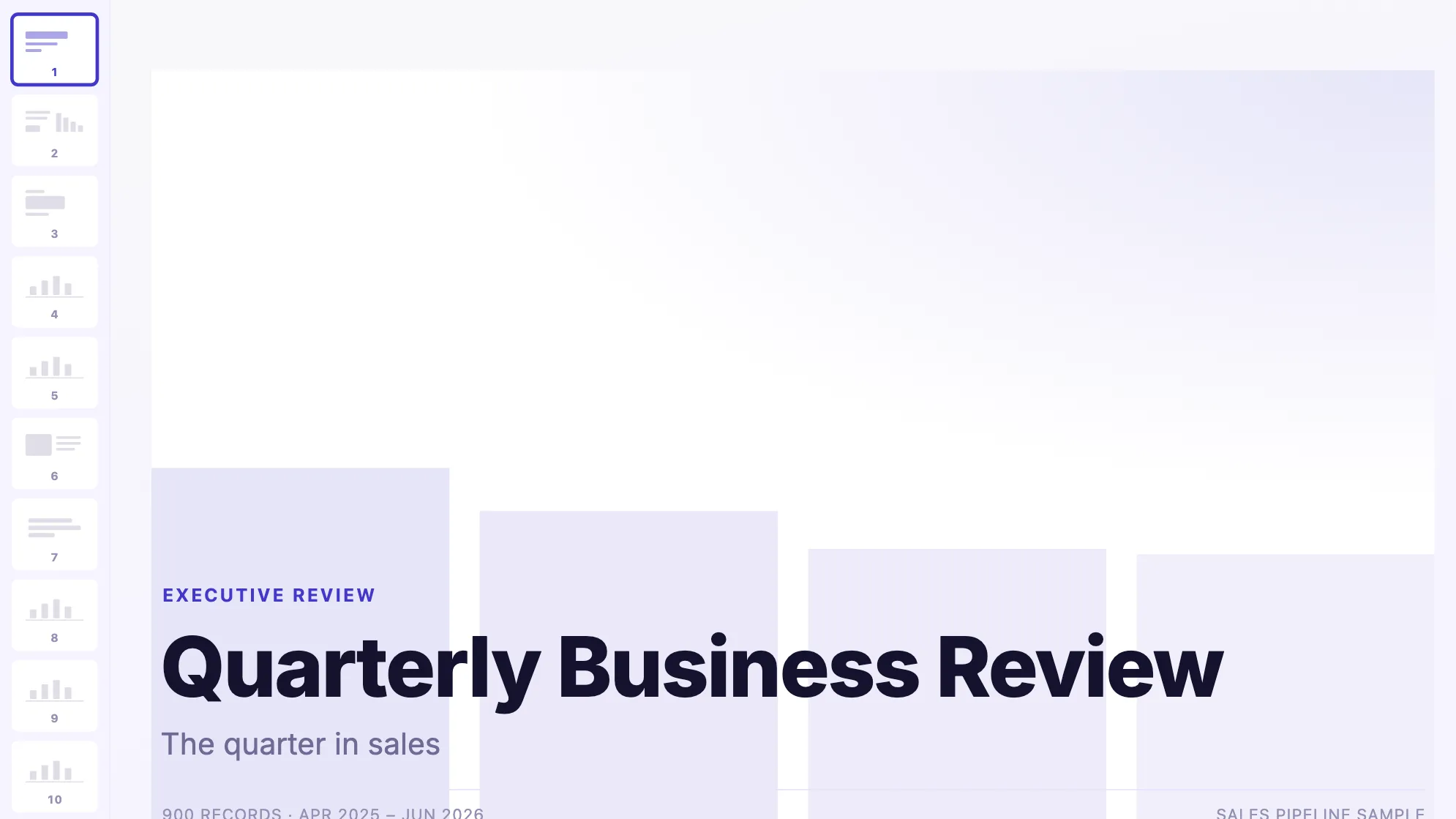
The written review and the QBR deck are the two artifacts a sales org rebuilds every quarter by hand. Both are built here from the same 900 rows as the dashboards above.
Sample data: illustrative figures, not business results. Sales Review Report
Can the book be read rather than presented?
The book written up: what closed, what is open and how long it is taking.
Sales · Document
Sample data: illustrative figures, not business results. Quarterly Business Review
What goes in the QBR deck?
The quarter's sales story: what closed, who closed it, and what is next.
Sales · Presentation
From example to live dashboard
Pretty is easy. Current and true is the hard part.
Any of these can be drawn in a slide. What makes one worth keeping is the five steps underneath it, and they are the same five whichever example you start from.
- 01
Connect the source
The dashboard reads the system, not an export somebody saved to their desktop. 100+ tested connectors, plus anything with a REST API.
- 02
Prepare it once
Cleaning, joining and reshaping are recorded as steps you can read, change and re-run, not a formula buried three sheets deep.
- 03
Check it before anyone sees it
Data checks run with the refresh and flag the rows that fail, so a broken upstream file shows up as an alert rather than as a wrong number in a meeting.
- 04
Put it on a schedule
Refresh on a schedule and the dashboard stays current on its own. Starter refreshes weekly, Team daily, and Pro every three hours.
- 05
Publish it and send the link
Public, password-protected or sign-in only. Every sharing mode is available on every plan, including the free one.
Sharing
Everyone can see it.
Nobody pays to look.
Most dashboard tools charge for every person who opens one, which is why so many dashboards end up as a screenshot pasted into a message. Mammoth charges for the people who build. Viewers are unlimited and free on every plan, including the free one.
You pay for
The people who build
Anyone connecting a source, preparing data or publishing a dashboard counts as a platform user.
You never pay for
The people who look
Viewers are unlimited and free on every plan, including the free one. A board, a client list or a whole company: the number does not change the bill.
Plans differ in how many builders and published dashboards a workspace gets. Drafts, viewers and every sharing mode are unlimited and free on all four. Full pricing.
Sales dashboard questions
What belongs on a sales dashboard?
What are the three main types of sales dashboards?
How do I build a sales dashboard?
- Connect the CRM, and the finance system too if closed revenue has to match the books.
- Agree the definitions once: what counts as closed, which stages count as pipeline, and how deals are weighted.
- Build the view that meeting needs: weighted against raw pipeline for a pipeline review, closed revenue by rep and region for the Monday meeting.
- Add the exceptions underneath: deals that have not moved, reps below the line, regions sliding.
- Schedule the refresh and share the link with the whole team, so nobody walks into the meeting with last week's export.
Can it read straight from our CRM?
How current can the numbers be?
Do the reps need licences to look at it?
Do I need sales dashboard software, or will a spreadsheet do?
Last reviewed against the template catalogue.
Build the sales dashboard you actually need.
Connect a source, prepare it once, and publish. Everyone who needs to see it can, at no per-viewer cost.
- 14-day Pro trial
- No credit card
- Viewers always free