Project dashboards
Project dashboard examples
In short
What a project dashboard is
A project dashboard is a single screen showing where the work has got to and what is at risk of missing its date. Teams also call it a project tracking or project health dashboard, and the portfolio version a PMO dashboard. The formats that earn a second look separate two things a status report usually blurs: how much is done, and how much it has cost to get there. Percent complete on its own says nothing about whether the budget survived it. The two below are a status view and a portfolio view, and the same numbers become a steering deck further down.
The examples
Two project dashboard examples
Real Mammoth templates on sample data. Every figure is illustrative. Both run on the same 486-row delivery dataset as the deck below.
Example 01· Template: Project Status
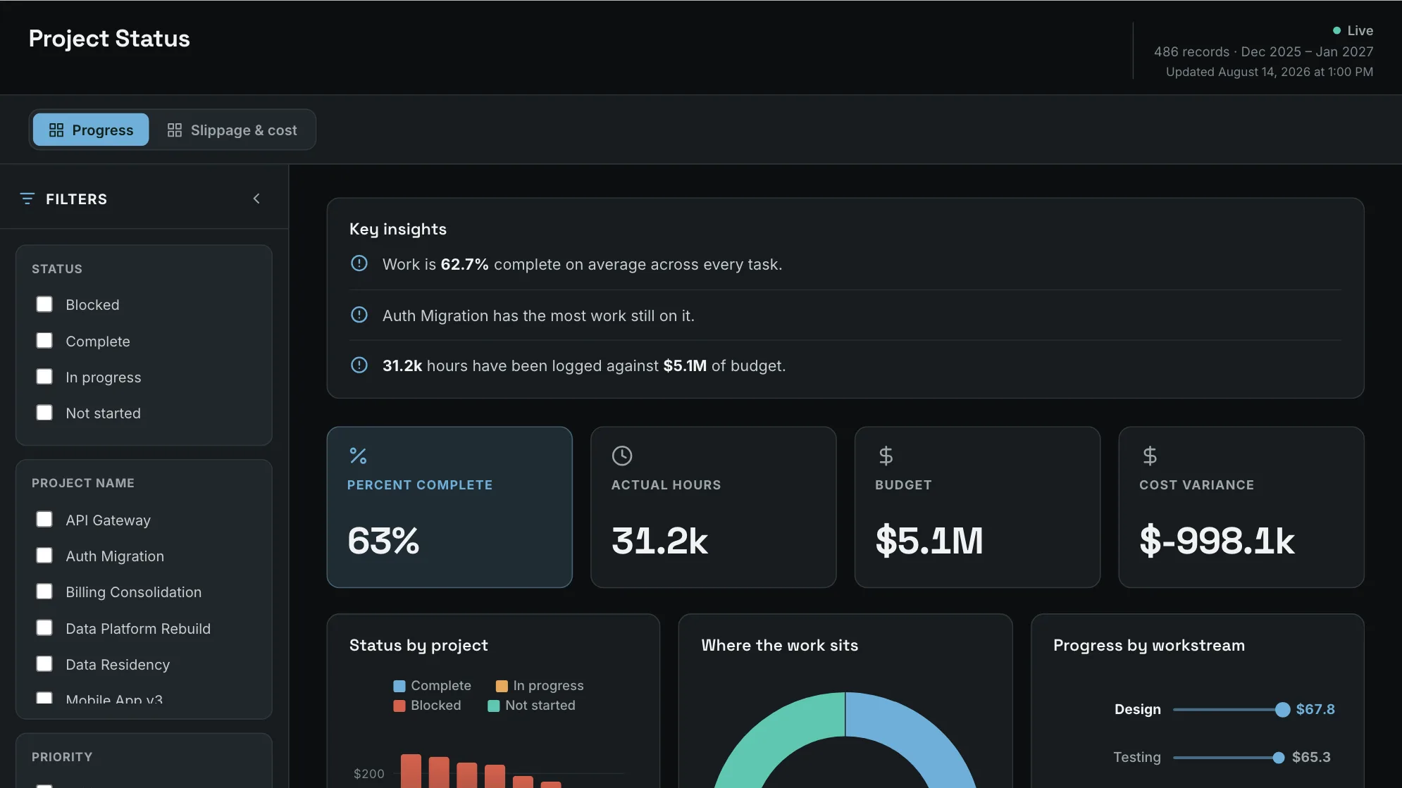
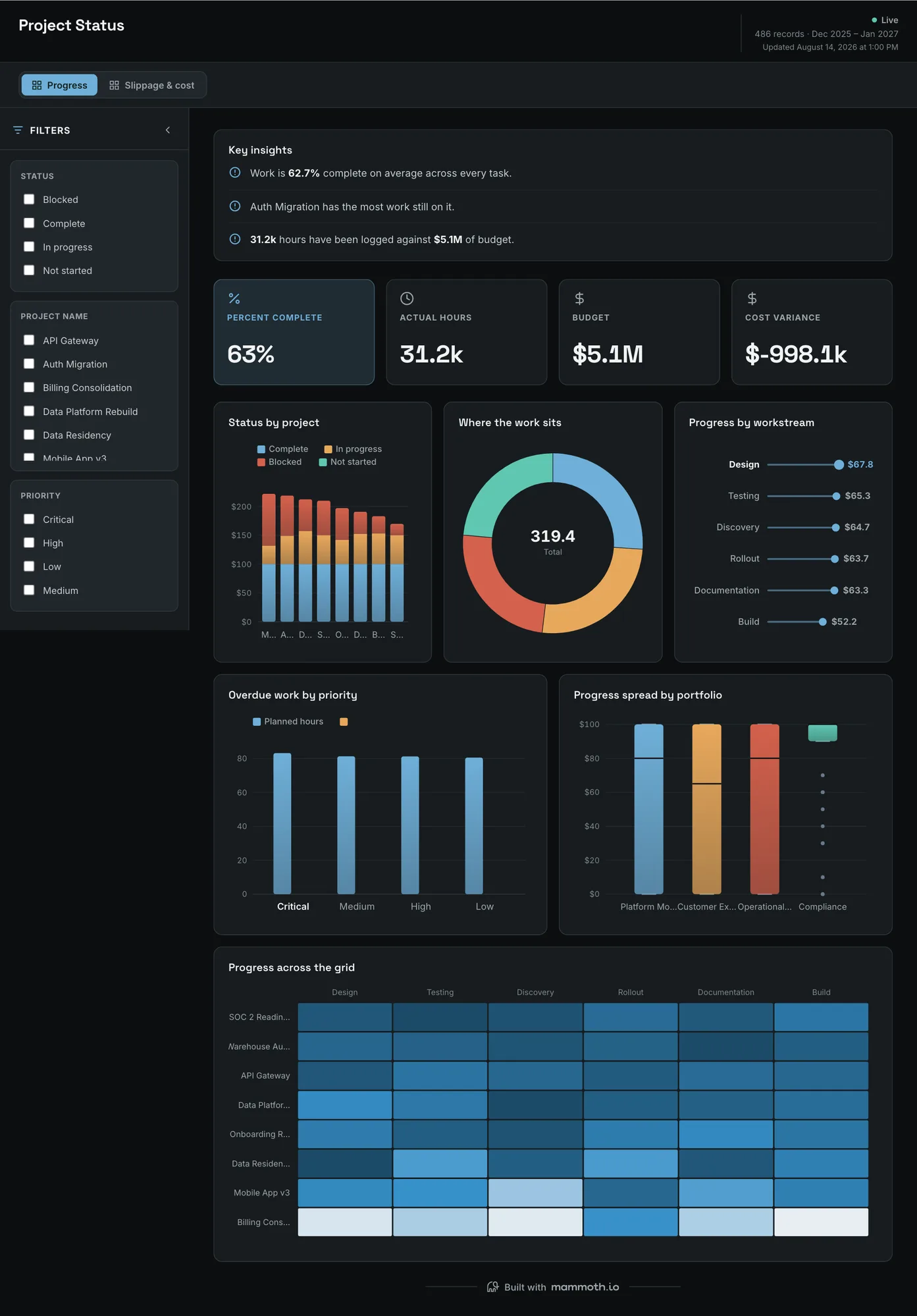
Project status dashboard
What is actually stuck, before the status meeting starts?
Every workstream in one state view, with the slippage and its cost on the second page. The point is that the meeting opens from what the data says rather than from a round of verbal updates: a status that nobody had to be asked for is a different conversation from one that was.
What is on it· 2 pages · Progress / Slippage & cost
- Status by project
- Where the work sits
- Progress by workstream
- Overdue work by priority
- Progress spread by portfolio
- Progress across the grid
Your data needsDashboard
- a rate or percentage
- a category (~4 values)
Sample data: illustrative figures, not business results. Example 02· Template: Project Portfolio
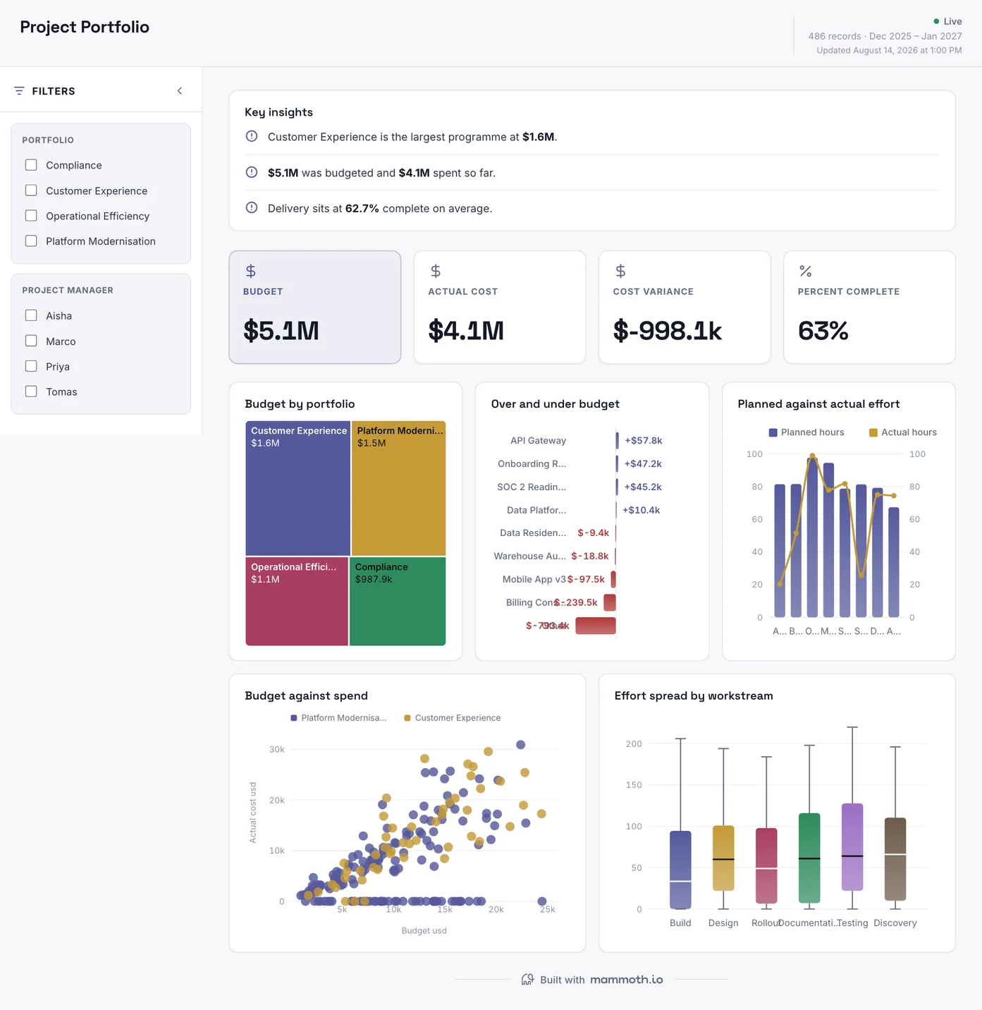
Project portfolio dashboard
Which programmes are over budget, and by how much?
Budget against actual cost across every portfolio, with effort planned against effort spent beside it. Cost variance is the number this board exists for, and it is shown per portfolio rather than as a total: a programme 20% under and one 20% over net to nothing, and netting to nothing is how an overrun stays invisible until it is large.
What is on it
- Budget by portfolio
- Over and under budget
- Planned against actual effort
- Budget against spend
- Effort spread by workstream
Your data needsDashboard
- a revenue or money column
- a category (~4 values)
Sample data: illustrative figures, not business results.
The metrics
The metrics a project dashboard is built from
Seven numbers, and the first two are the ones a status report usually blurs together. Percent complete says nothing about whether the budget survived getting there.
| Metric | What it answers | What your data needs |
|---|---|---|
| Percent complete | How much of the work is done? | One completion rule, stated. Tasks closed and effort burned give different answers on the same project, and the gap between them is itself the signal worth showing. |
| Schedule variance | How far has the date moved? | Baseline dates kept after each re-plan. Overwriting the baseline when a date slips makes every project on time, which is why so many portfolio boards are green. |
| Budget against actual cost | Which programmes are overspending? | Committed and spent per programme, never netted to a portfolio total. One programme 20% under and one 20% over sum to nothing, and that is how an overrun stays invisible until it is large. |
| Effort planned against actual | Is it taking the time it was supposed to? | Timesheet or estimate data recorded at the same level of the work breakdown as the plan. Effort logged against a programme and planned against a task cannot be compared. |
| Open risks and blockers by age | What has been stuck the longest? | A raised date and the status history, not only the current status. Without the history, an item that has been open for five months looks the same as one raised yesterday. |
| Resource utilisation | Are people overloaded on one project and idle on another? | Hours booked per person per project against their available hours for the same weeks. Leave out leave and part-time contracts and everyone looks under-used. |
| Milestones hit on time | Do the dates the project commits to actually land? | Each milestone's baseline date and the date it was met. A baseline overwritten at every re-plan turns this into 100% for every project. |
Other formats
The same numbers, presented
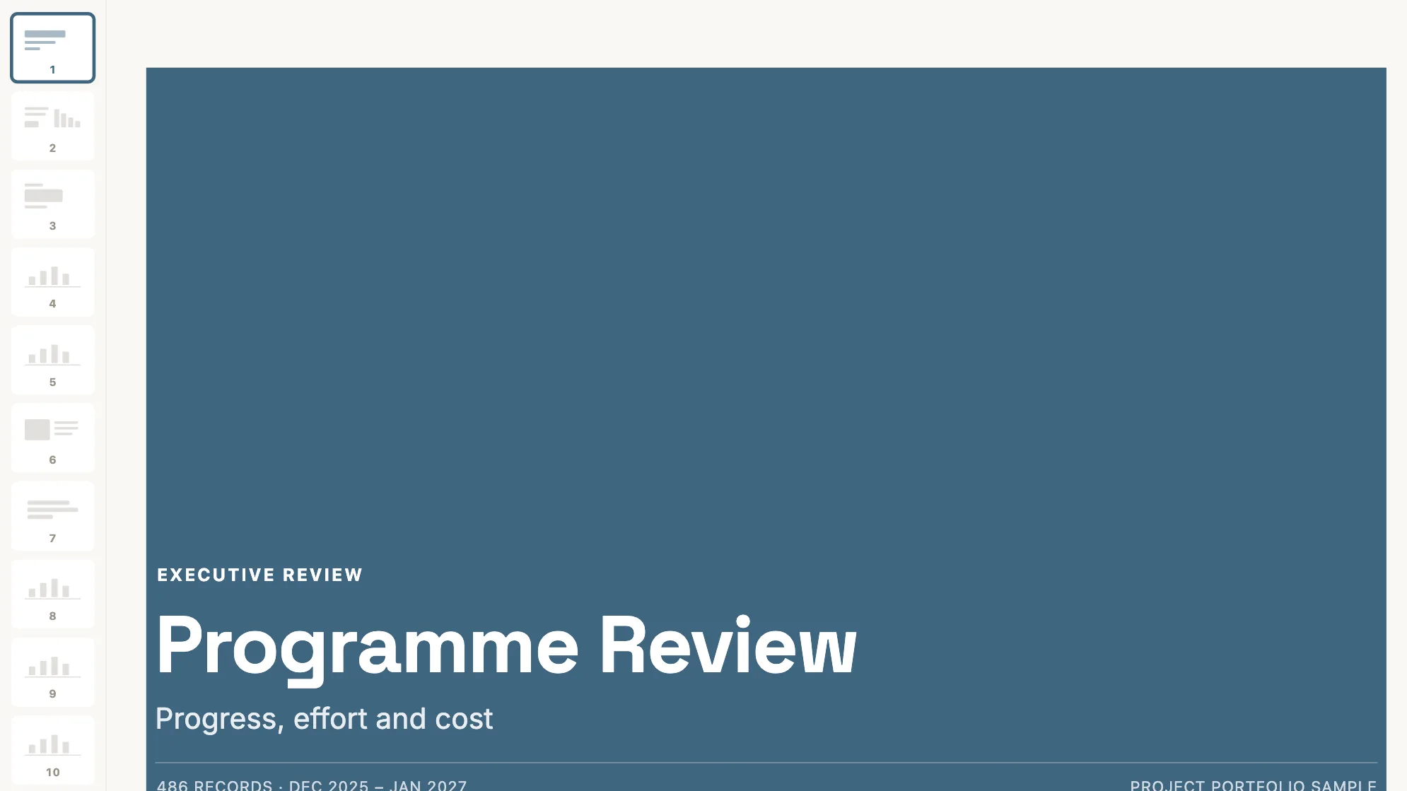
A steering review is walked through rather than browsed, and a board built for browsing does not survive being projected. The deck is built from the same 486 rows as the two dashboards above.
Sample data: illustrative figures, not business results. Programme Review Deck
And when the audience is a steering committee rather than a screen?
Every programme for a steering audience: progress, effort, cost and risk.
Project · Presentation
From example to live dashboard
Pretty is easy. Current and true is the hard part.
Any of these can be drawn in a slide. What makes one worth keeping is the five steps underneath it, and they are the same five whichever example you start from.
- 01
Connect the source
The dashboard reads the system, not an export somebody saved to their desktop. 100+ tested connectors, plus anything with a REST API.
- 02
Prepare it once
Cleaning, joining and reshaping are recorded as steps you can read, change and re-run, not a formula buried three sheets deep.
- 03
Check it before anyone sees it
Data checks run with the refresh and flag the rows that fail, so a broken upstream file shows up as an alert rather than as a wrong number in a meeting.
- 04
Put it on a schedule
Refresh on a schedule and the dashboard stays current on its own. Starter refreshes weekly, Team daily, and Pro every three hours.
- 05
Publish it and send the link
Public, password-protected or sign-in only. Every sharing mode is available on every plan, including the free one.
Already have the data in a spreadsheet? Turn it into a dashboard with the AI dashboard generator.
Sharing
Everyone can see it.
Nobody pays to look.
Most dashboard tools charge for every person who opens one, which is why so many dashboards end up as a screenshot pasted into a message. Mammoth charges for the people who build. Viewers are unlimited and free on every plan, including the free one.
You pay for
The people who build
Anyone connecting a source, preparing data or publishing a dashboard counts as a platform user.
You never pay for
The people who look
Viewers are unlimited and free on every plan, including the free one. A board, a client list or a whole company: the number does not change the bill.
Plans differ in how many builders and published dashboards a workspace gets. Drafts, viewers and every sharing mode are unlimited and free on all four. Full pricing.
Project dashboard questions
What belongs on a project dashboard?
What is a PMO dashboard?
How do I build a project dashboard?
- Connect the tracker where the work lives, such as Jira, Asana or a spreadsheet, and the finance export that holds the budget.
- Agree what done means and keep the baseline dates after every re-plan, or every project will look on time.
- Put progress and cost on the same strip, because percent complete says nothing about whether the budget survived.
- Add the exceptions underneath: overdue work ranked by priority, and projects over budget shown one by one rather than netted.
- Schedule the refresh before the meeting and send the link, so the hour goes on the exceptions instead of collecting updates.
Can I use Excel to create a project dashboard?
Is this a replacement for Jira, Asana or Monday?
Can it combine projects from more than one tool?
How current is it?
Do the project sponsors need licences to look at it?
Last reviewed against the template catalogue.





Build the project dashboard you actually need.
Connect a source, prepare it once, and publish. Everyone who needs to see it can, at no per-viewer cost.
- ✓ 14-day Pro trial
- ✓ No credit card
- ✓ Viewers always free