SaaS dashboards
SaaS metrics dashboard examples
In short
What a SaaS metrics dashboard is
A SaaS metrics dashboard is a single screen showing how recurring revenue is growing, what is holding it back, and what that growth costs. Its core is MRR broken into movements, new, expansion, contraction and churn, because a total that rose can hide a churn problem a smaller new-business month would have exposed. Around that sit retention, the cost of acquiring a customer, and burn.
The examples
Two SaaS metrics dashboard examples
Real Mammoth templates on sample data. Every figure is illustrative. The SaaS board shares one 162-row dataset with the reporting below; the investor view reads twenty companies' monthly packs.
Example 01· Template: SaaS Metrics
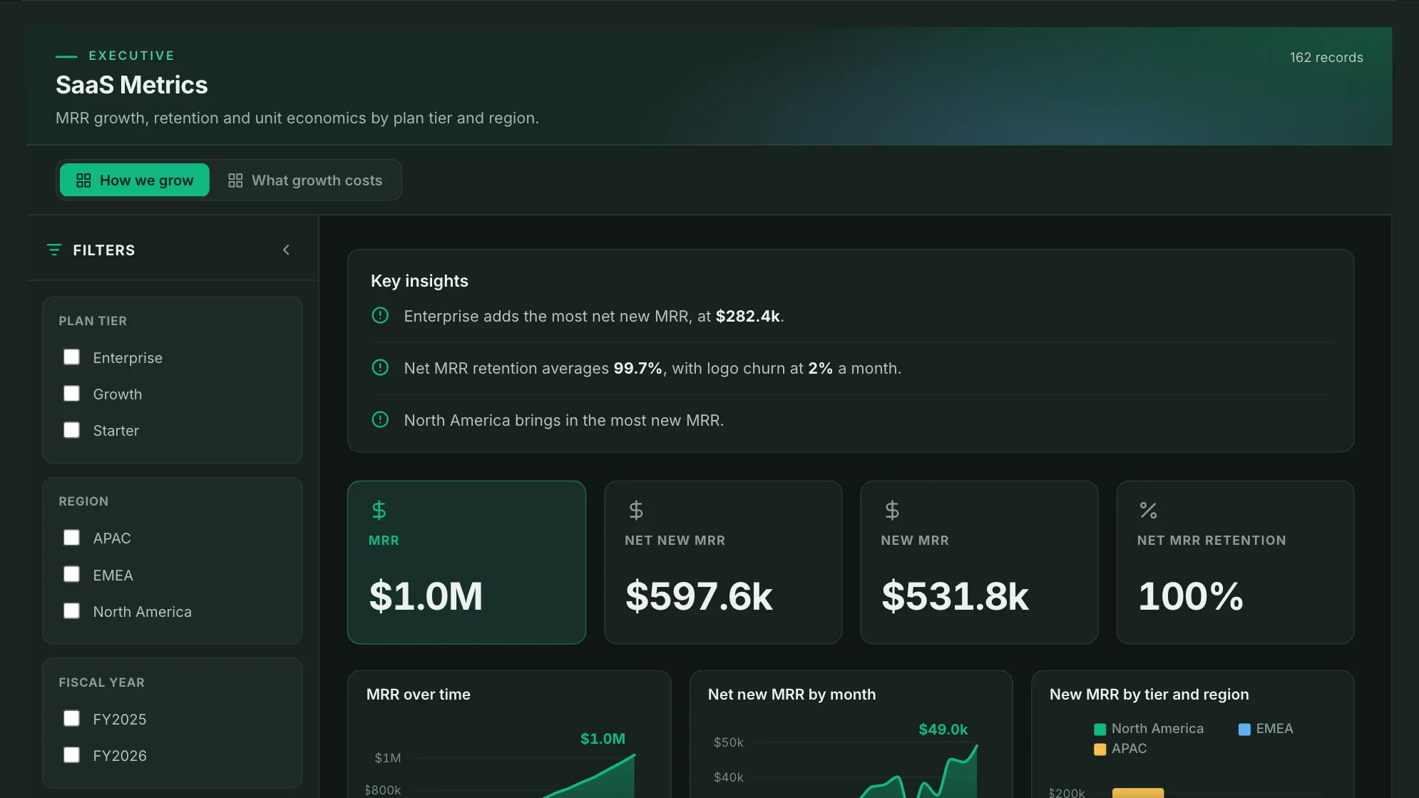
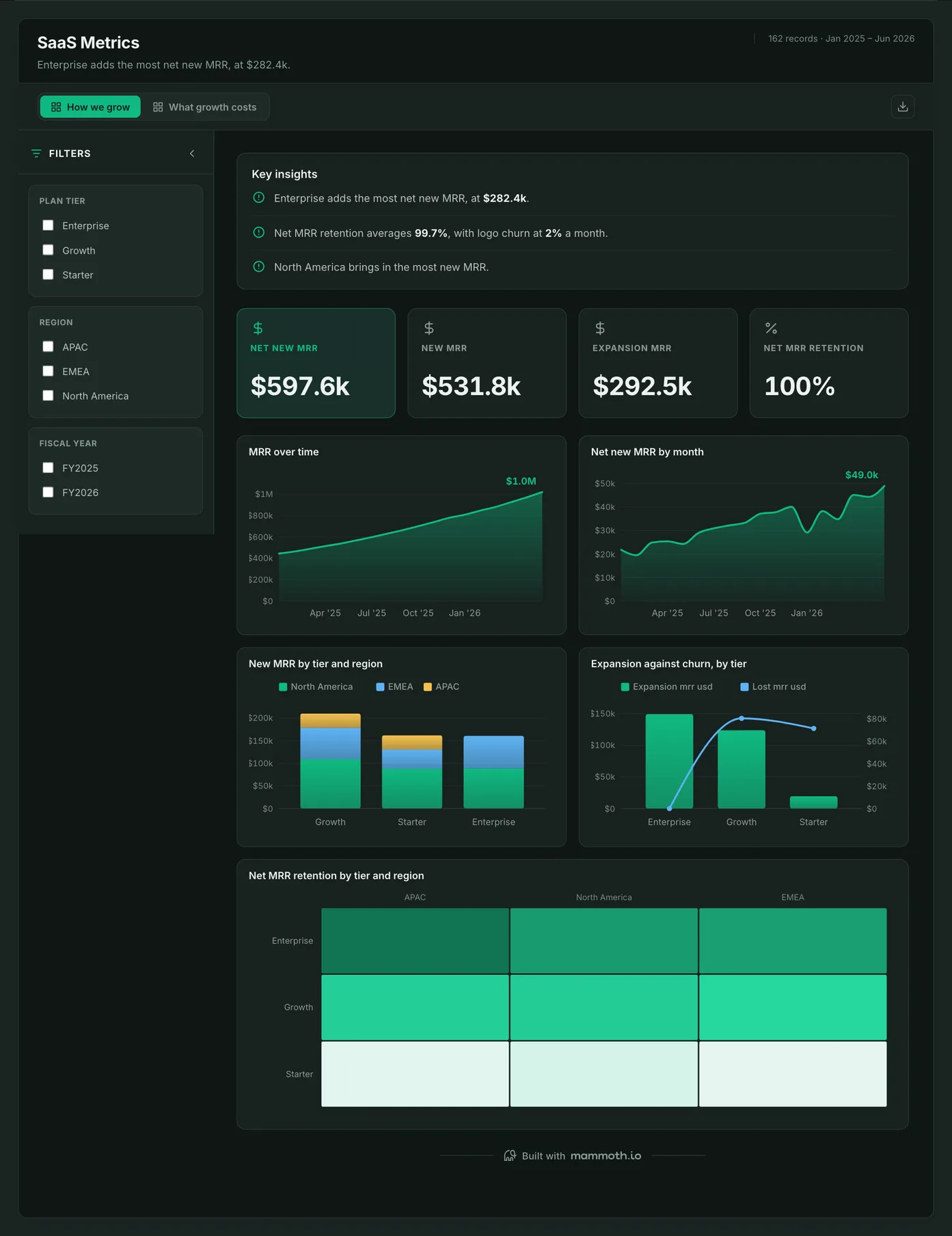
SaaS metrics dashboard
Is recurring revenue growing for the right reasons?
MRR and net new MRR by month, new MRR by plan tier and region, and expansion set against churn, with net MRR retention as a grid of tier by region. The second page puts acquisition cost, revenue and burn beside the growth, so a good month can be checked against what it cost.
What is on it· 2 pages · How we grow / What growth costs
- MRR over time
- Net new MRR by month
- New MRR by tier and region
- Expansion against churn, by tier
- Net MRR retention by tier and region
Your data needsDashboard
- a revenue or money column
- a category (~3 values)
Sample data: illustrative figures, not business results. Example 02· Template: Portfolio KPI Rollup
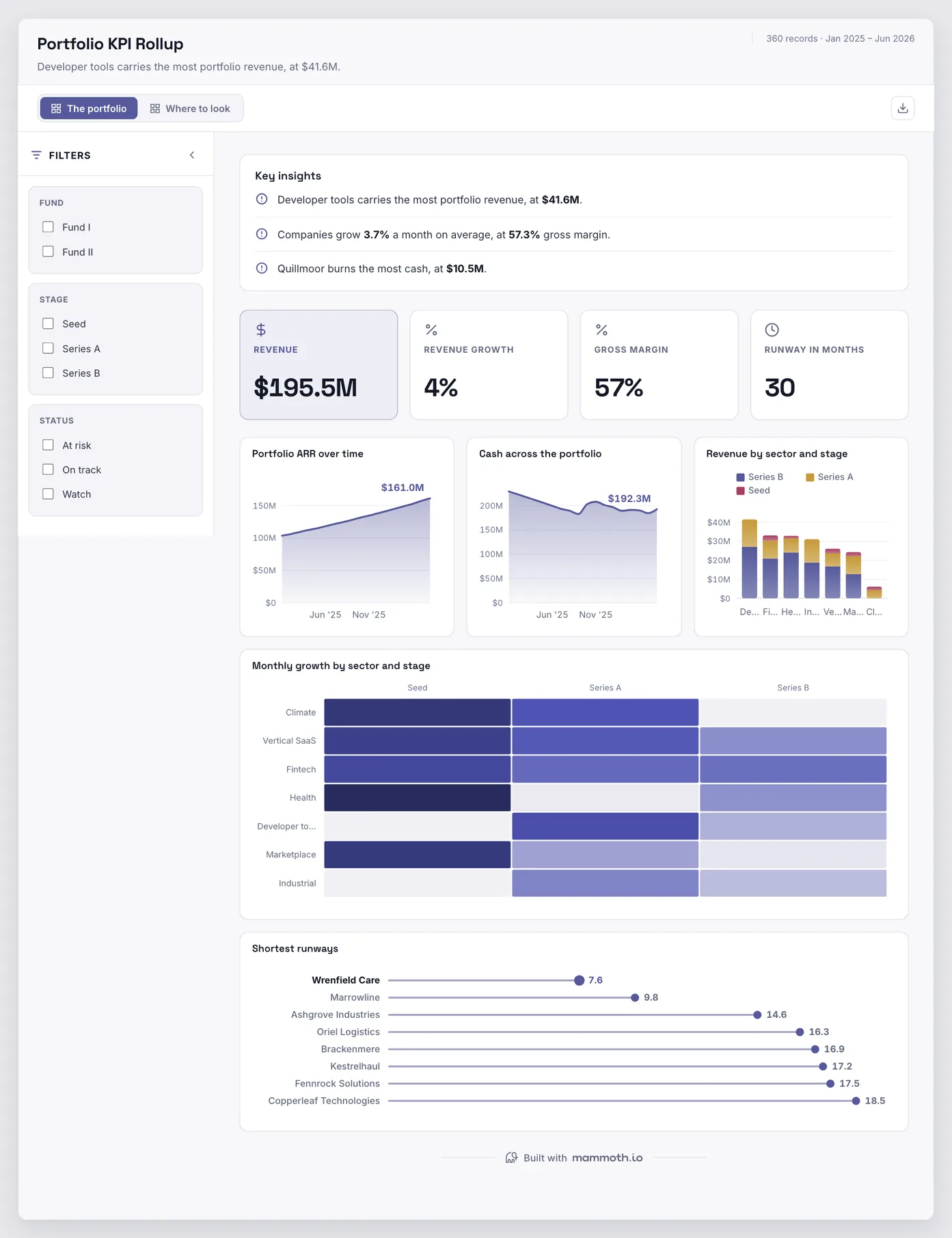
Investor portfolio dashboard
Which portfolio companies need a conversation this month?
Twenty companies' monthly packs in one view: portfolio ARR and cash as trends, revenue by sector and stage, and the shortest runways first. The second page ranks burn and burn multiple by company, so the watchlist is a sorted list rather than a feeling.
What is on it· 2 pages · The portfolio / Where to look
- Portfolio ARR over time
- Cash across the portfolio
- Revenue by sector and stage
- Monthly growth by sector and stage
- Shortest runways
Your data needsDashboard
- a revenue or money column
- a category (~7 values)
Sample data: illustrative figures, not business results.
The metrics
The metrics a SaaS dashboard is built from
Nine numbers, and the first is a position while the rest are movements or rates. Treating a position as a movement is the most common way a SaaS board ends up wrong.
| Metric | What it answers | What your data needs |
|---|---|---|
| MRR | Where does recurring revenue stand? | A month-end figure per customer or per segment. It is a position, so it is read at a month and never added across months. |
| Net new MRR | How much did recurring revenue grow this month? | New, expansion, contraction and churned MRR recorded separately. Net new is their sum, and each part answers a different question. |
| Net MRR retention | Are existing customers growing or shrinking? | Starting MRR for the period and what those same customers pay at the end, with new customers left out. Counting new business in it inflates retention. |
| Logo churn | How many customers are we losing? | Customers at the start of the month and customers lost during it. A rate, so it is averaged across segments rather than added. |
| Customer acquisition cost | What does a new customer cost to win? | Sales and marketing spend and new customers for the same period. A month with no new customers has no CAC, which is different from a CAC of zero. |
| Net burn | How much cash does the month consume? | Costs less revenue for the month, with shared costs allocated the same way each month. Runway then needs the cash balance, read at month end. |
| LTV to CAC ratio | Is a customer worth more than it cost to win? | Gross-margin lifetime value from revenue per customer, margin and churn, against fully loaded acquisition cost for the same cohort. Revenue-based lifetime value flatters the ratio by the cost of serving the customer. |
| CAC payback period | How many months until a new customer has paid back what it cost to win? | Acquisition cost divided by new MRR times gross margin, for the same cohort. Leave margin out and payback looks months shorter than it is. |
| Rule of 40 | Is growth being bought at a sensible price? | Revenue growth rate and a profit margin for the same period, with the margin named: EBITDA and free cash flow give different answers. |
Other formats
The same numbers, for the board and investors
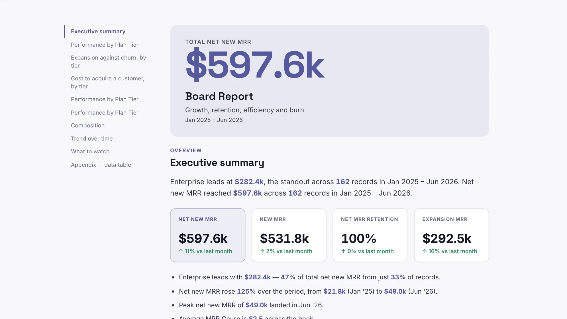
A board and an investor read these numbers as prose and slides more often than as a dashboard. The board report, the monthly investor update and the board deck are built from the same 162 rows as the SaaS board above.
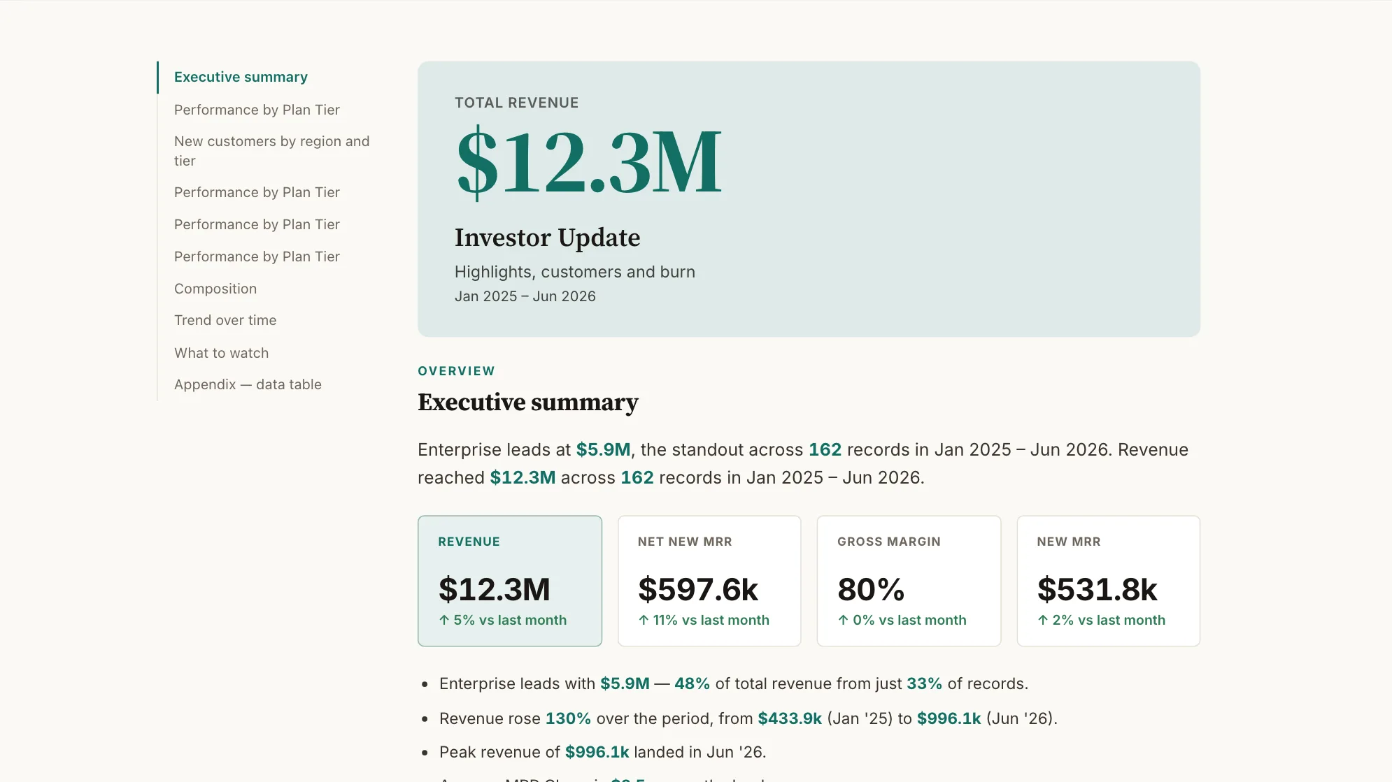
Sample data: illustrative figures, not business results. Startup Board Report
What does the board read before the meeting?
The period for a board: growth, retention, efficiency and burn.
Executive · Document
Sample data: illustrative figures, not business results. Monthly Investor Update
And the monthly note to investors?
The month for investors: highlights, customers and cash out the door.
Executive · Document
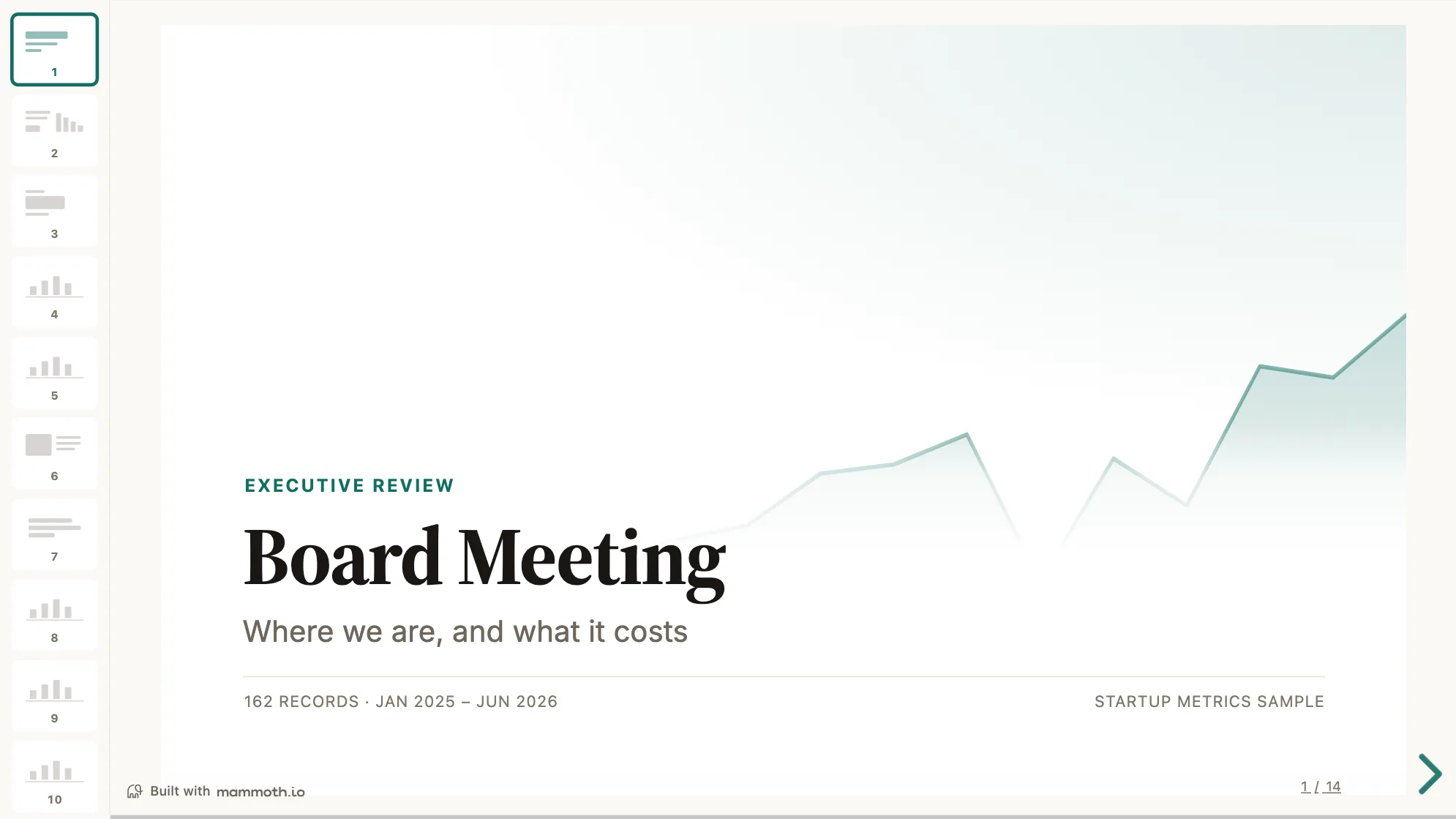
Sample data: illustrative figures, not business results. Startup Board Deck
What goes on the screen in the room?
The venture board meeting: growth, retention, efficiency and burn.
Executive · Presentation
From example to live dashboard
Pretty is easy. Current and true is the hard part.
Any of these can be drawn in a slide. What makes one worth keeping is the five steps underneath it, and they are the same five whichever example you start from.
- 01
Connect the source
The dashboard reads the system, not an export somebody saved to their desktop. 100+ tested connectors, plus anything with a REST API.
- 02
Prepare it once
Cleaning, joining and reshaping are recorded as steps you can read, change and re-run, not a formula buried three sheets deep.
- 03
Check it before anyone sees it
Data checks run with the refresh and flag the rows that fail, so a broken upstream file shows up as an alert rather than as a wrong number in a meeting.
- 04
Put it on a schedule
Refresh on a schedule and the dashboard stays current on its own. Starter refreshes weekly, Team daily, and Pro every three hours.
- 05
Publish it and send the link
Public, password-protected or sign-in only. Every sharing mode is available on every plan, including the free one.
Already have the data in a spreadsheet? Turn it into a dashboard with the AI dashboard generator.
Sharing
Everyone can see it.
Nobody pays to look.
Most dashboard tools charge for every person who opens one, which is why so many dashboards end up as a screenshot pasted into a message. Mammoth charges for the people who build. Viewers are unlimited and free on every plan, including the free one.
You pay for
The people who build
Anyone connecting a source, preparing data or publishing a dashboard counts as a platform user.
You never pay for
The people who look
Viewers are unlimited and free on every plan, including the free one. A board, a client list or a whole company: the number does not change the bill.
Plans differ in how many builders and published dashboards a workspace gets. Drafts, viewers and every sharing mode are unlimited and free on all four. Full pricing.
SaaS dashboard questions
What should a SaaS metrics dashboard show?
What is the rule of 40 in SaaS?
How do you calculate MRR, churn and net revenue retention?
- MRR: the sum of every active subscription's monthly value at month-end, with annual plans divided by twelve. It is a balance, so it is read at a point in time and never added up across months.
- Net new MRR: new plus expansion, minus contraction and churned MRR, for the month.
- Logo churn: customers lost in the period divided by customers at the start of it.
- Net revenue retention: MRR from customers who existed a year ago, today, divided by their MRR a year ago. New customers stay out of both sides.
How often should you review SaaS metrics?
Where does the data come from?
What is the difference between the board report and the investor update?
What is the investor portfolio dashboard for?
Can the board and investors see it without a licence?
Last reviewed against the template catalogue.





Build the SaaS metrics dashboard you actually need.
Connect a source, prepare it once, and publish. Everyone who needs to see it can, at no per-viewer cost.
- ✓ 14-day Pro trial
- ✓ No credit card
- ✓ Viewers always free