Inventory dashboards
Inventory dashboard examples
In short
What an inventory dashboard is
An inventory dashboard is a single screen showing what stock you hold, what it is worth, and how fast it moves. The broad version, often called an inventory management dashboard, is built on four numbers: value, units, turns and days of supply. Past that, the useful boards each take one narrower question: what is about to run out, what is not selling, and where the working capital is tied up.
The examples
Five inventory dashboard examples
Real Mammoth templates on sample data. Every figure is illustrative.
Example 01· Template: Inventory Management
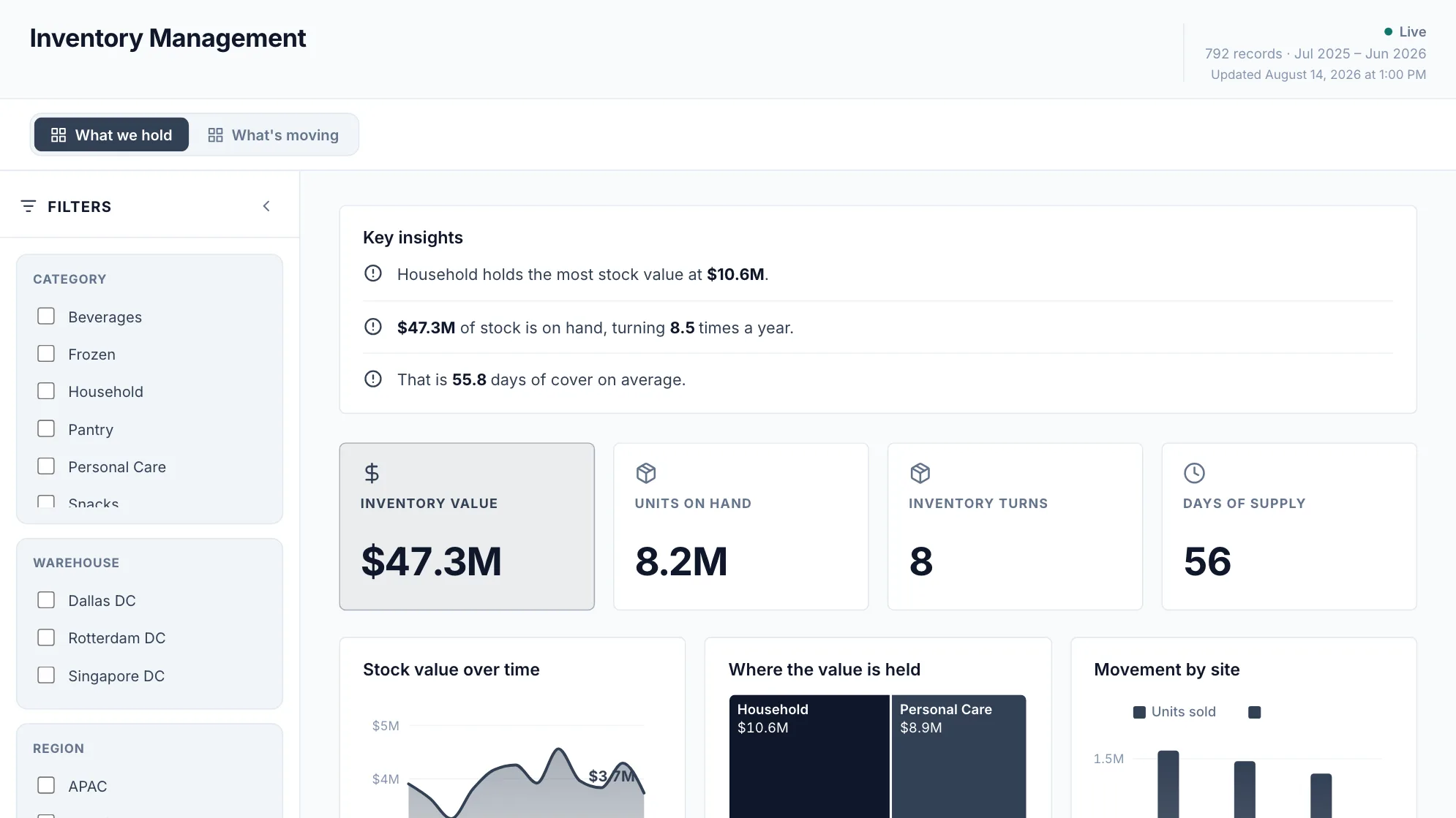
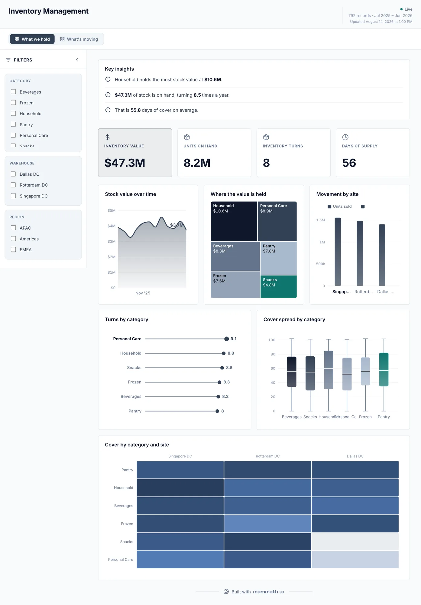
Inventory management dashboard
Which of this stock is working, and which is money sitting still?
Stock value over time on the first page and movement on the second, cut by category and site. Turns and cover sit on the same strip as value deliberately: stock that is worth a lot and moves slowly is a different problem from stock that is worth a lot because it sells.
What is on it· 2 pages · What we hold / What's moving
- Stock value over time
- Where the value is held
- Movement by site
- Turns by category
- Cover spread by category
- Cover by category and site
Your data needsDashboard
- a revenue or money column
- a category (~6 values)
Sample data: illustrative figures, not business results. Example 02· Template: Inventory Valuation
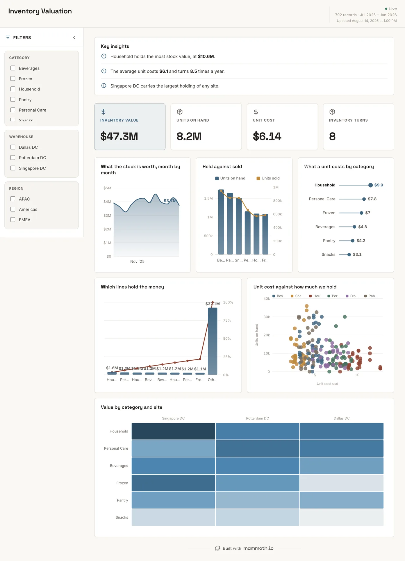
Inventory valuation dashboard
Where is the money tied up, and what does a unit of it cost?
What the stock is worth month by month, with held set against sold and unit cost broken out by category. The last chart plots unit cost against how much we hold, which is where an expensive line quietly carrying most of the balance becomes visible.
What is on it
- What the stock is worth, month by month
- Held against sold
- What a unit costs by category
- Which lines hold the money
- Unit cost against how much we hold
- Value by category and site
Your data needsDashboard
- a revenue or money column
- a category (~3 values)
Sample data: illustrative figures, not business results. Example 03· Template: Stock Health & Reorder
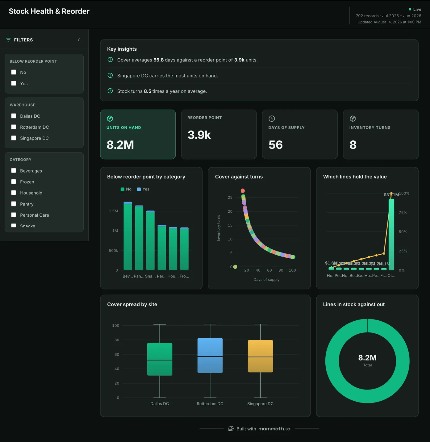
Inventory tracking dashboard
What needs reordering before it runs dry?
What has fallen below its reorder point, by category, with cover plotted against turns so a line that looks short but barely moves is not treated as urgent. Lines in stock are shown against lines out: the count that says whether this is a handful of lines or a systemic gap.
What is on it
- Below reorder point by category
- Cover against turns
- Which lines hold the value
- Cover spread by site
- Lines in stock against out
Your data needsDashboard
- a count column
- a category (~2 values)
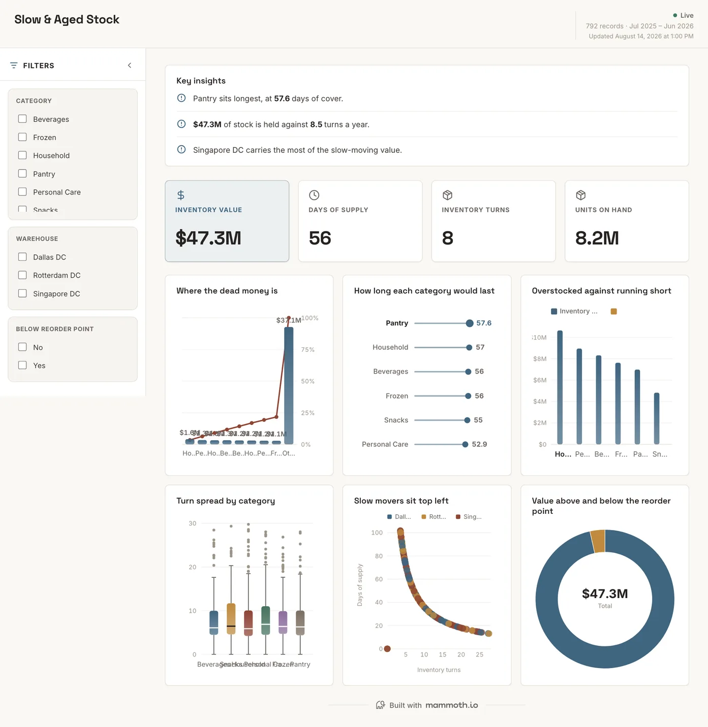
Sample data: illustrative figures, not business results. Example 04· Template: Slow & Aged Stock
Aged inventory dashboard
What has stopped moving, and what is it costing to hold?
Where the dead money sits, by category and site, with how long each category would last at its current rate. Value is split above and below the reorder point, which separates stock that is merely slow from stock that is both slow and overstocked.
What is on it
- Where the dead money is
- How long each category would last
- Overstocked against running short
- Turn spread by category
- Slow movers sit top left
- Value above and below the reorder point
Your data needsDashboard
- a revenue or money column
- a category (~6 values)
Sample data: illustrative figures, not business results. Example 05· Template: Warehouse Performance
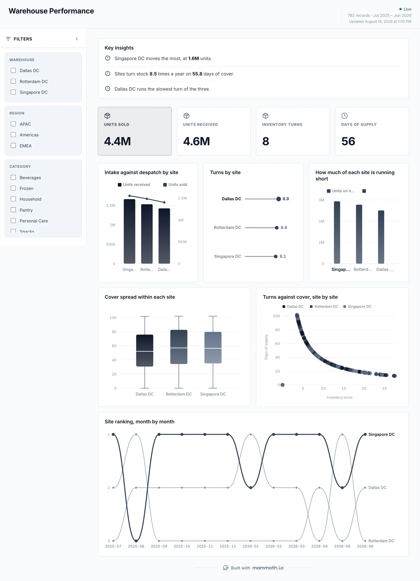
Warehouse dashboard
Is each site keeping up, and which one is running short?
Intake against despatch site by site, with turns and days of supply per site rather than a network total. The cover spread within each site is the chart that matters most: a site can hold healthy average cover while a third of its lines are about to run out.
What is on it
- Intake against despatch by site
- Turns by site
- How much of each site is running short
- Cover spread within each site
- Turns against cover, site by site
- Site ranking, month by month
Your data needsDashboard
- a count column
- a category (~3 values)
Sample data: illustrative figures, not business results.
The metrics
The metrics an inventory dashboard is built from
Ten numbers, and most of them depend on a decision made before the chart: which valuation method, which demand window, what counts as movement, and what counts as an order shipped complete.
| Metric | What it answers | What your data needs |
|---|---|---|
| Stock value | What is the working capital sitting in the warehouse? | Units on hand times a cost basis, with one valuation method stated and used throughout. FIFO and weighted average give different totals on the same stock, and a board that mixes them cannot be reconciled to the ledger. |
| Inventory turns | How many times does the stock sell through in a year? | Cost of goods sold over average inventory across the same window. Using the closing balance instead of the average makes a seasonal business look efficient in January and idle in November. |
| Days of supply | How long does what we hold last? | Units on hand and a recent demand rate per item per location. A chain-wide rate hides the site that is about to run out while another holds a year of cover. |
| Stockout risk | What is about to run out? | Reorder point, supplier lead time and open purchase orders. On-hand without the open orders re-orders things already in transit, which is how a stockout report creates an overstock. |
| Aged and slow-moving stock | What is not selling, and how long has it not been selling? | A receipt date per lot and a last-movement date. The record's last-modified timestamp is not movement: a stock count touches every row without anything leaving the building. |
| Inventory accuracy | Does the system count match what is on the shelf? | Cycle-count results against system quantities, by location, over a window. Adjustments posted without a count reason hide where the gap comes from. |
| Fill rate | What share of orders ship complete, first time? | Order lines with ordered and shipped quantities and a due date. A backorder that ships complete later is still a miss on the day it was due. |
| Sell-through rate | How much of what came in has sold? | Units received and units sold for the same items over the same window. Transfers between sites counted as sales inflate it at the site that sent them. |
| Carrying cost | What does it cost to hold the stock, beyond what it cost to buy? | Average inventory value over the period, plus the costs of holding it: storage, insurance, shrinkage and the cost of the capital tied up. Leave out the capital charge and slow stock looks free to keep. |
| Supplier lead time | How long does a reorder take to arrive? | Purchase order dates and receipt dates per supplier and line, over enough orders to show the spread. A promised lead time used in place of the actual one sets every reorder point too low. |
From example to live dashboard
Pretty is easy. Current and true is the hard part.
Any of these can be drawn in a slide. What makes one worth keeping is the five steps underneath it, and they are the same five whichever example you start from.
- 01
Connect the source
The dashboard reads the system, not an export somebody saved to their desktop. 100+ tested connectors, plus anything with a REST API.
- 02
Prepare it once
Cleaning, joining and reshaping are recorded as steps you can read, change and re-run, not a formula buried three sheets deep.
- 03
Check it before anyone sees it
Data checks run with the refresh and flag the rows that fail, so a broken upstream file shows up as an alert rather than as a wrong number in a meeting.
- 04
Put it on a schedule
Refresh on a schedule and the dashboard stays current on its own. Starter refreshes weekly, Team daily, and Pro every three hours.
- 05
Publish it and send the link
Public, password-protected or sign-in only. Every sharing mode is available on every plan, including the free one.
Already have the data in a spreadsheet? Turn it into a dashboard with the AI dashboard generator.
Sharing
Everyone can see it.
Nobody pays to look.
Most dashboard tools charge for every person who opens one, which is why so many dashboards end up as a screenshot pasted into a message. Mammoth charges for the people who build. Viewers are unlimited and free on every plan, including the free one.
You pay for
The people who build
Anyone connecting a source, preparing data or publishing a dashboard counts as a platform user.
You never pay for
The people who look
Viewers are unlimited and free on every plan, including the free one. A board, a client list or a whole company: the number does not change the bill.
Plans differ in how many builders and published dashboards a workspace gets. Drafts, viewers and every sharing mode are unlimited and free on all four. Full pricing.
Inventory dashboard questions
What should an inventory dashboard show?
What KPIs should an inventory dashboard track?
How do I build an inventory dashboard?
- Connect the stock system and the sales history: the ERP or warehouse system for what you hold, and orders or invoices for what moves.
- Agree the definitions once: one valuation method, one demand window for days of supply, and what counts as movement.
- Check the totals against the last stock count before anyone reads the board.
- Build the board around value, units, turns and days of supply, with the exceptions underneath: lines below reorder point and stock that has stopped moving.
- Put the preparation on a schedule and share it with every site, so the board shows this morning's stock rather than last week's export.
What is the difference between an inventory dashboard and a warehouse dashboard?
Where does the stock data come from?
How often should it refresh?
Can warehouse and store staff see it without a licence?
Last reviewed against the template catalogue.




Build the inventory dashboard you actually need.
Connect a source, prepare it once, and publish. Everyone who needs to see it can, at no per-viewer cost.
- ✓ 14-day Pro trial
- ✓ No credit card
- ✓ Viewers always free