The 17 Best KPI Dashboard Software Tools in 2026
I opened seventeen KPI dashboard pricing pages in one morning. Two wouldn't tell me the price at all. Here's what the other fifteen cost, and which one fits.
Jump to a section
- The best KPI dashboard software
- What makes good KPI dashboard software?
- Quick comparison
- Best KPI dashboard software overall
- Best KPI tool for office screens
- Best client reporting tool for agencies
- Best reporting tool for fresh numbers
- Best KPI tracker for a flat bill
- Cheapest KPI tracking tool
- Best free KPI dashboard
- Best open-source BI tool
- Best BI platform for Microsoft teams
- Best BI platform for analysts
- Best analytics tool for plain-language questions
- Best analytics platform for governed data
- Best automated marketing report tool
- Best agency tool billed per client
- Best live KPI tracker for sales floors
- Best embedded analytics tool
- Best scorecard and strategy tool
- Which KPI dashboard software should you choose?
- Frequently asked questions
- Where these prices came from
Seventeen pricing pages in one morning.
Two of them wouldn't tell me the price.
One of those two runs Google ads promising flat-rate pricing with no per-seat fees, then declines to publish the flat rate. Which is a choice.
I went looking because every KPI dashboard round-up does the same thing. Ranks the tools, describes the features, goes quiet on what any of it costs. So I opened all seventeen and wrote the numbers down.
The same basic promise, a screen with your numbers on it, sells for nothing at one end and $2,750 a month at the other.
The short answer
Mammoth is the strongest all-rounder if your KPI has to be assembled from several systems before anyone can chart it, with free unlimited viewers on every plan. After that it depends on the job: Geckoboard at $79 a month for KPIs on an office screen, Klipfolio at $120 when the number has to stay fresh, SimpleKPI at $67 for a small team wanting one flat bill, Looker Studio free if your data is already in Google, Power BI at $14 a user if you already run Microsoft. Check whether viewers are free before you shortlist, because it is the line that decides the bill at scale.
The best KPI dashboard software
- 1. Mammoth for KPIs that must be built before they can be charted
- 2. Geckoboard for live KPIs on an office screen
- 3. Databox for agencies reporting to clients
- 4. Klipfolio for numbers that have to stay fresh
- 5. SimpleKPI for a small team that wants one flat bill
- 6. Cyfe for the cheapest way onto a shared dashboard
- 7. Looker Studio for data that already lives in Google
- 8. Metabase for teams who'd rather self-host
- 9. Power BI for teams already inside Microsoft
- 10. Tableau for analysts who need depth
- 11. ThoughtSpot for asking questions in plain language
- 12. Qlik for governed analytics at scale
- 13. DashThis for automated marketing reports
- 14. AgencyAnalytics for agencies that bill by client
- 15. Plecto for live targets on a sales floor
- 16. Bold BI for embedding dashboards in your own product
- 17. Spider Impact for formal scorecards
What makes good KPI dashboard software?
Four things separate these, and none of them shows up on a feature grid.
-
What they charge for. Seats, dashboards, data sources or refresh rate. Find the one that goes up as you use the tool more, because that's where your bill grows.
-
Whether viewers are free. Eleven of these seventeen include viewers at no extra cost. Power BI, Tableau, ThoughtSpot and Qlik charge per head, including for the colleague who only ever reads. If the point is that everyone sees the number, paying per person works directly against you.
-
How fresh the number needs to be. Klipfolio puts a price on this openly. The others hide it inside the tiers. Decide how stale you can live with before you start comparing.
-
How clean your data already is. All seventeen display numbers. Only some prepare the data first. This decides more of these choices than anything else, and it gets asked the least.
How I compared these. Every number below came off the vendor's own pricing page, re-checked 18 September 2026. Not a competitor's round-up, not a figure somebody cached in 2024. What I have not done is run seventeen tools side by side on the same dataset, so treat nothing here as a verdict on which draws the nicer chart. Every "best for" is a judgement about fit, based on what the vendor builds around and how they charge. And where I'm describing our own product, I say so.
Quick comparison
| # | Tool | Best for | Entry price | Viewers |
|---|---|---|---|---|
| 1 | Mammoth | KPIs built from several systems | Free tier | Unlimited, free |
| 2 | Geckoboard | Office screens | $79/mo | Unlimited, free |
| 3 | Databox | Agency client reporting | Free, then $71/mo | Included |
| 4 | Klipfolio | Fresh numbers | $120/mo | Unlimited, free |
| 5 | SimpleKPI | One flat bill | $67/mo annual | Included |
| 6 | Cyfe | Cheapest entry | $29/mo | Paid below Premier |
| 7 | Looker Studio | Google data | Free | Free |
| 8 | Metabase | Self-hosting | Free self-hosted | Free self-hosted |
| 9 | Power BI | Microsoft shops | $14/user/mo | Each needs a licence |
| 10 | Tableau | Analyst depth | $15/user/mo | Each needs a licence |
| 11 | ThoughtSpot | Plain-language questions | $25/user/mo | Per user |
| 12 | Qlik | Governed analytics | $300/mo | Per user at Starter |
| 13 | DashThis | Marketing reports | $44/mo | Unlimited users |
| 14 | AgencyAnalytics | Billing by client | $20/client/mo | Included |
| 15 | Plecto | Sales floors | $24/tracked user/mo | Free |
| 16 | Bold BI | Embedding | No public price | No per-viewer fee |
| 17 | Spider Impact | Scorecards | No public price | Not disclosed |
Annual-billing rates from each vendor's own pricing page, re-read 18 September 2026.
Best KPI dashboard software overall
1. Mammoth
Mammoth pros:
- 42 chart types and four dashboard layouts, not one template with a label swapped on it
- Unlimited free viewers on every plan, including the free one
- Viewers can ask the dashboard follow-up questions and get answers that show their working
- Cleans and joins the data in the same product that publishes the board
- Any published board embeds in your own pages, on every plan
Mammoth cons:
- More tool than you need if your KPI already sits clean in one system
- Younger product, so a smaller community than Tableau or Power BI
Right, the awkward bit: Mammoth Analytics is our product. Discount this entry as much as you think it deserves.
Start with the dashboard, because that's the job. You get 42 chart types and four distinct layouts. An Executive Overview is four KPIs, a bar, a share-of-whole and a trend. An Operational Monitor drops the trend and gives you eight KPIs plus a live table, because a monitoring board answers "what's happening now" rather than "what happened". An Analytical Deep-Dive adds a second-dimension cut and a correlation scatter. Comparison redraws every tile side by side.
Nine visual styles ship as standard, or point Mammoth at a brand asset and it derives a custom one with the text contrast clamped to WCAG. Boards are multi-page on a 12-column grid. Filters re-aggregate in the browser, so they keep working in a shared link and in an exported file.
Sharing runs three ways: public link, password-protected, or authenticated for named people. Row-Level Security sits on the authenticated mode on Pro and Enterprise, so one board serves twelve clients with each seeing only their own rows. Export to PDF or push a motion story out as a 1080p MP4.
Any published board also embeds in a page you own, on every plan including the free one. There are three modes: a public link any page can frame, an embed key that lets a page hold the board without making it public, and host-signed tokens where each viewer gets their own, which is how row rules follow a person into someone else's application. Framing is open by default and you can restrict it to named origins. Boards on Free and Starter carry a small "Built with Mammoth" footer, which clears from Team upward.
Then there's the reason it's first. Every other tool here assumes you'll hand it a clean table, and that holds right up until the KPI has to come from three systems that disagree with each other. Mammoth cleans and joins that first, through steps that stay visible and rerun themselves when next month's export lands with the same faults.
There's a gallery of finished boards by function: financial, sales, marketing and six more. If you want the scorecards on their own, the KPI dashboard examples put finance, sales and people side by side. Our guide to the best dashboard software tools covers the wider category, and Mammoth's dashboards covers the build and share side.
| Plan | Per month, billed annually | Billed monthly | Builders |
|---|---|---|---|
| Free | $0 | $0 | 1 builder |
| Starter | $39/month | $49/month | 2 builders |
| Team | $149/month | $189/month | 5 builders |
| Pro | $499/month | $629/month | 15 builders |
| Enterprise | From $5,000/month | Annual only | Unlimited |
Viewers are free and unlimited on every plan, because only builders count. Storage is a separate axis: every paid plan includes 10 GB, and more costs the same on any plan (+$100/month for 50 GB, +$300/month for 250 GB, +$800/month for 1 TB, billed annually). Free holds 1 GB. Every account starts with 14 days of Pro, no credit card.
Mammoth pricing: Free tier available. Dashboard viewers are free and unlimited on every plan, including Free, because only the people building dashboards count as platform users.
Build the KPI and the dashboard in one place. Viewers are free and unlimited on every plan, including the free one.
Best KPI tool for office screens
2. Geckoboard
Geckoboard pros:
- Unlimited free viewers on every tier
- Visualisations sized to be read from across a room
- Pushes boards into Slack and Teams
Geckoboard cons:
- Display only, so analysis has to happen before the data arrives
- Costs climb with dashboard count, not reader count
Geckoboard knows exactly what it's for, which is rarer than it sounds. It builds one thing well: a screen on the wall people read on the way past. Big numbers, not many of them, legible from the other side of the room.
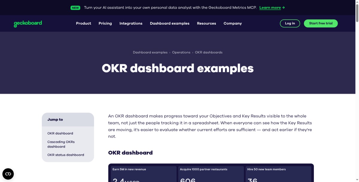
Costs climb quietly if every team wants its own view. It's a display tool, so any real analysis has to happen before the data arrives.
Geckoboard pricing: $79/month on Essentials for two dashboards and one editor. Extra dashboards $24, extra editors $20. Performance is $319/month for twenty dashboards and three editors.
Best client reporting tool for agencies
Agency reporting has its own pricing trap, since several of these tools bill by the dashboard and most agencies build one per client. We work through that in client dashboard software.
3. Databox
Databox pros:
- Templates for common marketing and sales sources
- Reports that send themselves on a schedule
- Agency plan billed per client pack rather than per seat
Databox cons:
- Counts data sources, not dashboards
- Lower tiers are single-user
Databox is built for showing results to somebody outside your company, and you can feel it everywhere: channel templates, scheduled sends, a plan priced per client instead of per person. For teams who want out of the per-source pricing, we ranked the options in 13 Databox alternatives.
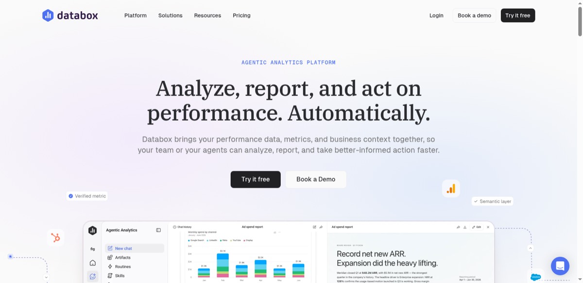
You're charged for data sources rather than dashboards, so pulling from a dozen systems moves you up the tiers fast. Databox also restructured these plans during 2026, which means older comparisons describe a price list that no longer exists.
Databox pricing: Free for one user, three data sources and 50 AI credits a month. Analyst $71/month billed annually, Team $199/month for three users and ten sources, Agency from $79/month plus $20 per client pack, all billed yearly.
Best reporting tool for fresh numbers
4. Klipfolio
Klipfolio pros:
- The only vendor that prices refresh rate openly
- Unlimited users on every plan
- 130+ data integrations
Klipfolio cons:
- Dashboard count and refresh rate are sold together
- Custom metrics take longer than picking a template
Klipfolio was the pricing page that made me stop and read twice. It's the only tool here that charges you visibly for how fresh your data is, and once you've seen that, you start noticing everyone else doing it quietly inside their tiers.
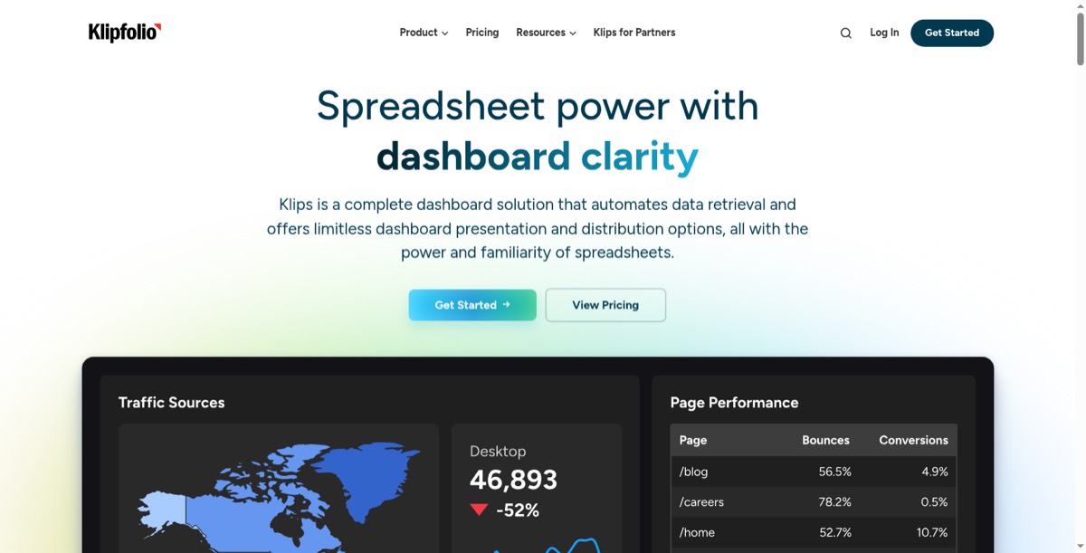
You pay for that freshness across every dashboard, whether each one needs it or not.
Klipfolio pricing: $120/month for 3 dashboards on a four-hour refresh, $190 for 10 on one hour, $310 for 20 on fifteen minutes, $600 for 40 up to the minute.
Best KPI tracker for a flat bill
5. SimpleKPI
SimpleKPI pros:
- One plan, one price, everybody included
- Unlimited users
- KPI-first rather than chart-first
SimpleKPI cons:
- Leans on manual entry and spreadsheet uploads
- Not built for live systems that change through the day
SimpleKPI has the shortest pricing page of anything here, and that tells you most of what you need to know. One plan, one price, everyone included. No warehouse, no modelling layer, no counting seats.
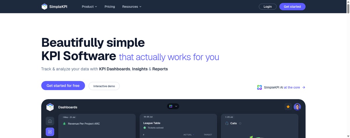
It relies on manual entry and spreadsheet uploads more than the others. If your numbers sit in live systems and change through the day, this isn't the right tool.
SimpleKPI pricing: $79/month billed monthly, or $67/month billed annually, which is $804 a year. Everyone in the company is included.
Cheapest KPI tracking tool
6. Cyfe
Cyfe pros:
- Lowest paid entry price here
- Widget library covering common marketing and sales sources
- Unlimited users from the Premier tier
Cyfe cons:
- Interface shows its age
- Lower tiers cap users tightly
Cyfe has been doing this a long time and it shows in both directions. It's the cheapest paid option on the list, and it looks like something designed a while ago.
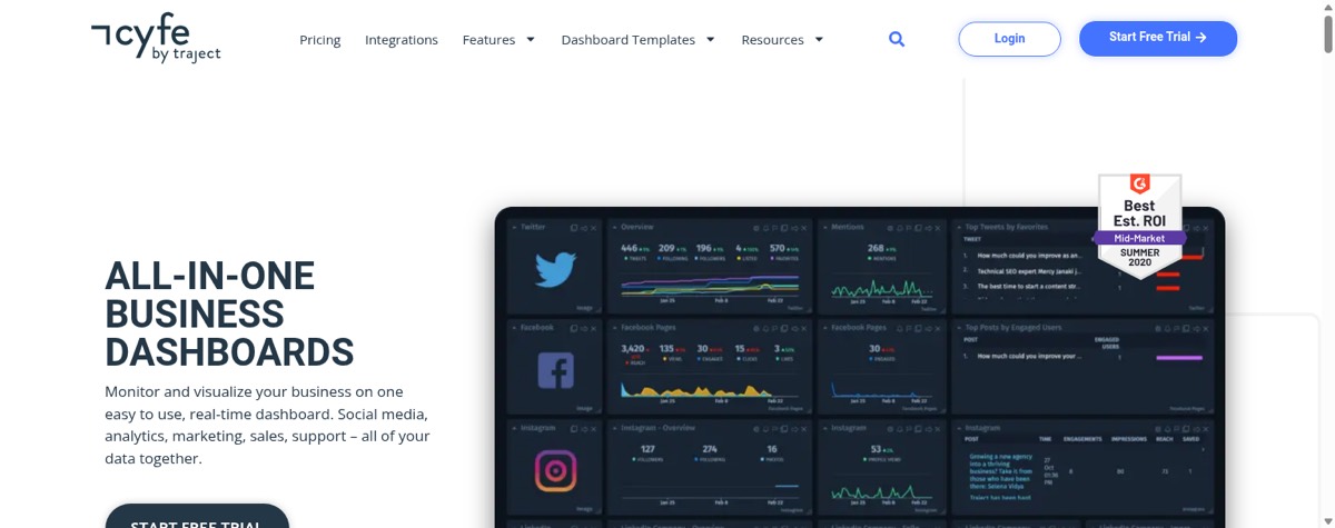
One user on Starter is restrictive for a team, and the interface feels dated next to newer tools.
Cyfe pricing: $29/month for 2 dashboards and 1 user. Standard $39 for 5 dashboards and 2 users, Pro $65 for 10 and 5, Premier $119 for 20 with unlimited users plus $5 per extra dashboard. Agency from $190.
Best free KPI dashboard
7. Looker Studio
Looker Studio pros:
- Free, with unlimited dashboards and viewers
- Native Google Analytics, Ads and BigQuery connectors
- Large community template gallery
Looker Studio cons:
- Slows on large or complex data
- Non-Google sources need paid connectors
Looker Studio is free, which ends a lot of arguments early. If your numbers already sit in Google Analytics, Google Ads or BigQuery, start here before spending anything.
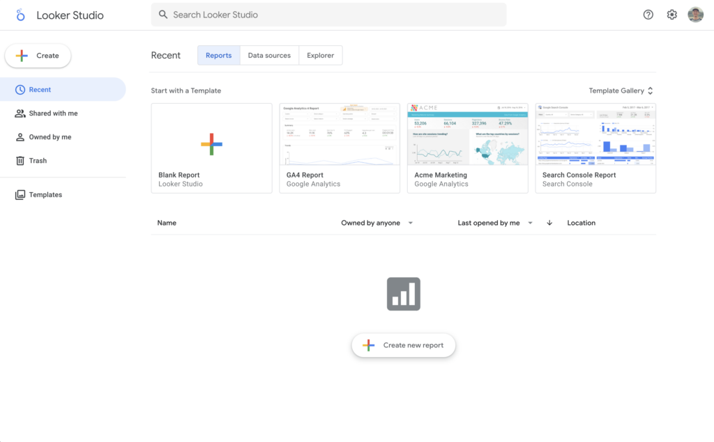
Performance drops on large or complex data, and non-Google sources need third-party connectors that cost extra. Free-tier support is community only.
Looker Studio pricing: Free. Pro is $9 per user per project per month.
Best open-source BI tool
8. Metabase
Metabase pros:
- Free open-source edition with unlimited users
- SQL editor alongside a point-and-click builder
- Runs on your own infrastructure
Metabase cons:
- Somebody has to host, patch and back it up
- The jump from Starter to Pro is $475/month
Metabase is what comes up when somebody asks why you can't host this yourselves. The open-source version is a real product rather than a crippled demo, as long as one person is willing to run it.
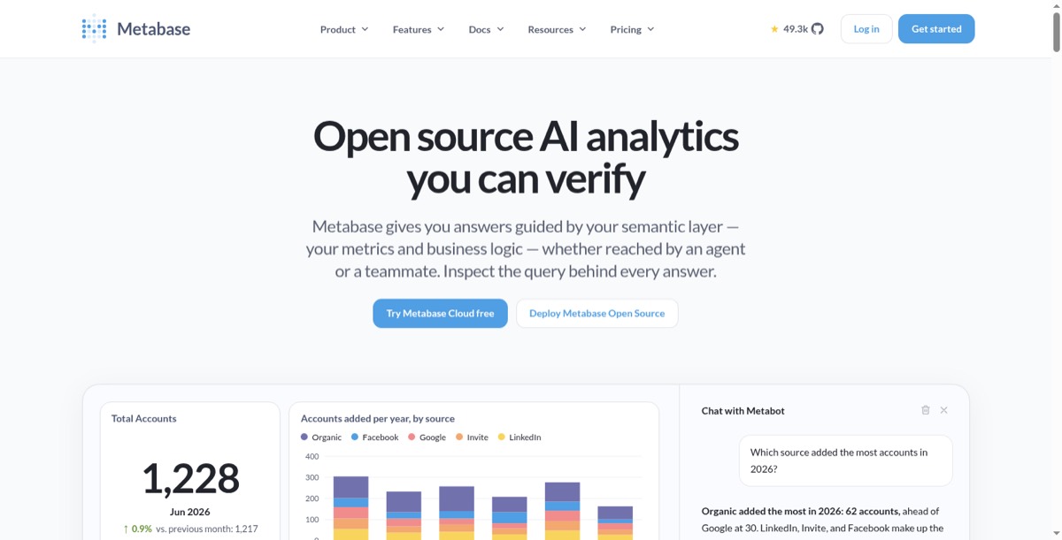
Free covers the licence, not the person who patches it and gets paged when it falls over. The jump from Starter to Pro is steep for the permissions most teams are after.
Metabase pricing: Open source free. Cloud Starter $100/month for 5 users plus $6 each, Pro $575/month for 10 plus $12 each, Enterprise from $20,000/year.
Best BI platform for Microsoft teams
9. Power BI
Power BI pros:
- Native Excel and Teams integration
- No cap on dashboards
- Familiar to anyone who has used Office
Power BI cons:
- Every viewer needs a paid licence
- The bill grows with your audience, not your team
Most teams don't choose Power BI so much as find themselves on it. It's already in the building, it opens Excel files without complaining, and nobody has to get a new vendor approved.
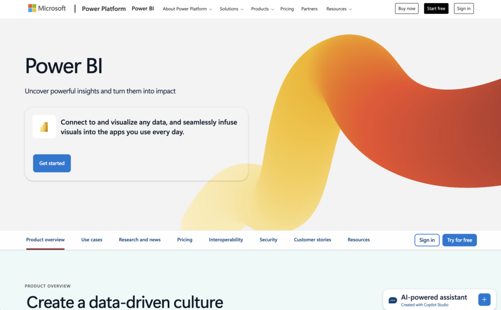
The bill grows with your audience rather than your team. Two hundred people costs $33,600 a year, which is an odd way to pay for a tool whose point is that everyone can see the number. Our Power BI pricing post has the full breakdown.
Power BI pricing: $14 per user per month on Pro, paid yearly. Premium Per User is $24. Every person who opens a report needs a licence.
Best BI platform for analysts
10. Tableau
Tableau pros:
- The deepest visual analysis in this group
- Separate Viewer and Explorer seat types
- Large community and template library
Tableau cons:
- Per-seat arithmetic, starting higher than Power BI
- Needs more skill to run than anything else here
Tableau is for people whose job is looking at data, not glancing at it. If somebody needs to slice a chart six ways to answer a question nobody asked yesterday, this is still the best tool for that.
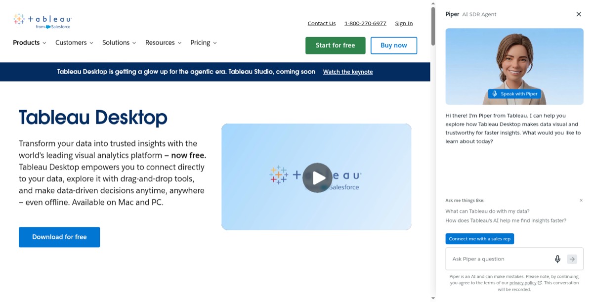
Two hundred Explorer seats is close to $100,000 a year, and it needs more skill to run than anything else here. Our Tableau pricing post breaks the tiers down.
Tableau pricing: $15 per user per month for Viewer seats, $42 for Explorer, $75 for Creator on the Standard edition.
Best analytics tool for plain-language questions
11. ThoughtSpot
ThoughtSpot pros:
- Natural-language search over your data
- Handles large row counts
- Dashboards generated from questions
ThoughtSpot cons:
- Two pricing models, and the second is hard to budget
- Expects a modelled warehouse underneath
ThoughtSpot's pitch is that people type a question instead of hunting for the right chart. That suits teams where the questions keep changing and nobody wants to file a request every time one does.

Credits only make sense once you know how much you'll use, and you have to pick a plan before you know that.
ThoughtSpot pricing: Essentials $25 per user per month billed annually, covering 5 to 50 users and 25 million rows. Pro switches to consumption pricing, Enterprise is a quote.
Best analytics platform for governed data
12. Qlik
Qlik pros:
- Managed spaces and governance controls
- Unlimited users from the second tier
- Broad connector range
Qlik cons:
- The most expensive way to start on this list
- More platform than a KPI board needs
Qlik is what gets bought when analytics has to be governed rather than fast. Managed spaces, data lineage, a layer IT will put its name to.
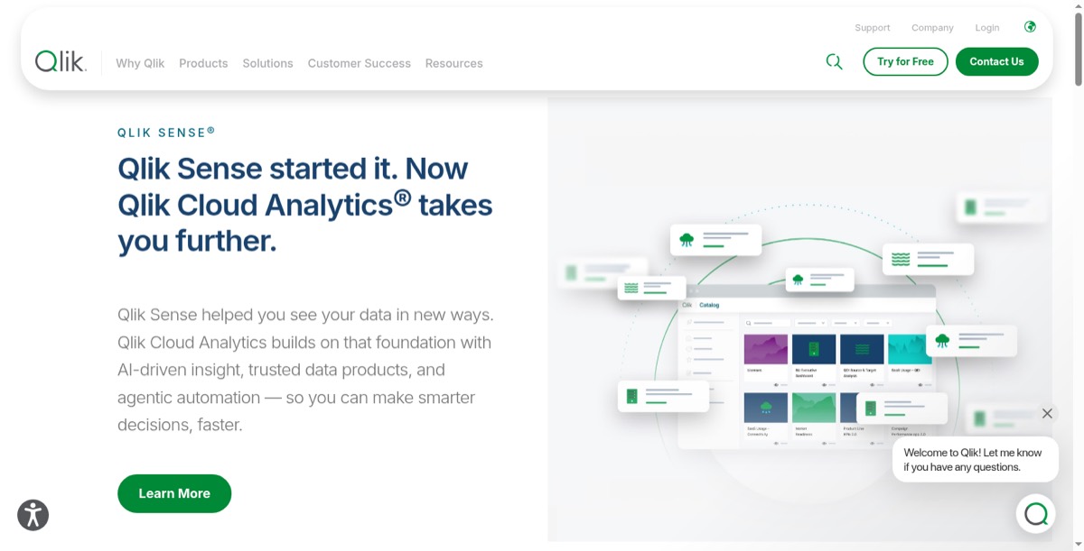
Unlimited users don't arrive until $825 a month. Our Qlik pricing post covers all four tiers.
Qlik pricing: Cloud Analytics Starter $300/month for 10 users and 10 GB. Standard $825 for 25 GB with unlimited users. Premium $2,750 for 50 GB.
Best automated marketing report tool
13. DashThis
DashThis pros:
- Preset templates for common marketing channels
- Automated scheduling and sending
- Unlimited users on every plan
DashThis cons:
- Built for marketing reporting and little else
- Dashboard and source counts move together
DashThis does one job: the monthly marketing report somebody currently rebuilds by hand. It connects the ad platforms, assembles the report on a schedule, and sends it.
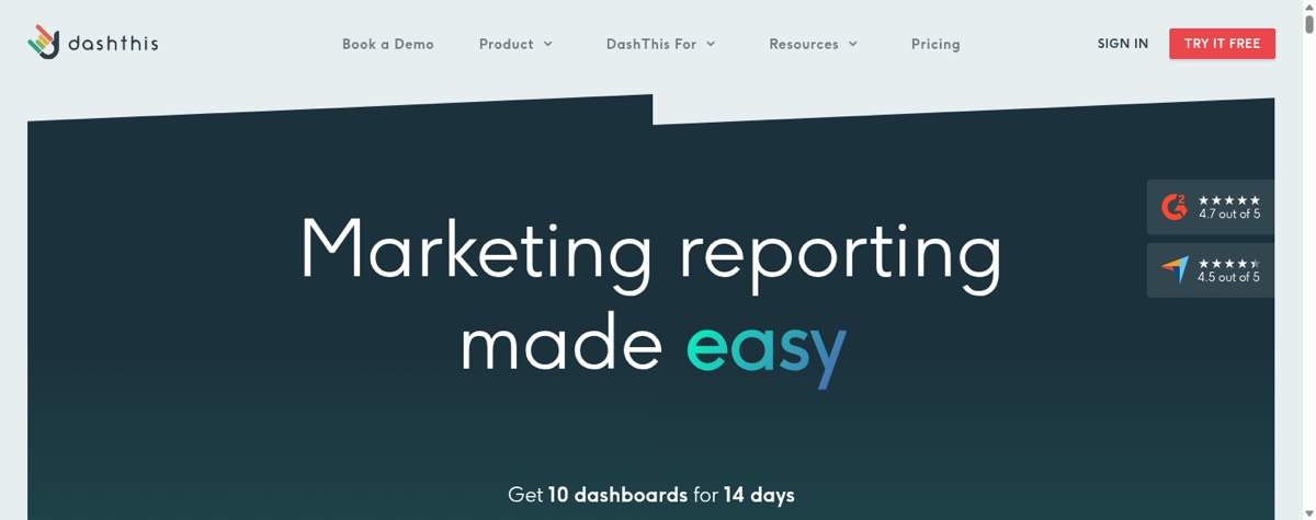
A team with many small reports climbs tiers quickly, because dashboard and source counts rise together. My comparison of marketing dashboard software prices DashThis against nine other tools for the same 10-client agency.
DashThis pricing: $44/month for 3 dashboards and 15 data sources. Professional $139 for 10 and 40, Business $279 for 25 and 100, top plan $429 for 50 and 200. Users unlimited on every tier.
Best agency tool billed per client
14. AgencyAnalytics
AgencyAnalytics pros:
- Billed per client rather than per seat
- Unlimited staff and client users
- Client portal with agency branding
AgencyAnalytics cons:
- Only makes sense if your work is organised by client
- Add-ons push the real cost above the headline
AgencyAnalytics prices the way agencies think, which is per client rather than per seat. The bill grows with how many clients you report on rather than how many people you employ.
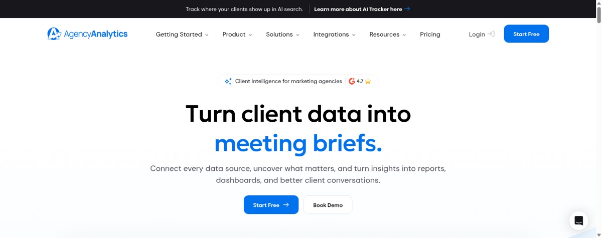
An in-house team pays for a structure it won't use, and the add-ons move the real number.
AgencyAnalytics pricing: $20 per client per month, 20% off billed annually. Add-ons priced separately: AI tracker $20.83/month per 250 credits, rank tracking $41.67 per 500 keywords. Agencies with 25+ clients move to a custom plan.
Best live KPI tracker for sales floors
15. Plecto
Plecto pros:
- Real-time performance dashboards
- Leaderboards, contests and achievement triggers
- Viewers are free, only tracked users are paid
Plecto cons:
- You pay per tracked person
- Much of the product goes unused outside sales and support
Plecto is for teams with a number to hit today. Live performance on a screen, leaderboards, contests, pointed squarely at sales and support floors.
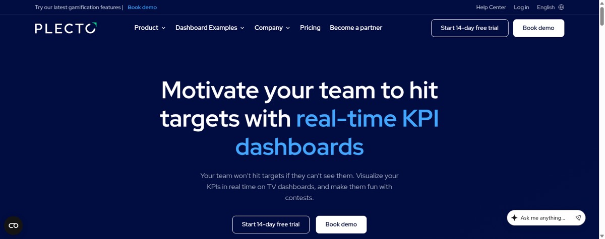
The bill grows with the team being measured. Outside those floors, a lot of the product goes unused. My comparison of sales dashboard software sets Plecto against the dashboards built into Salesforce, HubSpot and Pipedrive.
Plecto pricing: $24 per tracked user per month on Medium with a minimum of ten, $37.20 on Large. Managers who only view data are free.
Best embedded analytics tool
16. Bold BI
Bold BI pros:
- Built for embedding in your own application
- No per-user or per-viewer charges
- Cloud, private cloud or on-premises
Bold BI cons:
- No public price at all
- You cannot compare it without a sales call
Bold BI wants to live inside your own product rather than beside it. It advertises hard on having no per-seat fees, which is where this gets strange.
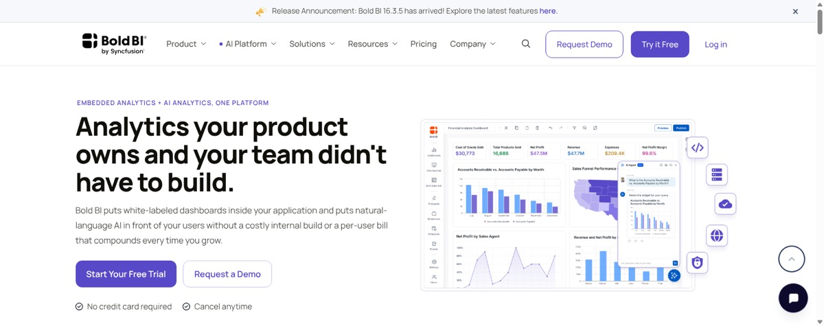
You can't compare it on price without a sales call, which is awkward for a company whose main advertised message is how it charges.
For the record, and discount this for the obvious reason: Mammoth embeds any published board on every plan, viewers are free, and the price is on the page above. Bold BI is the more established embedding product and will suit a deployment that has to sit on your own servers. I just can't tell you what it costs.
Bold BI pricing: No public price. Quoted per deployment, varying by deployment type, user count and currency. States there are no per-user or per-viewer fees without saying what the flat rate is.
Best scorecard and strategy tool
17. Spider Impact
Spider Impact pros:
- Balanced scorecard methodology built in
- Objectives cascading through an org chart
- Briefing and review modes
Spider Impact cons:
- No public price
- Less a dashboard tool than a strategy system
Spider Impact is less a dashboard tool than a way of running strategy. Balanced scorecards, objectives cascading down the org chart, review meetings built around them.
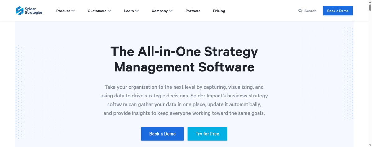
You can't budget for it from the website. A sales call is the only way to find out whether this is a $200 or a $2,000 decision.
Spider Impact pricing: No public price. Four tiers by user count: Growth at 1+, Team at 10+, Department at 25+, Enterprise at 100+, with no figure against any of them.
Which KPI dashboard software should you choose?
Ignore the feature lists for a minute.
One question decides this, and it is not about features. It is about where your KPI lives right now.
If it sits in one system, already correct, you are buying a display layer. Take the cheapest one that fits your dashboard count and refresh needs: Geckoboard for a wall screen, SimpleKPI for a flat bill, Klipfolio when freshness matters, Databox when you report to clients, Power BI when you are already Microsoft.
If it is spread across three systems and a spreadsheet somebody keeps by hand, the dashboard is not your problem. That work happens before the chart, and none of these display tools will do it for you.
One thing this page does not answer: what any of these cost once the whole company is reading the dashboards rather than building them. I worked that out separately in our guide to the best dashboard software tools, and the spread at 200 readers is wider than the spread at 3.
That is the decision.
Everything else is a preference, and preferences are cheap to change once you have picked a lane.
Frequently asked questions
What is the best software for KPI dashboards?
There is no single best one, and the honest split is by your data rather than by features. Geckoboard suits live team KPIs on clean data, SimpleKPI a small team wanting one flat price, Klipfolio dashboards needing sub-hour refresh, and Mammoth the case where the number must be assembled from several systems first.
How much does KPI dashboard software cost?
Between free and $2,750 a month across the seventeen tools here. Databox has a free plan, SimpleKPI is $67 a month with unlimited users, Geckoboard starts at $79 and Klipfolio at $120. Qlik Premium is the ceiling at $2,750.
Do KPI dashboard tools charge for viewers?
Often not. Geckoboard, SimpleKPI and Klipfolio include unlimited viewers or users on every tier, and Mammoth includes free viewers on every plan. Power BI, Tableau and ThoughtSpot charge per person, including for people who only read.
How do I create my own KPI dashboard?
Connect the source, pick the handful of numbers that will change a decision, then put them on a refresh schedule so nobody rebuilds it by hand. The usual mistake is picking charts first. Start with the decision you need to make, then work out which number tells you.
Can I build a KPI dashboard in Excel?
Yes, and for a single one-off view it is often the right answer. It stops working when the data has to refresh on its own, when several people need the same number at once, or when the source changes shape and every formula has to be rechecked.
Is Power BI cheaper than a dedicated KPI dashboard tool?
Below roughly thirty viewers, usually yes, at $14 per user per month. Above that the per-seat bill overtakes a flat plan: 200 people on Power BI Pro is $33,600 a year, against $3,828 for Geckoboard Performance with unlimited viewers.
What data do I need before a KPI dashboard will render?
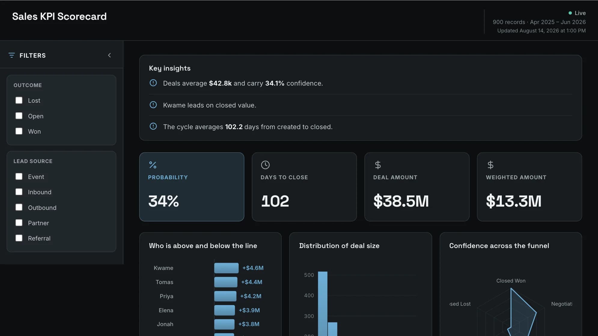
Less than people expect. Mammoth's Sales KPI Scorecard needs a money column and a category column with about three values. The harder requirement is that the numbers are correct and consistent, which is where multi-source data usually fails.
Where these prices came from
Every figure on this page was read off the vendor's own pricing page rather than a round-up, and the date each was checked is listed below. Prices in this category move: Databox restructured its plans during 2026, and Microsoft raised Power BI Pro from $10 to $14 in April 2025. If you are reading this months from now, spot-check the two or three you care about before you budget.