13 Best Databox Alternatives in 2026 (Tested & Ranked)
The best Databox alternatives are Mammoth, Coupler.io, AgencyAnalytics, Swydo, DashThis, Whatagraph, Looker Studio, Power BI, Klipfolio, Tableau, Domo, Cyfe and Geckoboard.
Jump to a section
- The four jobs these tools do
- What Databox is good at, and the one thing it won’t do
- 1. Mammoth Analytics: best Databox alternative for messy data
- 2. Coupler.io: best Databox alternative for teams that only need the plumbing fixed
- 3. AgencyAnalytics: best Databox alternative for agencies
- 4. Swydo: best Databox alternative for agencies with many accounts
- 5. DashThis: best Databox alternative for teams that want no learning curve
- 6. Whatagraph: best Databox alternative for high-volume client reporting
- 7. Looker Studio: best free Databox alternative
- 8. Power BI: best Databox alternative for Microsoft shops
- 9. Klipfolio: best Databox alternative for unlimited editors
- 10. Tableau: best Databox alternative for serious analysis
- 11. Domo: best Databox alternative for unlimited users at enterprise scale
- 12. Cyfe: cheapest Databox alternative
- 13. Geckoboard: best Databox alternative for wall displays
- How to choose a Databox alternative
- Frequently Asked Questions
- Switching sideways on purpose
Ten of the thirteen most popular Databox alternatives have the same blind spot Databox does.
They chart what you hand them. None of them fixes what you hand them. So if you’re leaving because a number came out wrong, or because you spent Tuesday morning stitching four exports together in a spreadsheet, most of this list is a sideways move with a new logo on it.
That’s the thing to get right before you compare anything else. You’re not picking a dashboard. You’re picking where the manual work lives.
The short answer
Sort the options by job before you sort them by price. Geckoboard and Cyfe put a number on a wall. AgencyAnalytics, Swydo, DashThis and Whatagraph send a client a branded report. Looker Studio, Power BI, Klipfolio, Tableau and Domo give you analytical depth. Only Mammoth, Domo and, in a narrower way, Coupler.io do anything to the data before it becomes a chart. Pick the group first, then pick inside it.
The four jobs these tools do
Every tool below is somebody’s best answer and nobody’s answer to everything. They sort into four jobs, and switching within a job is cosmetic while switching across one is the reason people leave.
| Job | Tools | What you get | What stays your problem |
|---|---|---|---|
| Fix the data first | Mammoth, Coupler.io, Domo | Cleaning and joining before anything charts | Depth of analysis |
| Report to clients | AgencyAnalytics, Swydo, DashThis, Whatagraph | Branded reports, client portals, scheduled sends | Anything outside marketing |
| Analyse it properly | Looker Studio, Power BI, Klipfolio, Tableau, Domo | Real analytical range | Prep, and often a learning curve |
| Put it on a screen | Cyfe, Geckoboard | A glanceable board in minutes | Blending, calculations, transformation |
Databox sits in the third and fourth columns at once, which is why it feels like it should be enough and often isn’t.
What Databox is good at, and the one thing it won’t do
Credit where it’s due. Databox connects fast, ships pre-built metrics and templates, and gets a marketing team looking at real numbers on the same day. For plug-and-play KPI monitoring it’s one of the easiest tools in this category.
It shows your data. It doesn’t reshape it.
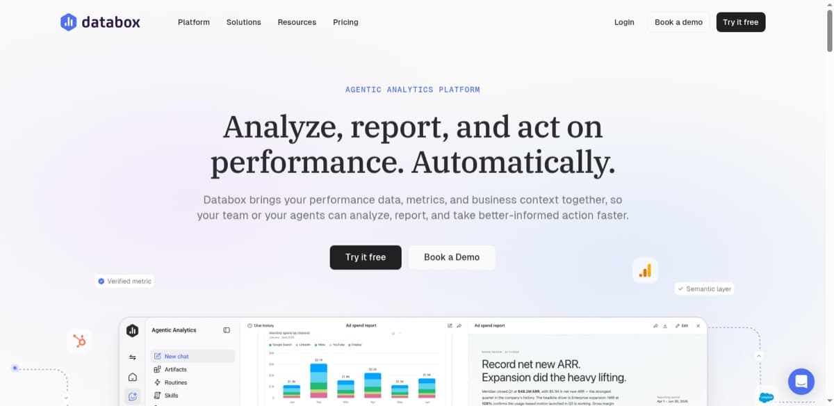
If your numbers arrive split across four exports with inconsistent column names, that stays your problem, and it stays your problem in ten of the thirteen tools below too. A BI analyst at a property management firm, running Power BI off 20 to 25 Excel reports updated once a week, put the consequence about as plainly as it can be put:
"We’ve been encountering some instances where we have some wrong inputs, and obviously the input will drastically impact your output of the analysis. If you find some messy data, then your outcome will also be kind of messy."
No tool on this page catches that for you. By the time the chart renders, the wrong number is already in it.
The other complaint is structural. Databox meters seats and data sources, so the bill grows when you connect another tool or seat another person, and multi-client isolation means sub-accounts on a higher tier. That’s worth knowing, and it’s the second reason people leave rather than the first.
1. Mammoth Analytics: best Databox alternative for messy data
Most suitable for: teams whose data needs work before it can become a dashboard.
Full disclosure: this is our product. Here’s where it fits and where it doesn’t.
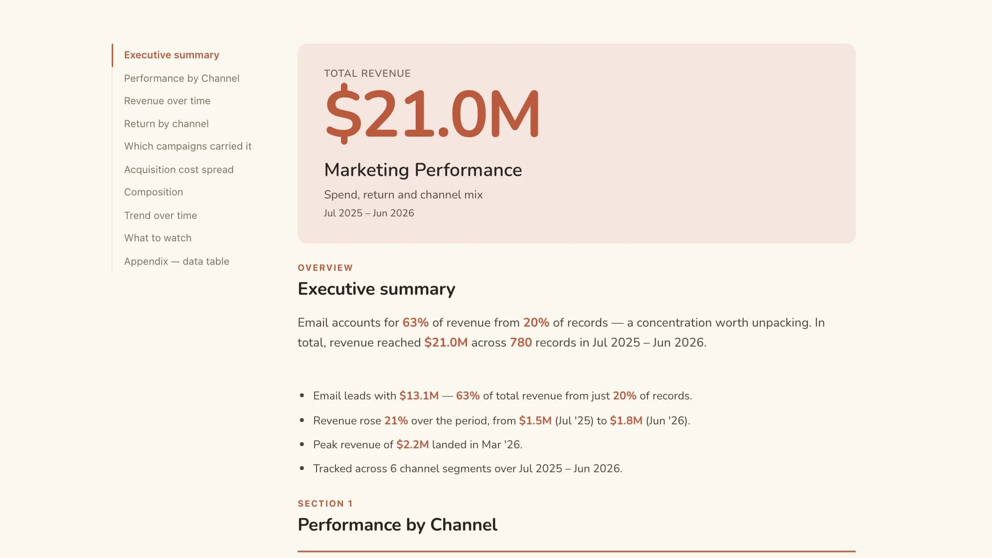
Mammoth Analytics starts from the assumption the rest of this list makes in reverse. Your data isn’t clean. So you connect sources, fix and combine them through a visual pipeline with no SQL, and build the dashboard on the result. The Data Engine and the dashboards are one product, not two purchases.
Dashboards get built by describing what you want in plain language. One detail matters more than the speed: the model never writes a number. It produces a query plan and the values are computed from your data, so what you read on a tile came from the dataset rather than from a language model’s guess.
A state and local tax compliance consultant described the shape of the problem to us in March 2025 better than I can. She serves large enterprises, builds their dashboards, and had been doing the preparation in Alteryx:
"The information that I need in that file might be coming from 10 different locations or 10 different tables or databases within the client’s ERP system. Most of my clients and the people that I’m working directly with are not IT people. I can’t hand off an Alteryx workflow, because the client looks at that and they’re like, I have no idea what I’m looking at."
Two problems in one breath. The data arrives scattered, and whatever you build to fix it has to be handoverable to someone non-technical. That pair is what Mammoth is shaped around.
Sharing, and the multi-client question
Published dashboards have three sharing modes: public with no login, password-protected for a single client, and authenticated for logged-in users. Viewers are unlimited and free on every plan, so showing a board to the whole company doesn’t move the bill.
Where one dashboard serves several clients who must not see each other’s figures, Row-Level Security filters per viewer. You pick the column that identifies your clients and assign viewers to their values. A "Viewing as" dropdown previews what each client sees before you share, and an unassigned viewer sees nothing rather than everything.
Three honest limits. Row-Level Security is a Pro and Enterprise capability. It needs authenticated mode, so those client contacts have to be logged-in users. And it governs the dashboard and anything exported from it, not scheduled pipeline exports to a warehouse or SFTP, which carry the full dataset and are governed by project roles instead.
Key features
- No-code cleaning and transformation through a visual pipeline
- Combine multiple sources into one dataset
- Dashboards generated from a plain-language description
- Viewer-facing Q&A on published dashboards
- Row-Level Security on Pro and above
- Free unlimited viewers on every plan
Pros and cons
Pros:
- Fixes data as well as charting it
- No SQL on either side
- Viewers cost nothing
- Per-viewer filtering without one dashboard per client
Cons:
- Newer name than Power BI or Tableau
- Not purpose-built for agency client reporting, where AgencyAnalytics and Swydo are more specialised
- Free and Starter dashboards carry a "Built with Mammoth" footer, and RLS starts at Pro
Pricing Free plan with no expiry, plus a 14-day Pro trial so you can run real data through it first.
| Plan | Per month, billed annually | Billed monthly | Builders |
|---|---|---|---|
| Free | $0 | $0 | 1 builder |
| Starter | $39/month | $49/month | 2 builders |
| Team | $149/month | $189/month | 5 builders |
| Pro | $499/month | $629/month | 15 builders |
| Enterprise | From $5,000/month | Annual only | Unlimited |
Viewers are free and unlimited on every plan, because only builders count. Storage is a separate axis: every paid plan includes 10 GB, and more costs the same on any plan (+$100/month for 50 GB, +$300/month for 250 GB, +$800/month for 1 TB, billed annually). Free holds 1 GB. Every account starts with 14 days of Pro, no credit card.
2. Coupler.io: best Databox alternative for teams that only need the plumbing fixed
Most suitable for: teams whose problem is getting numbers somewhere reliably, not drawing them.
Coupler.io is the other tool here that touches data before it becomes a chart, though it does less of it. It pulls from 400+ sources into Sheets, Excel or a warehouse on a schedule, with light transformation in transit, then hands off to whatever draws your charts.
Pair it with Looker Studio and you’ve covered most of what a small team was paying Databox for, at a fraction of the cost. Know what you’re buying: this is plumbing, not a dashboard suite, and the transformation is light enough that four exports with mismatched column names will still beat it.
Key features
- 400+ sources
- Scheduled refresh into Sheets, Excel, BigQuery and BI tools
- Transformations in transit
- Unlimited users from the Active plan up
Pros and cons
Pros:
- Cheap for what it does
- Unlimited users above the entry plan
- Broad connector range
Cons:
- Not a dashboard tool on its own
- Light transformation
- Needs a partner tool for visuals
Pricing Free tier available. Starter $24/month, Active $99, Pro $199, billed annually.
3. AgencyAnalytics: best Databox alternative for agencies
Most suitable for: agencies whose cost should scale with clients rather than seats.
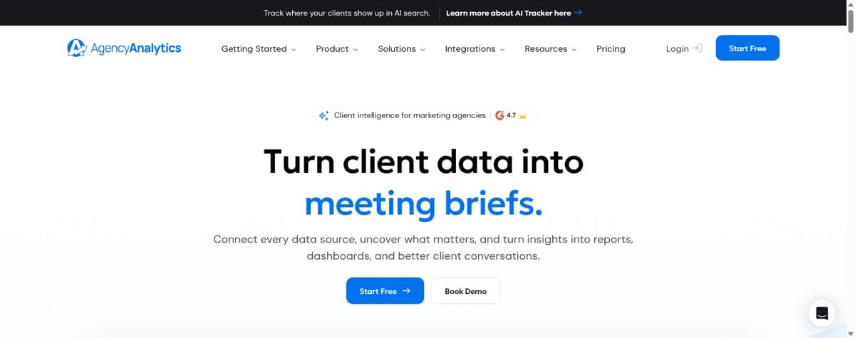
AgencyAnalytics inverts the meter. You pay $20 per client per month billed annually and get unlimited staff and client users, unlimited dashboards, and 85+ integrations. If seating a second person is what pushed you off Databox, that axis disappears entirely.
Client portals, white-label branding, custom domain and email are included. It’s agency software rather than a general analytics tool, so data outside campaign platforms isn’t its strength, and it does nothing to clean what arrives.
Key features
- Per-client pricing, unlimited users
- 85+ marketing integrations
- White-label client portals, custom domain and email
- Automated scheduling and alerts
Pros and cons
Pros:
- Cost tracks clients, not seats or sources
- Unlimited staff and client users
- Built end to end for client reporting
- 30-day money-back guarantee on top of the trial
Cons:
- Built for agencies and narrow outside them, marketing platforms first
- No data cleaning
Pricing $20 per client per month billed annually. 14-day trial, no card.
4. Swydo: best Databox alternative for agencies with many accounts
Most suitable for: agencies connecting the same two or three platforms across a lot of clients.
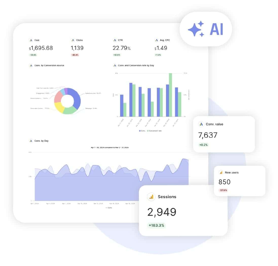
Swydo has one plan at €69 a month, €62 billed annually, covering the first ten data sources with unlimited clients, users, dashboards and reports. Extra sources are tiered from €4.50 down to €2.00 each as you scale.
A data source means one account on one integration, so ten clients on both Google Ads and Facebook Ads counts as twenty. Same meter Databox uses, far lower rate, everything else unlimited. White-labelling, client portals and goal tracking ship with the single plan.
Key features
- One plan, unlimited clients, users and reports
- 38+ integrations, priced per connected account
- Per-source rate drops from €4.50 to €2.00 as you scale
- White-labelling and secure client portals
- Goal tracking with alerts
Pros and cons
Pros:
- Only one thing is metered, cheaply, and it stays predictable as accounts grow
- Unlimited users and clients
Cons:
- Still a per-source meter
- 38 integrations is a narrow list here
- Marketing reporting only
Pricing €69/month, €62 billed annually, including 10 data sources. 14-day trial.
5. DashThis: best Databox alternative for teams that want no learning curve
Most suitable for: small marketing teams that want a report out without configuring much.
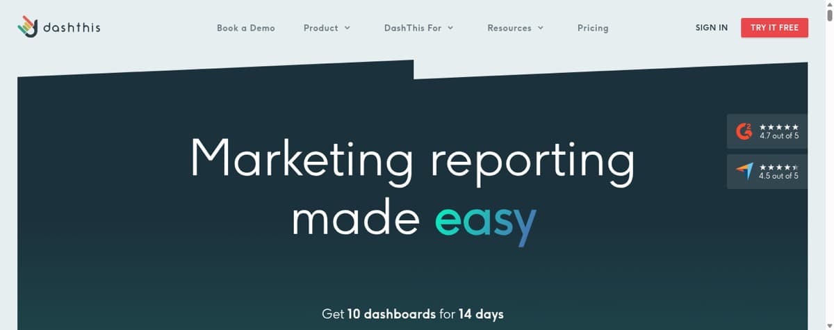
DashThis covers preset marketing channels and little beyond them, which is what makes it the shortest thing here to learn. Users and integrations are unlimited on every plan, so the seat axis disappears again. Dashboards are the meter instead, which is worth doing the arithmetic on against your client count.
White-labelling is included. There’s no free plan, though the trial gives ten dashboards for 14 days.
Key features
- Unlimited users on every plan
- Preset templates by channel
- White-label reports and automated sending
- Drag-and-drop editor
Pros and cons
Pros:
- Fastest here to learn
- Unlimited users and integrations
- White-labelling included
Cons:
- Metered by dashboard count
- Marketing reporting only
- No blending depth
- No free plan, only a trial
Pricing Individual $44/month, Professional $139, Business $279.
6. Whatagraph: best Databox alternative for high-volume client reporting
Most suitable for: agencies with enough clients to justify an enterprise rate.
Whatagraph is narrower than Databox and better at the narrow thing: connect the marketing platforms, work from a template, brand it, schedule the send.
It has moved upmarket. Max is €999 a month billed annually from 50 credits, where a credit is one connected data account, with unlimited users and reports. Below a certain client count the arithmetic doesn’t work and AgencyAnalytics or Swydo will cost a fraction of it.
Key features
- Marketing integrations priced in credits
- Unlimited users and reports
- White-labelling and branded client reports
- Scheduled delivery
Pros and cons
Pros:
- Purpose-built for client reporting
- Unlimited users and reports
- Strong white-labelling
Cons:
- High entry price
- Narrow outside marketing
- No free plan
Pricing Max €999/month billed annually. Prime is custom.
7. Looker Studio: best free Databox alternative
Most suitable for: anyone whose numbers already live in Google Analytics, Ads and Sheets.
Looker Studio is free with no per-source meter at all, which removes Databox’s pricing structure outright. Inside Google it connects in seconds.
Outside Google it gets harder. Blending non-Google sources is clunky, reports slow down as they grow, and there’s no preparation layer, so messy inputs stay messy. Looker Studio Pro adds team features on top.

Key features
- Free
- Native Google Analytics, Ads and Sheets connections
- Shareable, collaborative reports
- Community connectors for other sources
Pros and cons
Pros:
- No licence cost, no source limit
- Fast inside Google
Cons:
- Clunky non-Google blending
- Slows on larger reports
- No data cleaning
Pricing Free. Looker Studio Pro is the paid team tier.
8. Power BI: best Databox alternative for Microsoft shops
Most suitable for: companies already inside Microsoft 365.
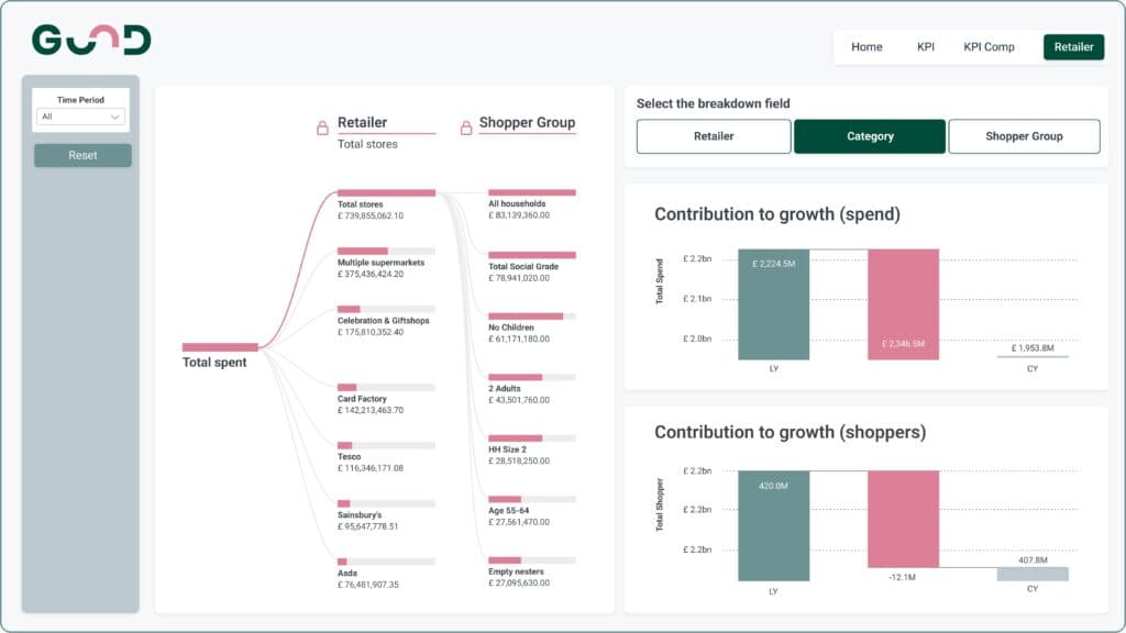
Power BI carries far more analytical depth than Databox for a low per-seat rate, and Power BI Desktop is a free download. For a team of five it works out cheaper than Databox’s three-user tier.
The cost is in the learning and the sharing. Real preparation happens upstream in Power Query, DAX takes time, and anyone who opens a report needs a licence, which is the opposite of what a team leaving a seat-metered tool usually wants. We break the tiers down in the Power BI pricing guide and the field in Power BI alternatives.
Key features
- Deep Microsoft 365 and Azure integration
- Power Query for transformation
- Strong analytics and custom visuals
- Free desktop authoring
Pros and cons
Pros:
- Low per-seat price
- Powerful once learned
- Fits Microsoft estates
Cons:
- Steep learning curve, particularly DAX
- Viewers need licensing
- Prep happens upstream
Pricing Desktop free. Pro $14/user/month, Premium Per User $24, paid yearly.
9. Klipfolio: best Databox alternative for unlimited editors
Most suitable for: teams that want many people building without a per-seat bill.
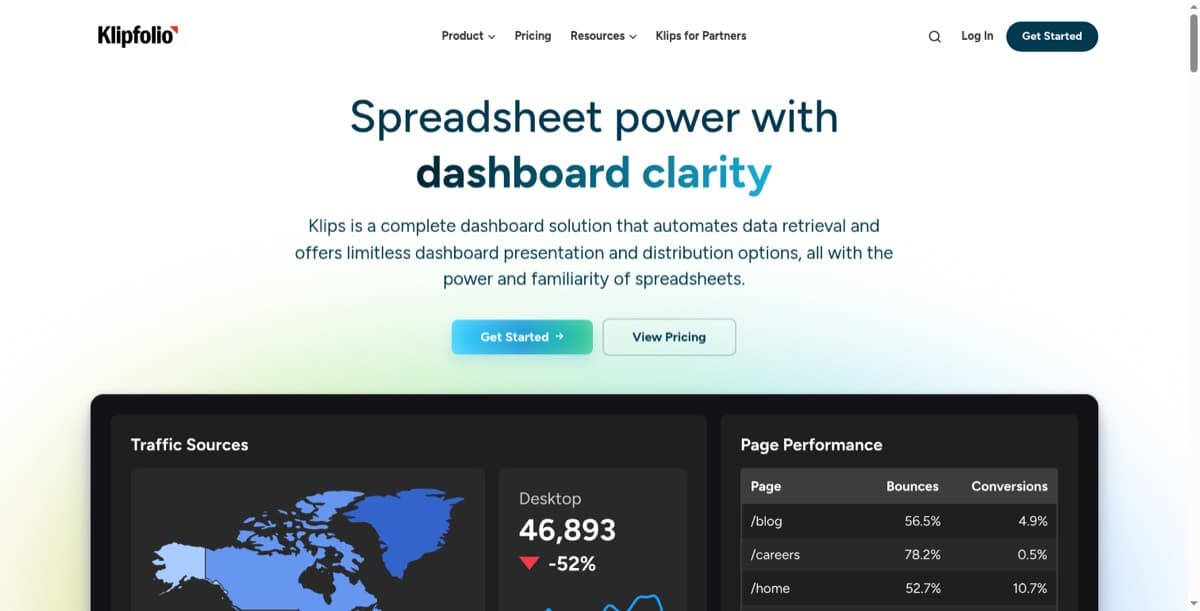
Klipfolio carries unlimited users on every plan, the sharpest contrast on this page with Databox’s single-seat entry tier. Refresh rates go down to a minute on higher tiers and the formula layer is flexible once you’re in it.
The cost lands elsewhere. Building a Klip is hands-on, custom work often wants SQL, and the add-ons are their own line: extra dashboards, custom domain, white-label bundle and SSO all bill separately. There’s no free plan. See Klipfolio alternatives for the longer look.
Key features
- Unlimited users on every plan
- 130+ integrations
- Refresh down to a minute on higher tiers
- Custom formulas and SQL-backed sources
Pros and cons
Pros:
- No per-seat charge
- Flexible once built
- Fine-grained refresh control
Cons:
- Slow to build, custom work needs SQL
- Add-ons for white-label, SSO and domains
- No free plan
Pricing Base $120/month, Grow $190, Team $310, Team+ $600, billed annually.
10. Tableau: best Databox alternative for serious analysis
Most suitable for: teams that need analytical depth and have somebody to drive it.
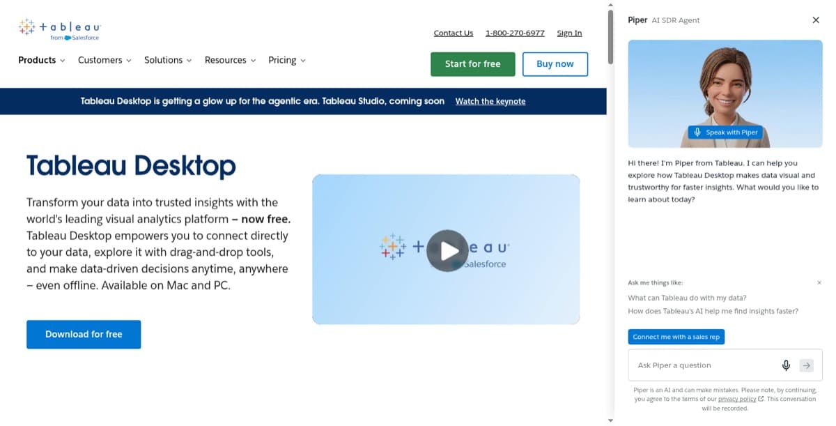
Tableau is the heavyweight of this list. For deep analysis and visual range, few tools here come close, and it scales well past anything Databox is built for.
Two catches. It's priced per seat across Creator, Explorer and Viewer roles, so the cost grows the way Databox's does, just from a higher base. And you can't clean data inside it: preparation happens before your data ever arrives, which is the same gap you're leaving Databox over. Plenty of teams end up pairing it with a prep tool, which is the job Mammoth does. Current rates by role are in our Tableau pricing breakdown, and the wider field in Tableau alternatives.
Key features
- Advanced analytics and forecasting
- Large community and learning ecosystem
- 90+ integrations
Pros and cons
Pros:
- Best analytical depth here
- Scales to serious enterprise use
- Huge community
Cons:
- Can't clean data in the tool
- Per-seat cost across three roles
- Steep learning curve
Pricing Per user per month by role, billed annually. See Tableau's pricing page for current rates.
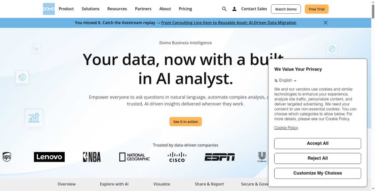
11. Domo: best Databox alternative for unlimited users at enterprise scale
Most suitable for: large organisations that want one platform and have the budget for it.
Domo is the other tool here that does something to your data rather than only charting it. It covers integration, preparation, storage and visualisation under one roof, which is why it's both capable and expensive.
The pricing model is the interesting part for anyone leaving Databox over seats. Domo publishes no plan figures at all. Its pricing page describes credit-based pricing with the line "unlimited users, no hidden fees, pay for what you use," and paid tiers are a custom quote through sales. So you stop paying per person and start paying per credit, which is better or worse depending entirely on how heavily you use it. There's a 30-day free trial covering the full platform with unlimited users and no card required. We dug into the model in our Domo pricing guide and the field in Domo alternatives.
Key features
- End to end: integrate, prepare, store, visualise
- 1,000+ connectors
- Credit-based pricing with unlimited users
- Real-time alerting
Pros and cons
Pros:
- Unlimited users on every tier
- Does preparation as well as charting
- Scales to large organisations
- 30-day trial of the full platform, no card
Cons:
- No published prices, so every quote is a conversation
- Consumption billing replaces the seat problem with a usage one
- Implementation takes real effort
Pricing Credit-based, custom quote, no published figures. 30-day free trial, full platform, no card.
12. Cyfe: cheapest Databox alternative
Most suitable for: teams that want a lot of simple boards without a lot of money.
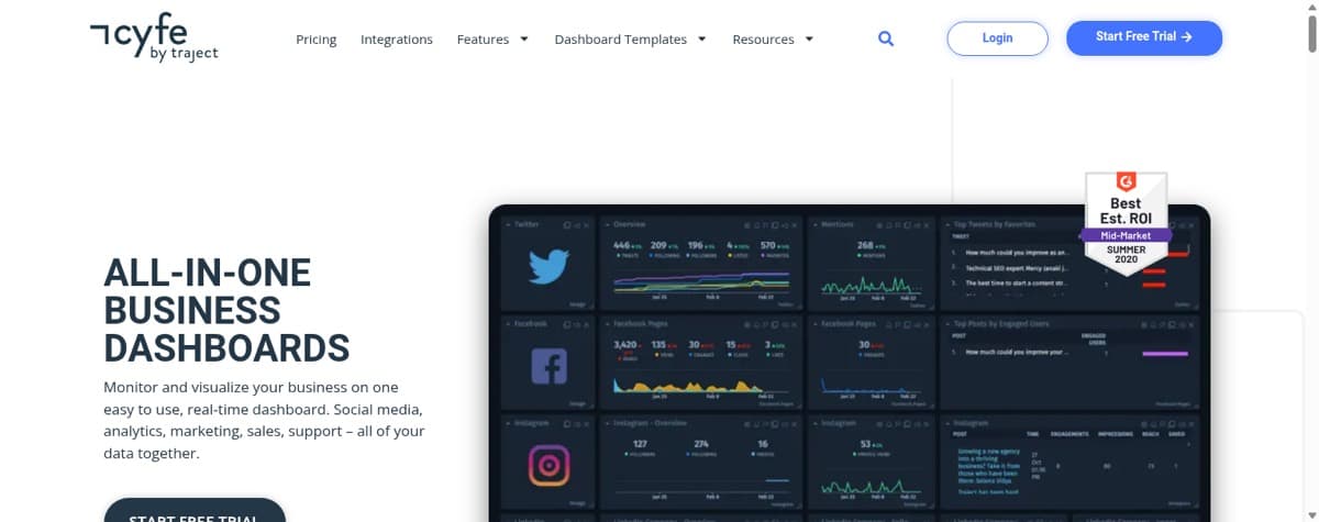
Cyfe is the budget answer here, and unusually the things other tools charge extra for ship on every plan: TV mode, public URLs, custom logo, custom SSL domain and embedded analytics. There’s an Agency tier with a per-client structure.
What you give up is depth. Cyfe is a widget board rather than an analysis tool and it does no transformation, so it solves the display half of Databox and none of the rest.
Key features
- 100+ integrations, widget-based boards
- TV mode and public URLs on every plan
- White-label logo and custom SSL included
- Agency tier with per-client structure
Pros and cons
Pros:
- Cheapest entry point here
- White-labelling on every tier
- Unlimited users from Premier up
Cons:
- A widget board rather than an analysis tool, with no transformation
- Dashboards and users both metered below Premier
Pricing Starter $29/month, Standard $39, Pro $65, Premier $119, Agency from $190.
13. Geckoboard: best Databox alternative for wall displays
Most suitable for: putting a handful of live metrics on a screen the team walks past.
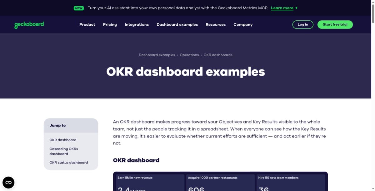
Geckoboard does one job well. Large, legible status boards that read from across a room, built in minutes, with unlimited viewers.
It does no blending, no custom metrics and no transformation by design, so it replaces the display half of Databox and none of the rest. Every unit is billed separately and the extras add up quickly, so a small team can hit the second tier sooner than expected. We cover the field in Geckoboard alternatives.
Key features
- Fast board builder
- 90+ integrations
- TV and wall-display mode
- Unlimited viewers
Pros and cons
Pros:
- Easiest tool here for a status board, and quick to set up
- Unlimited viewers
Cons:
- No blending, calculations or custom metrics
- Add-on pricing for dashboards, editors and screens
- No free plan
Pricing Essentials $79/month, Performance $319, billed annually.
How to choose a Databox alternative
1. Which of the four jobs are you buying? Go back to the table above. If you switch inside a job you get a different interface and the same outcome. Most disappointed switchers changed tool without changing job.
2. Is your problem the data or the chart? If the numbers are scattered or wrong before anything plots them, a pure dashboard tool relocates the work rather than removing it. That’s the case for Mammoth, and the gap Databox, Cyfe, Geckoboard and Looker Studio all leave with you.
3. What should the bill be indexed to? Everything here meters something. Databox meters seats and sources. AgencyAnalytics meters clients. DashThis and Cyfe meter dashboards. Swydo and Whatagraph meter connected accounts. Klipfolio and Mammoth meter neither viewers nor sources. Work out which number grows fastest for you, then avoid the tool that charges for it.
Frequently Asked Questions
Why do people look for Databox alternatives? Two reasons in order. Databox displays data rather than reshaping it, so teams with messy inputs never get the problem solved. And it meters both seats and data sources, so the bill grows as the team and the stack do.
What is the best free Databox alternative? Looker Studio if your data is already in Google and reasonably tidy. Mammoth if it needs cleaning first, since the free plan covers preparation as well as dashboards. Coupler.io has a free tier for moving data, though you’ll need something else to draw the charts.
Does Databox clean or transform data? No. It connects to sources and displays metrics from them. Reshaping, deduplicating or joining data across sources happens before Databox sees it, which is why some teams end up paying for a preparation tool alongside it.
How do I stop clients seeing each other’s data? In Databox that means sub-accounts on a higher tier. AgencyAnalytics, Swydo and DashThis give each client their own portal or report. Mammoth uses Row-Level Security on Pro and above, where one dashboard serves every client and each logged-in viewer sees only their own rows. Our client dashboard software round-up compares how each tool prices that isolation.
Can I share a dashboard with someone outside my company? Depends on the viewer model. Geckoboard, Klipfolio and Mammoth carry unlimited viewers, so external stakeholders cost nothing. Power BI needs a licence for every person who opens a report. Agency tools handle it through client portals instead.
Is there a Databox alternative without per-seat pricing? Several. Klipfolio, DashThis and Swydo carry unlimited users on every plan, AgencyAnalytics has unlimited staff and client users, and Mammoth charges for builders while dashboard viewers are free and unlimited.
What if my team has never built a dashboard? DashThis and Cyfe have the shortest learning curves because they’re template and widget driven. Mammoth takes a different route: you describe the dashboard you want in plain language and it gets generated from your dataset, so the entry skill is saying what you want rather than learning a modelling tool.
Which Databox alternative is best for agencies? AgencyAnalytics if you want cost to track client count. Swydo if you connect the same few platforms across many clients. Whatagraph above a certain volume. Mammoth if the reason reports are late is the state of the data rather than the reporting tool.
How much does Databox cost? Free covers 1 user, 3 data sources and 1 dashboard. Paid plans run from Analyst at $71 a month for one user up to Team Scale at $319, with an Agency tier priced per client pack. All annual rates, with monthly billing higher. The full plan-by-plan breakdown, including what counts as a data source, is in our Databox pricing guide.
Switching sideways on purpose
The tools on this page are good at different things and none of them is good at everything. Pick the job first, and the shortlist collapses from thirteen to three.
If the job is a board on a wall, that’s Geckoboard or Cyfe and you can stop reading. If it’s client reports, AgencyAnalytics and Swydo will cost you less than Databox did. If it’s depth, Looker Studio and Power BI outclass Databox on analysis.
And if the reason the reports are late is that somebody spends Tuesday morning fixing a spreadsheet before anything can be charted, none of those solve it, because none of them were built to. That’s the one gap worth switching across.
Bring the messiest export you have and see what comes back. No credit card needed.
Prefer a walkthrough first? Book a 20-minute demo.