The 13 Best Dashboard Software Tools in 2026
I compared 13 dashboard tools on what they connect to, who they suit and what they cost once your whole team is reading. Here are the best ones, and how to pick.
Jump to a section
- The best dashboard software
- What makes the best dashboard software?
- The best dashboard software at a glance
- Best all-in-one dashboard software
- Best dashboard tool for teams already inside Microsoft
- Best BI platform for analysts who need real depth
- Best free dashboard software for Google users
- Best cheap BI suite for small teams
- Best dashboard tool for office wall screens
- Best reporting tool for data that has to stay fresh
- Best client reporting tool for agencies
- Best open-source dashboard tool
- Best monitoring dashboard for engineering metrics
- Best analytics platform for governed data
- Best BI tool for plain-language questions
- Best enterprise BI platform for large rollouts
- What these tools cost once everybody's reading
- Which dashboard software should you choose?
- Dashboard software for small business
- Frequently asked questions
I opened thirteen dashboard pricing pages in one morning to work out what these things cost.
One of them wouldn't tell me.
That was the first surprise. The second was Tableau, whose pricing page quietly opens on its Enterprise edition, so the $115 you see is not the $75 that nearly every comparison article quotes. Nobody mentions which one they're quoting. I only caught it because I went looking for the toggle.
Here's the one that matters, though. Take three people building dashboards and two hundred people reading them, which is roughly how every company I've worked at is shaped. Geckoboard costs $948 a year. Tableau Enterprise costs $88,140.
Same job. Ninety-three times the money.
The gap isn't about chart quality. All thirteen draw a perfectly good bar chart. It's about what each tool assumes you'll hand it, and what it charges you for once other people start looking.
The best dashboard software
- 1. Mammoth for a full dashboard builder that also cleans your data
- 2. Power BI for teams already inside Microsoft
- 3. Tableau for analysts who need real depth
- 4. Looker Studio for data that already lives in Google
- 5. Zoho Analytics for the cheapest real BI
- 6. Geckoboard for live KPIs on an office screen
- 7. Klipfolio for numbers that have to stay fresh
- 8. Databox for agencies reporting to clients
- 9. Metabase for teams who'd rather self-host
- 10. Grafana for engineering and ops metrics
- 11. Qlik for governed analytics at scale
- 12. ThoughtSpot for asking questions in plain language
- 13. Domo for large enterprise rollouts
What makes the best dashboard software?
Five things, roughly in order of how much they'll annoy you six months from now.
-
Whether it connects to your stuff. Every vendor brags about a connector count. Ignore it. The only question is whether your four or five systems are on the list, and a tool with 700 connectors that's missing your CRM is worse than one with 50 that isn't.
-
What the vendor counts. Seats? Dashboards? Data sources? Refresh rate? Gigabytes? This is the axis your bill grows along, and it's why two tools with identical headline prices can finish thousands apart.
-
Whether viewers are free. Four of these thirteen let unlimited people read a board for nothing. The other nine charge per head, including for the colleague who glances at it once a month. At 200 readers this is the biggest number on the page, by a mile.
-
How fresh the numbers need to be. Klipfolio is the only one that prices this out loud. Everyone else hides it in the tiers, so work out how stale you can live with before you shop.
-
Where the data gets cleaned. All thirteen draw charts. Far fewer will join two systems, fix categories that don't match, or cope with a column that shows up as text one month and a number the next.
How I compared these. I read all thirteen pricing pages on 17 September 2026 and checked features against each vendor's docs, not their marketing copy, wherever the two disagreed. What I did not do is run all thirteen side by side on the same dataset, so treat nothing here as a verdict on which draws the prettiest chart. And where I'm talking about our own product, I say so.
The best dashboard software at a glance
| Best for | Standout feature | Starting price | |
|---|---|---|---|
| 1. Mammoth | An all-in-one dashboard tool | 42 chart types, free unlimited viewers | Free |
| 2. Power BI | Teams inside Microsoft | Excel and Teams integration | $14/user/mo |
| 3. Tableau | Analysts who need depth | Deepest visual analysis | $15/user/mo |
| 4. Looker Studio | Data inside Google | Free, native to GA and BigQuery | Free |
| 5. Zoho Analytics | Cheapest real BI | 500+ data sources, AI assistant | $24/mo |
| 6. Geckoboard | Office wall screens | Built to be read across a room | $79/mo |
| 7. Klipfolio | Data that must stay fresh | Refresh rate you pick openly | $120/mo |
| 8. Databox | Agencies with clients | Per-client billing | Free, then $71/mo |
| 9. Metabase | Self-hosting teams | Real open-source edition | Free self-hosted |
| 10. Grafana | Engineering metrics | Time-series and alerting | Free, then $19/mo |
| 11. Qlik | Governed analytics | Managed spaces and lineage | $300/mo |
| 12. ThoughtSpot | Plain-language questions | Natural-language search | $25/user/mo |
| 13. Domo | Enterprise rollouts | 1,000+ connectors | No public price |
Best all-in-one dashboard software
1. Mammoth
Mammoth pros:
- 42 chart types, four dashboard layouts and nine visual styles out of the box
- Unlimited free viewers on every plan, including the free one
- Viewers can ask the dashboard follow-up questions and get answers with their working shown
- Cleans and joins the data in the same product that publishes the board
- Any published board embeds in your own pages, on every plan
Mammoth cons:
- Younger product with a smaller community than Tableau or Power BI
- More tool than you need if your data is already clean and in one system
Right, the awkward bit: Mammoth Analytics is our product. Discount this entry as much as you think it deserves.
Start with the dashboard, because that's what you came here for.
You get 42 chart types and four distinct layouts. Not one template with a label swapped on it. Four different structures.
An Executive Overview is four KPIs, a bar, a share-of-whole and a trend. Sparse on purpose.
An Operational Monitor drops the trend entirely and gives you eight KPIs plus a live data table, because a monitoring board answers "what's happening now" rather than "what happened".
An Analytical Deep-Dive adds a second-dimension cut and a correlation scatter. Comparison redraws every tile side by side.
Nine visual styles ship as standard. Point Mammoth at a brand asset instead and it derives a custom one, clamping text contrast to WCAG as it goes.
Boards are multi-page, with tab or rail navigation, on a 12-column grid where gaps are structurally impossible.
Filters re-aggregate in the browser with no server round trip. They keep working in a shared link and inside an exported file.
Sharing runs three ways: public link, password-protected, or authenticated access for named people.
Row-Level Security sits on the authenticated mode on Pro and Enterprise. One board serves twelve clients, each seeing only their own rows.
A published board embeds in your own pages too, on every plan including the free one, either over the public link, behind an embed key, or with a host-signed token per viewer so the row rules travel with the person. Boards on Free and Starter carry a small "Built with Mammoth" footer, which clears from Team upward.
Export to PDF or push a motion story out as a 1080p MP4. Publishing is versioned rather than a switch, so your draft keeps moving while the shared link stays put.
Here's the part that doesn't exist anywhere else on this list: what a reader can do.
Every generated dashboard gets a Q&A page. Somebody looking at the board asks a follow-up in their own words, instead of filing a request and waiting two days.
Answers arrive with their provenance and a CSV export. The numbers are computed server-side, not written by a language model.
Then there's the bit that made me put it first.
Every other tool here assumes you'll hand it a clean table. Fine when revenue sits in one system, spelled the same way every time.
Less fine when revenue is in the CRM, target is in a finance spreadsheet, and three systems disagree about how to spell "EMEA".
Mammoth cleans and joins that first, through steps that stay visible and rerun themselves when next month's export lands with the same faults.
There's a gallery of finished boards by function if you want to see output before signing up: financial, sales, marketing and six more. Mammoth's dashboards covers the build and share side in detail.
If you are shopping specifically for KPI tracking rather than dashboards in general, we priced seventeen KPI dashboard tools separately, including two that publish no price at all.
| Plan | Per month, billed annually | Billed monthly | Builders |
|---|---|---|---|
| Free | $0 | $0 | 1 builder |
| Starter | $39/month | $49/month | 2 builders |
| Team | $149/month | $189/month | 5 builders |
| Pro | $499/month | $629/month | 15 builders |
| Enterprise | From $5,000/month | Annual only | Unlimited |
Viewers are free and unlimited on every plan, because only builders count. Storage is a separate axis: every paid plan includes 10 GB, and more costs the same on any plan (+$100/month for 50 GB, +$300/month for 250 GB, +$800/month for 1 TB, billed annually). Free holds 1 GB. Every account starts with 14 days of Pro, no credit card.
Mammoth pricing: Free tier available. Dashboard viewers are free and unlimited on every plan, including Free, because only the people building dashboards count as platform users.
Build the dashboard and clean the data in one place. Viewers are free and unlimited on every plan, including the free one.
Best dashboard tool for teams already inside Microsoft
2. Power BI
Power BI pros:
- Already in the building at most companies, with no new vendor to approve
- Power Query handles real transformation before the chart
- Lives inside Teams and SharePoint where people already work
Power BI cons:
- Every viewer needs their own paid licence
- The free tier can't share with anyone
- DAX gets steep fast past sums and counts
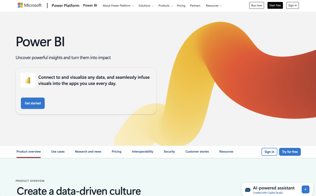
Nobody chooses Power BI. You wake up one morning and you're on it.
The licence came bundled with something else, it opens Excel files without complaining, and nobody had to drag a new vendor through procurement. Those are unglamorous reasons and they explain Microsoft's market share better than any feature does.
Once you're there, it earns its keep.
Power Query handles transformation before the chart, which makes Power BI the closest thing here to a real preparation layer. It asks more patience than most business users have spare.
DAX will build almost any measure you can describe, assuming you're willing to climb the learning curve.
The catch isn't on the price list. It's in the licensing.
Everyone who opens a shared report needs their own licence, and the free tier can't share with anybody at all. Free Power BI is single-player, in a category whose whole point is showing one number to a lot of people.
Under about thirty readers it's the cheapest serious option here. Over that, you're paying per head for people who only ever look. Our Power BI pricing breakdown works through the tiers, and how to create a Power BI dashboard covers a build end to end.
Power BI pricing: $14/user/month on Pro, $24/user/month on Premium Per User, both paid yearly.
Best BI platform for analysts who need real depth
3. Tableau
Tableau pros:
- The deepest visual analysis of anything on this list
- Separate Viewer and Explorer seats, so readers cost less than builders
- Enormous community, template library and hiring pool
Tableau cons:
- Charges twice for scale, per seat and again through the edition
- Needs more skill to run than anything else here
- The pricing page opens on the expensive edition
Tableau is built for people who look at data all day and has never pretended otherwise. When somebody needs to slice a chart six ways to answer a question nobody thought to ask yesterday, nothing else here keeps up.
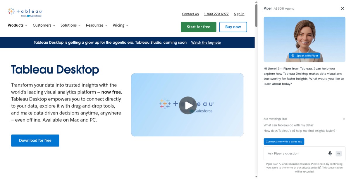
The depth comes with a real learning curve, offset by the largest community in analytics. Whatever problem you're having, somebody's had it before and written it up, which is worth more than it sounds when you're three hours into a calculation that refuses to behave.
One thing to watch before you compare quotes. Tableau's pricing page opens on the Enterprise edition, where Creator is $115. Standard is $75. Most articles quoting "Tableau pricing" mean Standard and never say so, which makes a quote roughly 50% higher than expected a fairly common surprise. Our Tableau pricing guide keeps the two apart.
Tableau pricing: On Standard, $75/user/month for Creator, $42 for Explorer, $15 for Viewer. The same roles on Enterprise are $115, $70 and $35.
Best free dashboard software for Google users
4. Looker Studio
Looker Studio pros:
- Free, with unlimited dashboards and unlimited viewers
- Native connectors across Google Analytics, Ads, Sheets and BigQuery
- Sharing behaves exactly like a Google Doc
Looker Studio cons:
- Slows noticeably on large or complex data
- Non-Google sources need paid third-party connectors
- Free-tier support is a community forum
Looker Studio settles most budget conversations before they get going. The standard product costs nothing, reads the whole Google stack natively, and shares like any other Google file.
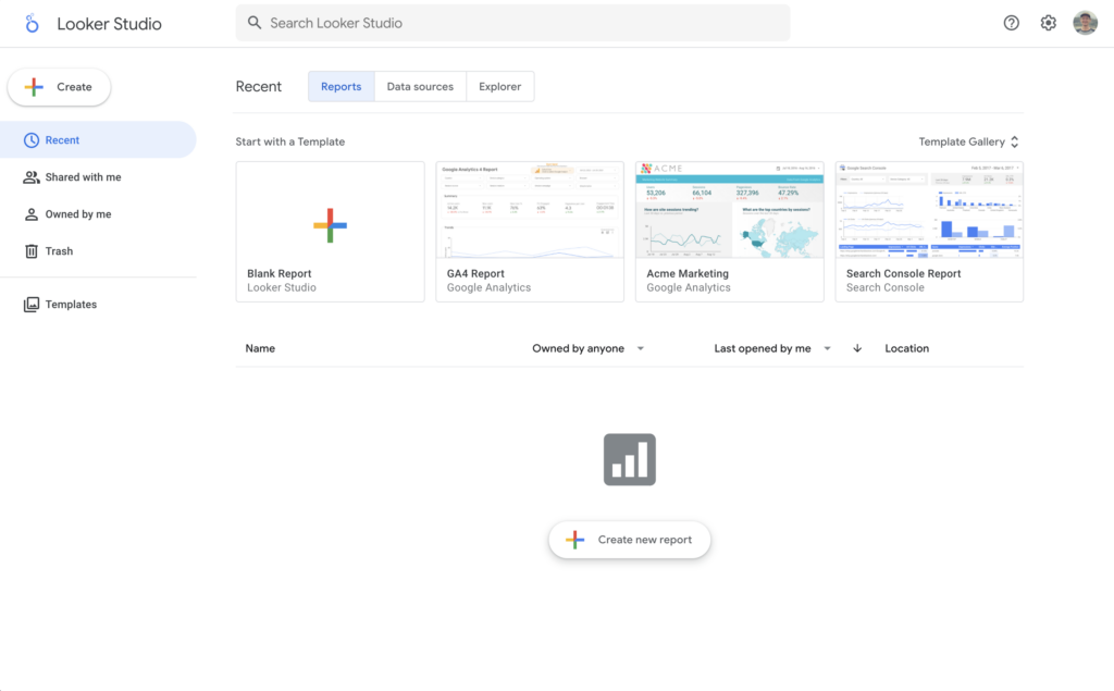
The limits turn up on schedule. It slows on large data, and anything outside Google needs a third-party connector billing per source per month, so a "free" setup pulling from Facebook Ads and a warehouse stops being free once you total those up.
Start here if your data is Google's. Spend nothing until it gets slow.
It will get slow. You'll know the exact week it happens.
Looker Studio pricing: Free. Pro is $9/user/project/month for team workspaces and Google Cloud support.
Best cheap BI suite for small teams
5. Zoho Analytics
Zoho Analytics pros:
- Full BI suite at a fraction of Qlik or Tableau's entry price
- 50+ visualisation types and unlimited reports on every tier
- Ask Zia builds charts from plain-language questions
Zoho Analytics cons:
- Read-only viewers are a paid add-on sold in blocks of 25
- Dense interface
- Makes most sense if you already run other Zoho products
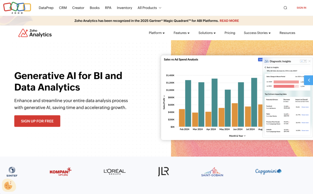
Zoho Analytics is the value pick here by a wider margin than most comparisons admit. You get modelling, an AI assistant, 50+ chart types and 500+ data sources for a fraction of what Qlik or Tableau charge to let you in the door.
The catch is easy to walk past on the pricing page.
Read-only viewers are a separate add-on: $80 a month per block of 25, and 25 is the smallest block sold. Two hundred readers means eight blocks stacked on top of your plan.
That turns a $48 tool into something rather different.
Zoho Analytics pricing: $24/month for 2 users, $48 for 5, $115 for 15, $455 for 50, all billed annually. Extra users $6.40. Viewers $80/month per 25.
Best dashboard tool for office wall screens
6. Geckoboard
Geckoboard pros:
- Unlimited free viewers on every tier
- Visualisations sized to be read from across a room
- Screen pairing and rotating loops for TV dashboards
Geckoboard cons:
- Display only, so analysis has to happen before the data arrives
- Costs climb with dashboard count, not reader count
Geckoboard knows exactly what it's for, which is rarer than it ought to be. It builds a screen on the wall that people read walking past: big numbers, not many of them, legible from the far side of the room. For a sales leaderboard specifically, my guide to sales dashboard software compares it with the CRMs' own dashboards.
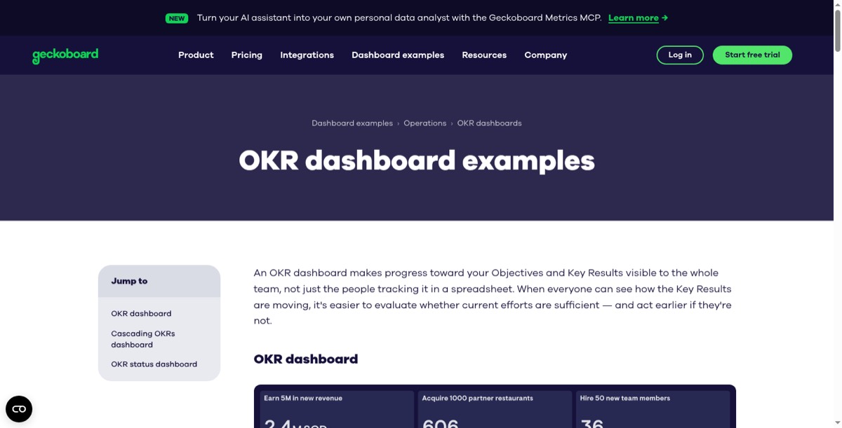
Because it never charges for viewers, the bill doesn't budge when more people start reading, which is the opposite of how Power BI and Tableau behave. What does move it is teams each wanting their own board, so the maths turns at around ten dashboards.
Geckoboard pricing: $79/month on Essentials for 2 dashboards, 1 editor and 1 screen. Performance is $319/month for 20 dashboards and 3 editors. Extra dashboards on Essentials are $24 each.
Best reporting tool for data that has to stay fresh
7. Klipfolio
Klipfolio pros:
- The only vendor that prices refresh rate openly
- Unlimited users on every plan
- 130+ data integrations
Klipfolio cons:
- Dashboard count and refresh rate are sold together
- Custom metrics take longer to build than picking a template
Klipfolio charges you openly for how recent your data is. Once you've spotted that, you start noticing everyone else doing the same thing quietly inside their tiers.
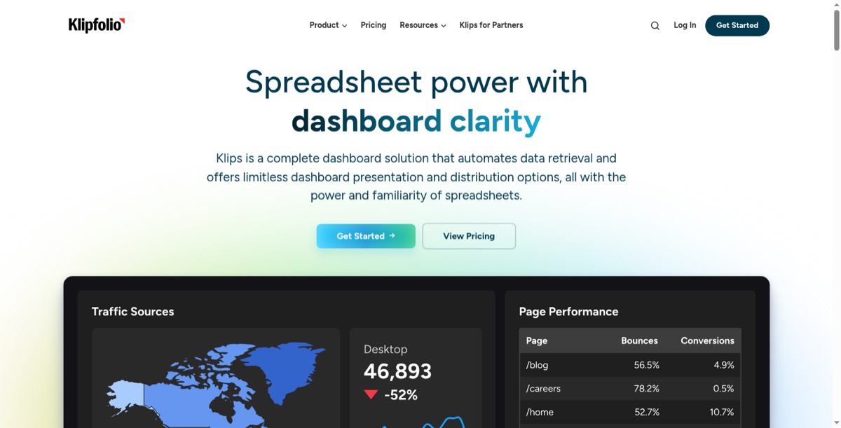
The two knobs are welded together, so you can't buy one fast board and thirty-nine slow ones. Work out how quickly your number moves before you pick a tier, because it's easy to buy a fifteen-minute refresh for a figure that changes on Fridays.
Klipfolio pricing: $120/month for 3 dashboards on a 4-hour refresh, $190 for 10 on 1 hour, $310 for 20 on 15 minutes, $600 for 40 up to the minute.
Best client reporting tool for agencies
8. Databox
Databox pros:
- Billed per client rather than per seat
- Reports that send themselves on a schedule
- A free tier you can run a real report on
Databox cons:
- Counts data sources, not dashboards
- Lower tiers are single-user
Databox is built for reporting outward rather than inward, and the structure gives it away: channel templates, scheduled sends, and a plan priced per client instead of per person. If the source meter or the single-user entry tier is what puts you off, we compared the field in 13 Databox alternatives.
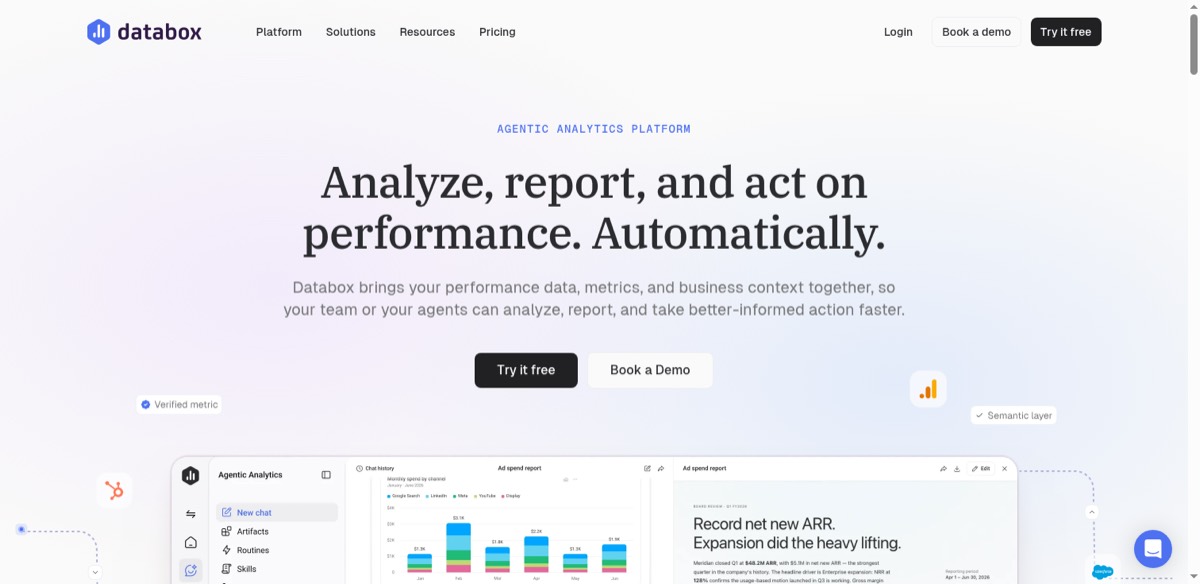
It counts data sources, not dashboards, so pulling from a dozen systems climbs the tiers fast even when everything lands on a single screen. My comparison of marketing dashboard software prices Databox against nine other tools for a 10-client agency.
Databox also restructured these plans during 2026. Older comparisons describe a price list that no longer exists, so check the date on anything you read about Databox pricing, including ours.
Databox pricing: Free for 1 user and 3 data sources. Analyst $71/month, Team $199/month for 3 users and 10 sources, Agency from $79/month plus $20 per client pack, all billed yearly.
Best open-source dashboard tool
9. Metabase
Metabase pros:
- The open-source edition is a complete product, not a limited demo
- Question builder for non-technical users alongside a full SQL editor
- Runs on your own infrastructure, so data never leaves
Metabase cons:
- Somebody has to patch it, back it up and answer the pager
- The jump from Starter to Pro is $475/month
Metabase is what comes up when an engineer asks why you can't just host this yourselves. The open-source edition is the full product, which is unusual enough to say out loud.
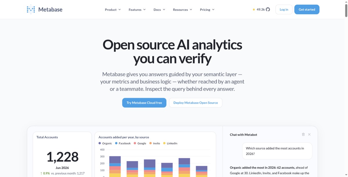
The catch is the one every self-hosted tool carries.
Free covers the licence. Not the person who patches it, backs it up, and gets paged when it falls over at two in the morning.
That cost never lands on an invoice, which is why self-hosting looks cheaper than it is until whoever maintains it takes a fortnight off.
Metabase pricing: Open source is free. Cloud Starter $100/month including 5 users then $6 each, Pro $575/month including 10 then $12 each, Enterprise from $20,000/year. Worked costs by team size are in our Metabase pricing guide.
Best monitoring dashboard for engineering metrics
10. Grafana
Grafana pros:
- Purpose-built for time-series and observability data
- Alerting that routes into PagerDuty, Slack and on-call rotations
- Huge library of community dashboards and plugins
Grafana cons:
- Bills on data ingestion and retention as well as users
- Wrong shape for business metrics like revenue by region
Grafana comes at this category from a different direction, because it was built for time-series data. Latency, error rates, queue depth, server health. Not revenue by region.
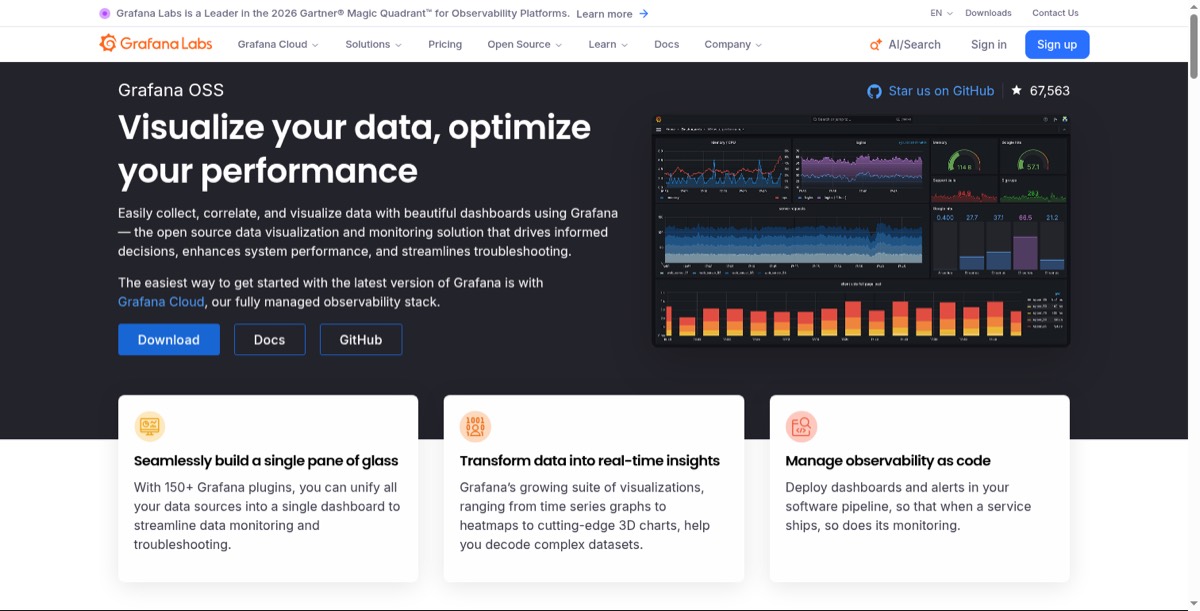
The part that surprises people is that Grafana also bills on ingestion and retention, so a chatty metrics pipeline moves your bill in a way a seat count never would.
Grafana pricing: Free tier up to 10k active series. Pro is a $19/month platform fee including 10k active series, then $6.50 per 1k series beyond that. There is no per-user charge on core Grafana Cloud; the $20 per active user rate applies to the Grafana Assistant AI add-on only.
Best analytics platform for governed data
11. Qlik
Qlik pros:
- Associative engine explores the whole data model, not a fixed join path
- Managed spaces, data lineage and impact analysis
- No charge for extra users above the Starter tier
Qlik cons:
- The most expensive entry point on this list
- Unlimited users don't arrive until $825/month
Qlik is what organisations buy when the requirement is governance rather than speed. Managed spaces, data lineage, and a layer IT will put its name to.
Its associative engine works differently from everything else here, exploring relationships across the full model instead of following a join path somebody defined in advance. Depending on how your data's shaped, that's either the whole reason to buy Qlik or completely beside the point. Our Qlik pricing guide covers all four tiers.
Qlik pricing: Cloud Analytics Starter $300/month for 10 users and 10 GB, Standard $825/month for 25 GB with unlimited users, Premium $2,750/month for 50 GB.
Best BI tool for plain-language questions
12. ThoughtSpot
ThoughtSpot pros:
- Natural-language search across your data
- Spotter, an AI analyst you query in natural language
- Handles large row counts on cloud warehouses
ThoughtSpot cons:
- Expects a modelled warehouse underneath to answer well
- Switches to consumption pricing above Essentials
ThoughtSpot's bet is that people would rather type a question than hunt for the right chart, which suits organisations where the questions keep moving and nobody wants to file a ticket every time.

The bigger caveat is architectural rather than commercial. ThoughtSpot needs a modelled warehouse underneath it to answer well, so it's less a starting point than a layer you add once a data platform already exists.
ThoughtSpot pricing: Essentials $25/user/month billed annually for 5-50 users and 25 million rows. Pro moves to consumption pricing, Enterprise is a quote.
Best enterprise BI platform for large rollouts
13. Domo
Domo pros:
- 1,000+ connectors, one of the widest ranges available
- Magic ETL for transformation inside the platform
- Scales to tens of thousands of users
Domo cons:
- No public pricing at all
- Consumption credits make the bill hard to forecast
Domo is a full cloud data platform that happens to put dashboards on top. Integration, transformation, app building and distribution to thousands of users, all in one system.
The breadth is the pitch and also the problem. You cannot price Domo from its website at all, which tells you plenty about who it's built for.
We keep what customers report paying on a separate page, labelled as third-party reports, because that is exactly what they are.
Domo pricing: No public price. Quoted per deployment.
What these tools cost once everybody's reading
Every round-up prices the people who build dashboards. Almost nobody prices the people who only read them.
Which is odd, because readers outnumber builders roughly ten to one, and they're the entire reason the dashboard exists.
So I held builders at three and moved only the reader count.
| Tool | 10 readers | 50 readers | 200 readers |
|---|---|---|---|
| Looker Studio | $0 | $0 | $0 |
| Grafana Cloud Pro | $228 + usage | $228 + usage | $228 + usage |
| Geckoboard Essentials | $948 | $948 | $948 |
| Klipfolio Base | $1,440 | $1,440 | $1,440 |
| Zoho Analytics Standard | $1,536 | $2,496 | $8,256 |
| Metabase Cloud Starter | $1,776 | $4,656 | $15,456 |
| Mammoth Team | $1,788 | $1,788 | $1,788 |
| Power BI Pro | $2,184 | $8,904 | $34,104 |
| Tableau Standard | $4,500 | $11,700 | $38,700 |
| Tableau Enterprise | $8,340 | $25,140 | $88,140 |
Annual cost, three builders plus the readers shown, at published annual rates on 17 September 2026. Mammoth is our own product and three builders puts it on Team. Grafana Cloud carries a $19/month platform fee; its usage charges track active metrics series, so the total moves with how much data you send it rather than with how many people read a board.
The flat rows stay flat because those vendors don't charge for readers at all.
The per-seat rows climb forever, because a per-seat vendor sees no difference between the analyst who lives in the tool and the colleague who checks one figure before a Monday meeting. Same licence. Same price.
That's how you end up at ninety-three times.
Which dashboard software should you choose?
Count your readers. Most of the answer falls straight out of that number.
Under thirty? Power BI if you're a Microsoft shop, Zoho if you're not. The per-seat maths hasn't turned against you yet, and these are the two cheapest ways in.
Over fifty? Look hard at the flat-rate options. Geckoboard at $948 a year and Klipfolio at $1,440 do not care how many people read. At that headcount, the gap against Tableau Enterprise is roughly a junior salary.
And if the number itself is the problem, scattered across systems and wrong again by Wednesday, the display tools won't help you. That work happens before the chart.
Mammoth is first on this list because it does both halves. It's also why its viewers cost nothing, however many people you send the board to.
Dashboard software for small business
Business dashboard software is the same category as everything above. The word "business" usually means the people reading it run the company rather than analyse data for a living.
At small-business size, three things decide the choice more than features do.
A free way in. Looker Studio is free. Databox has a free plan for one user and three data sources. Mammoth's free plan gives you one builder and three dashboards, but it reads files and databases only, so connecting apps like a CRM starts on Starter at $39/month.
Readers who cost nothing. A small team still wants everyone to see the numbers. Geckoboard ($79 a month for two dashboards) and Klipfolio ($120 a month for three) include unlimited viewers, and so does every Mammoth plan. Power BI and Tableau charge for each person who reads a shared report.
Data from the tools you already run. Most small businesses keep their numbers in an accounting tool, a CRM and a few spreadsheets. If one dashboard needs all three, check that the tool can combine them, not only connect to each one.
Put together, the shortlist is short:
- Your data is mostly in Google: Looker Studio, free.
- Two people and a tight budget: Zoho Analytics, from $24 a month for two users.
- Numbers on an office screen: Geckoboard, from $79 a month.
- Data spread across several tools that has to be combined first: Mammoth.
Frequently asked questions
What is the best dashboard software?
Mammoth is the strongest all-rounder if you want the dashboard builder and the data prep in one place, with 42 chart types and free unlimited viewers. After that it depends on what you already run: Power BI inside Microsoft, Tableau for analysts who need depth, Looker Studio if your data is in Google, Geckoboard for a wall screen.
What is business dashboard software?
Business dashboard software shows a company's key numbers, such as sales, cash and pipeline, on one screen that updates itself. It's the same category as the tools in this guide; "business" usually means the readers run the company rather than analyse data.
What is data dashboard software?
Data dashboard software connects to your data sources and turns the numbers into charts that refresh on a schedule. Some tools also clean and combine the data first, which matters when it comes from several systems.
How much does dashboard software cost?
Between $948 and $88,140 a year for three builders and 200 readers, across the thirteen tools priced here. The spread comes almost entirely from whether readers are charged. Flat-rate tools start around $79 to $120 a month; per-seat tools start at $14 a user a month and grow with your audience.
Does dashboard software charge for viewers?
Often, and it is the single most expensive variable. Power BI and Tableau charge per person, including people who only read. Zoho charges $80 a month per 25 viewers as an add-on. Geckoboard, Klipfolio and Mammoth include unlimited viewers at no cost.
Is free dashboard software good enough?
Sometimes. Metabase's open-source edition is a real product with unlimited users if somebody will host and maintain it. Looker Studio is free and fast if your data already lives in Google. Both stop being free the moment your scarce resource is engineering time instead of budget.
What data do I need before a dashboard will render?
Less than people expect. Mammoth's Sales KPI Scorecard needs a money column and a category column with about three values. The harder requirement is that the numbers are correct and consistent across sources, which is where multi-system data usually fails.
What is the difference between dashboard software and BI tools?
Dashboard software displays a fixed set of numbers and refreshes them, while BI platforms add modelling, ad hoc querying and governance on top. That is why Tableau, Qlik and ThoughtSpot cost more and take longer to roll out than Geckoboard or Klipfolio.
How long does it take to build a dashboard?
An afternoon if the data is clean and in one system, because every tool here has templates. Weeks if the numbers live in three systems and disagree with each other, and almost all of that time goes on reconciling sources rather than on the dashboard itself.
Can dashboard software connect to more than one data source?
Every tool here does. The useful question is how many, and which ones.
Klipfolio publishes 130+ integrations. Looker Studio is native to Google and third-party to everything else. Check your own four or five systems against the list before comparing prices.
Do I need a data warehouse to use dashboard software?
No, for most teams. These tools connect directly to spreadsheets, databases and SaaS apps. A warehouse becomes worthwhile when several tools need the same definitions, when queries get slow, or when history has to outlive the source system.
What is the cheapest dashboard software?
Looker Studio at $0 if your data is in Google, and Grafana Cloud's free tier if your data is time-series. Among paid tools with unlimited readers, Geckoboard at $79 a month and Klipfolio at $120 are the cheapest that scale to a large audience without a per-seat bill.