Financial dashboards
Financial dashboard examples
In short
What a financial dashboard is
A financial dashboard is a single screen tracking the money: what came in, what it cost, and what is still owed. Finance teams also call it a finance or accounting dashboard. The useful ones do one job, the P&L or the working capital, and point at the exception rather than stopping at the total.
The examples
Six financial dashboard examples
Real Mammoth templates on sample data. Every figure is illustrative.
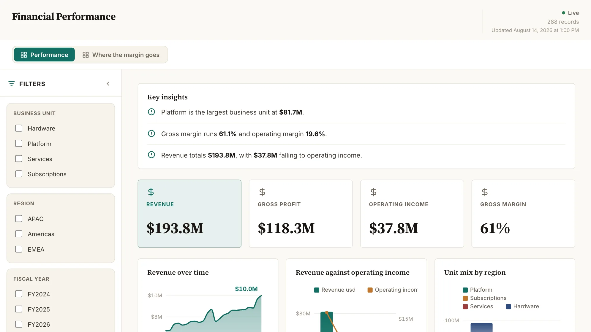
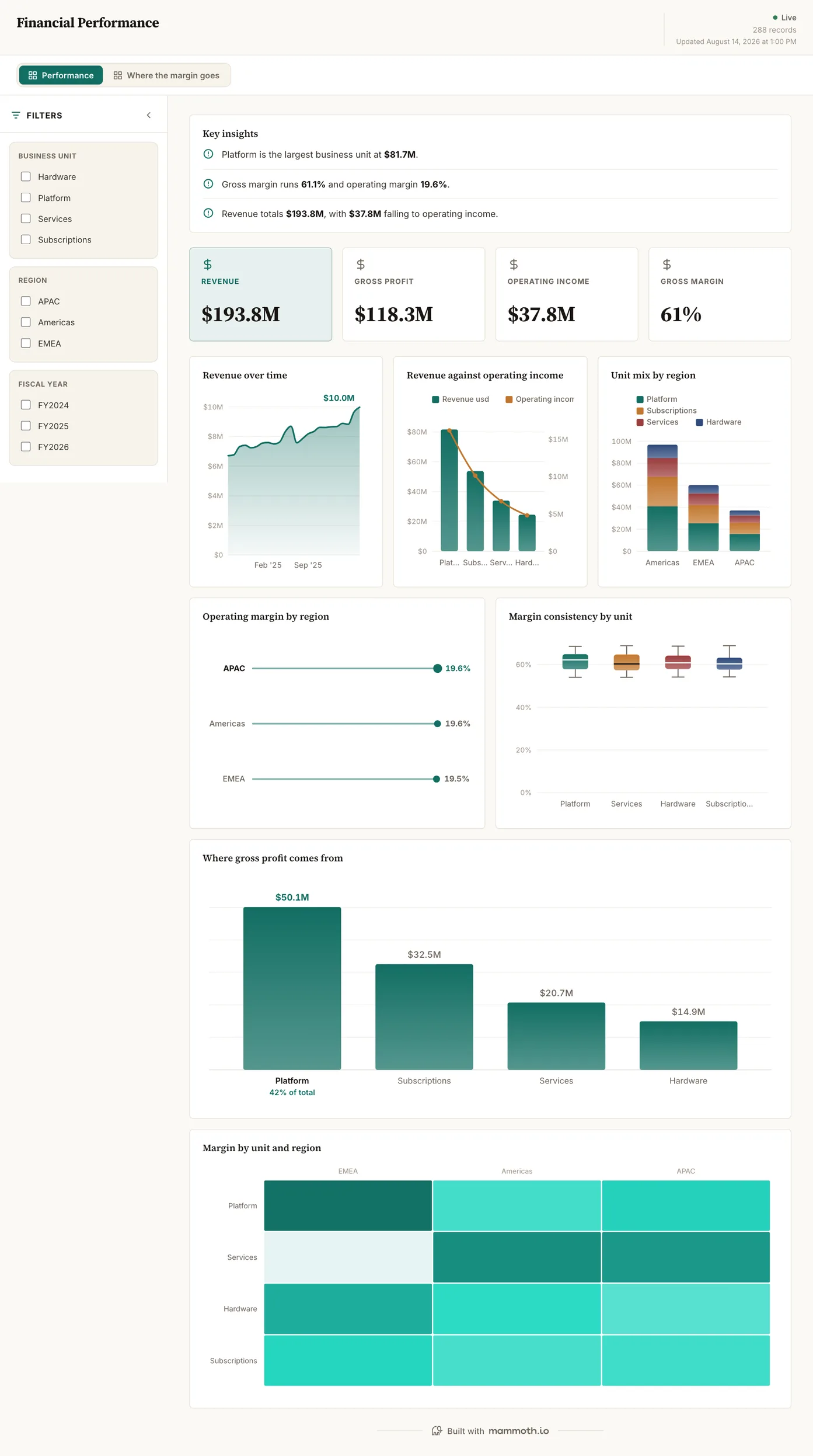
Example 01· Template: Financial Performance
Financial reporting dashboard
Where is the money coming from, and what survives the trip to operating income?
Revenue, gross profit and operating income on one strip, then the same figures cut by business unit and by region. The second page follows the margin specifically, because 'revenue is up' and 'margin is up' are different sentences and finance meetings run aground on the difference.
What is on it· 2 pages · Performance / Where the margin goes
- Revenue over time
- Revenue against operating income
- Unit mix by region
- Operating margin by region
- Margin consistency by unit
- Where gross profit comes from
- Margin by unit and region
Your data needsDashboard
- a revenue or money column
- a category (~4 values)
Sample data: illustrative figures, not business results. Example 02· Template: Budget vs Actual
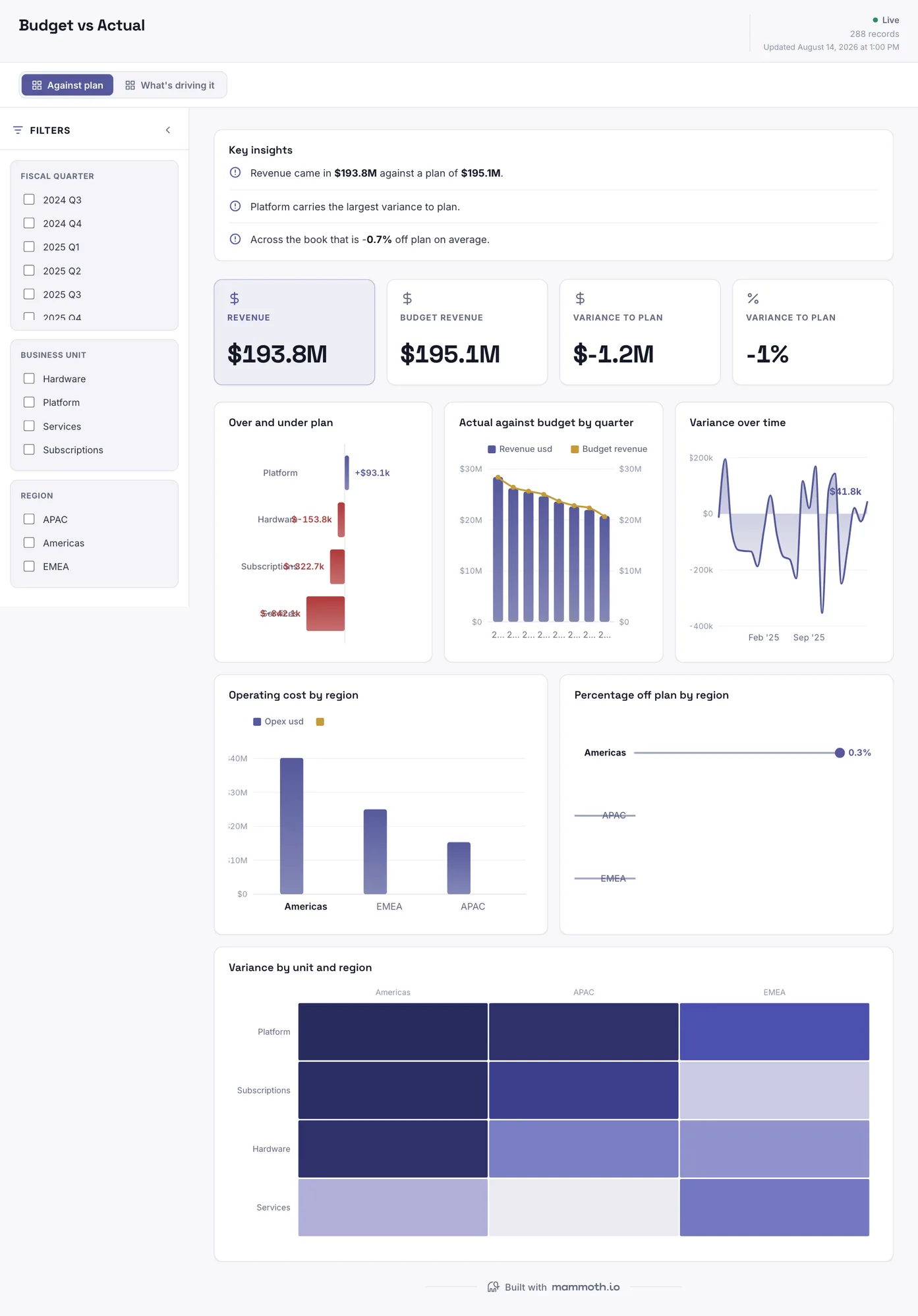
Budget vs actual dashboard
Where did the plan hold, and where did it not?
Actual against plan by unit, region and quarter. The cut is the point: a variance figure without the breakdown that produced it starts an argument rather than settling one, and the quarter view shows whether a miss is a blip or a trend.
What is on it· 2 pages · Against plan / What's driving it
- Over and under plan
- Actual against budget by quarter
- Variance over time
- Operating cost by region
- Percentage off plan by region
- Variance by unit and region
Your data needsDashboard
- a revenue or money column
- a category (~4 values)
Sample data: illustrative figures, not business results. Example 03· Template: Financial KPI Scorecard
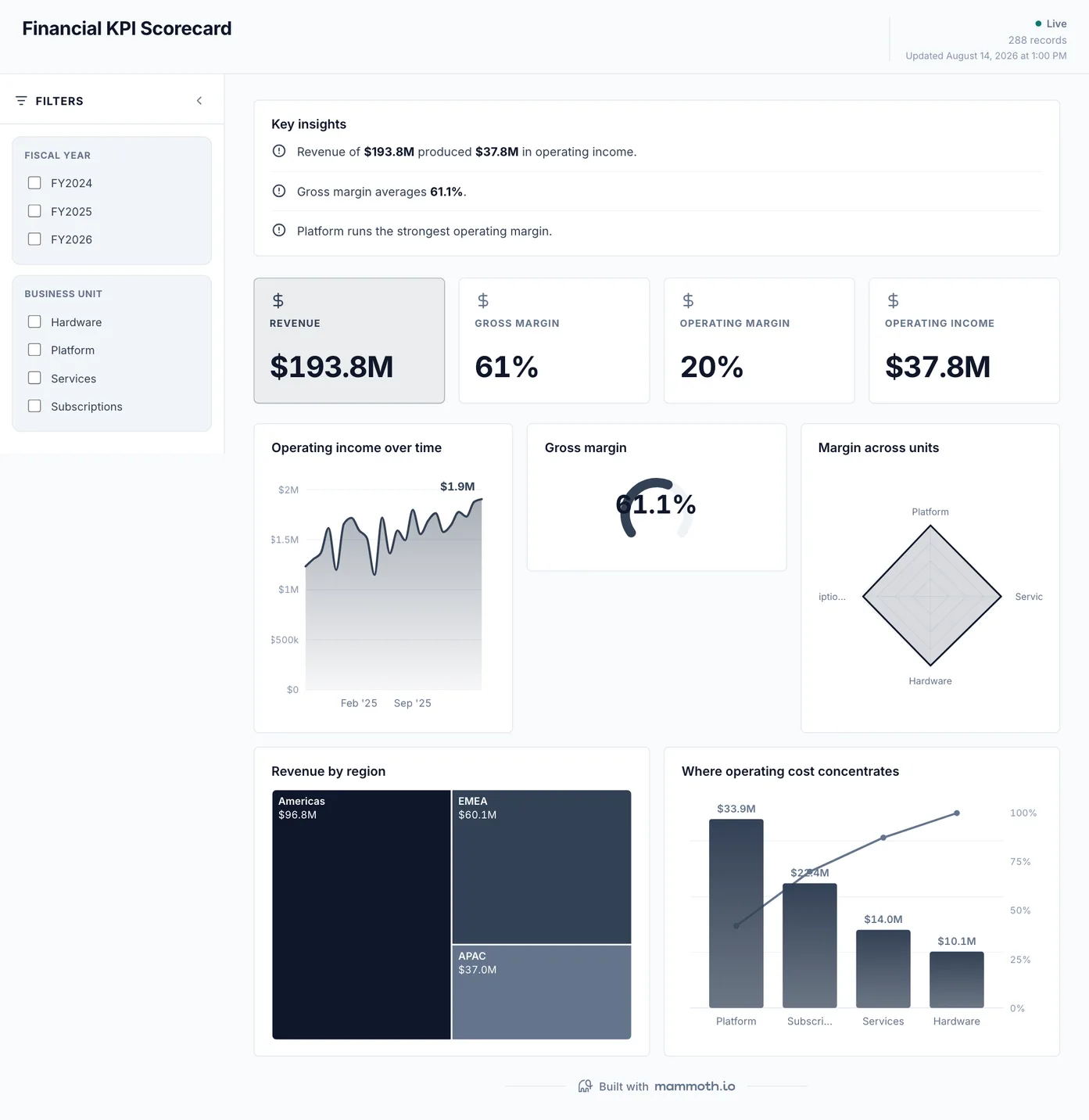
Financial KPI dashboard
What are the four numbers this review opens with?
The short list, each with its trend rather than a single value. Built for the meeting that starts with 'how are we doing': sparse on purpose, because a scorecard that lists everything is a report, and a report is a different artifact.
What is on it
- Operating income over time
- Gross margin
- Margin across units
- Revenue by region
- Where operating cost concentrates
Your data needsDashboard
- a revenue or money column
- a category (~8 values)
Sample data: illustrative figures, not business results. Example 04· Template: Collections & AR Aging
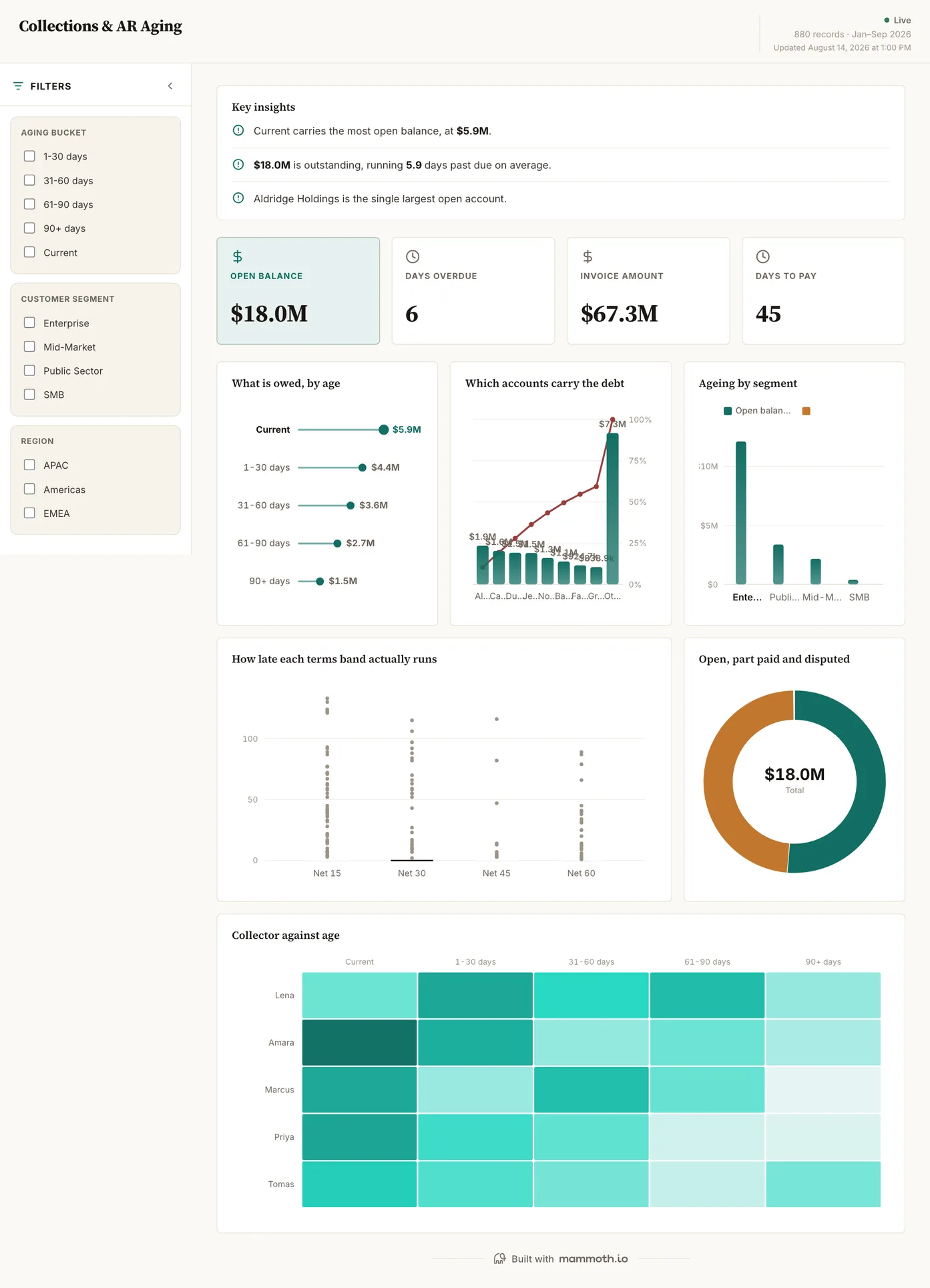
Accounts receivable dashboard
Who owes us, how old is it, and who is chasing it?
The open ledger by age bucket, with the accounts carrying the balance ranked underneath and each payment-terms band shown against how late it actually runs. Disputed and part-paid are separated from simply overdue, because those are three different phone calls.
What is on it
- What is owed, by age
- Which accounts carry the debt
- Ageing by segment
- How late each terms band actually runs
- Open, part paid and disputed
- Collector against age
Your data needsDashboard
- a revenue or money column
- a category (~5 values)
Sample data: illustrative figures, not business results. Example 05· Template: Cash Collection Forecast
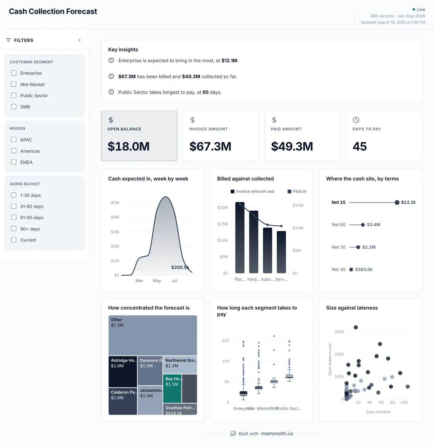
Cash collection forecast
When does the open ledger turn into cash?
Expected receipts week by week, with billed set against collected and the forecast's concentration shown: one late payer on a top-heavy week is a different risk from the same amount spread thin. Inflows only: this forecasts collection, not a net cash position. It is the money-in half of a cash flow view, and the spend dashboard below is the money-out half.
What is on it
- Cash expected in, week by week
- Billed against collected
- Where the cash sits, by terms
- How concentrated the forecast is
- How long each segment takes to pay
- Size against lateness
Your data needsDashboard
- a revenue or money column
- a category (~4 values)
Sample data: illustrative figures, not business results. Example 06· Template: Spend & Vendor Concentration
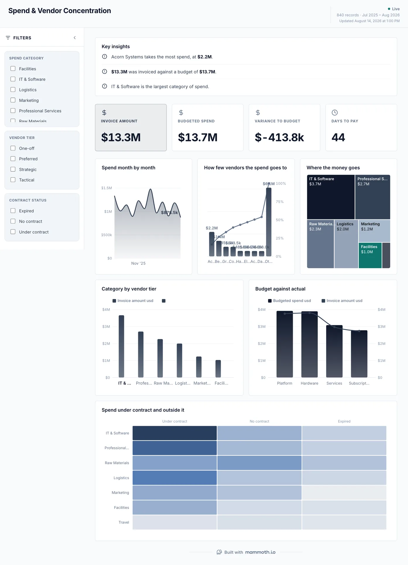
Spend dashboard
Where does the money go, and how few vendors does it go to?
Spend by month and category against budget, with the concentration curve that says how much of the total rides on a handful of vendors. The last chart splits spend under contract from spend outside it, which is usually the number nobody has to hand.
What is on it
- Spend month by month
- How few vendors the spend goes to
- Where the money goes
- Category by vendor tier
- Budget against actual
- Spend under contract and outside it
Your data needsDashboard
- a revenue or money column
- a category column
Sample data: illustrative figures, not business results.
The metrics
The metrics a financial dashboard is built from
Twelve numbers, split the same way the six dashboards are: six that follow the P&L and six that follow the working capital. The last column is where finance dashboards go wrong, and it is almost never the chart.
| Metric | What it answers | What your data needs |
|---|---|---|
| Gross margin | What is left after the cost of delivering the revenue? | Revenue and cost of sales for the same period, from one agreed definition of which costs are direct. A margin that moves when nothing happened is usually a reclassification. |
| Operating income | What does the business earn before financing and tax? | Revenue, cost of sales and operating expenses mapped to one chart of accounts. Two ledgers with different account trees have to be reconciled before this computes. |
| Variance to plan | Where did the month land against what was committed? | Actuals and budget at the same granularity, matched on both period and account. Annual budgets read against monthly actuals are the most common reason this reads wrong. |
| Revenue growth | Is the top line moving, and by how much? | Revenue by period on a consistent period boundary, and a rule for restatements. A prior period that changed after close will move this without anything happening in the business. |
| Net profit margin | How much of each sale does the business keep once every cost is in? | Revenue and every cost line, including interest, tax and one-off items, for the same period. A one-off left in makes a normal month read as a collapse or a record. |
| Operating expense ratio | Is the cost of running the business growing faster than revenue? | Operating expenses and revenue for the same periods, with people costs coded the same way every month. A cost moved between cost of sales and operating expense changes this ratio without any spending changing. |
| Days sales outstanding | How long does it take to turn an invoice into cash? | Invoice dates, payment dates and open balances over one window, with credit notes handled explicitly rather than left as negative invoices. |
| Receivables ageing | How old is what is owed, and who owes it? | Open balance per invoice with a due date, bucketed from the due date rather than the invoice date. Bucketing from the invoice date makes every customer on long payment terms look delinquent. |
| Expected collections | When does the open ledger become cash? | Open invoices with due dates, plus how each customer has actually paid before. A forecast on terms alone assumes everyone pays on the day, which nobody does. |
| Spend concentration | How much of the outflow rides on a handful of vendors? | Supplier spend over a window with vendor names normalised, and a flag for whether the spend sits under contract. The same vendor spelled three ways reads as three small suppliers. |
| Days payable outstanding | How long does the business take to pay its suppliers? | Bill dates, payment dates and open payables over one window. Bills keyed in days after they arrived make payment look faster than it is. |
| Operating cash flow | Does the business turn its profit into cash? | Operating income plus the movement in receivables, payables and stock over the same period. Profit with receivables growing faster than revenue is cash that has not arrived yet. |
Other formats
The same numbers, three other ways
A dataset does not only become a dashboard. These three are built from the same 288-row P&L as the first three dashboards above, reshaped rather than rebuilt: a written month-end report, a quarterly summary, and a board presentation. The receivables and spend dashboards run on their own ledgers and have no written form in the catalogue.
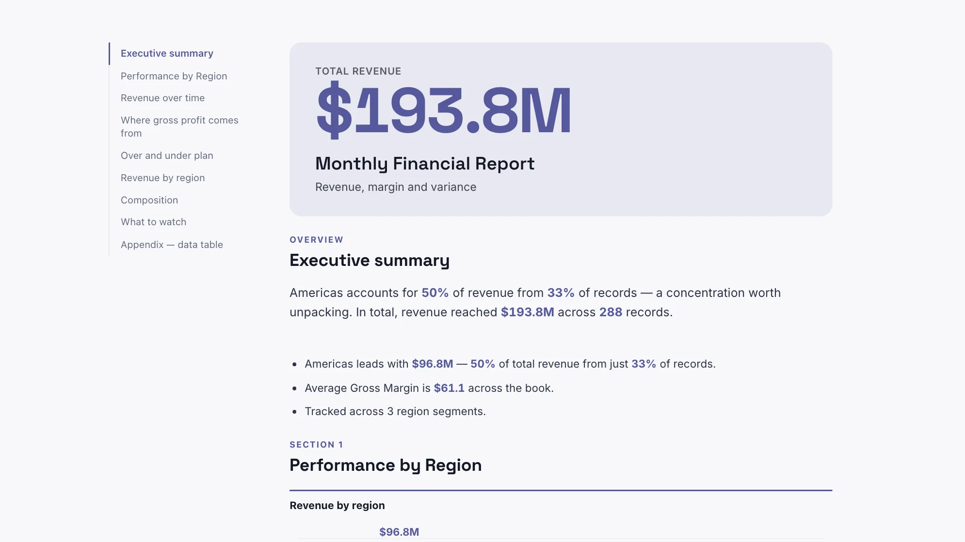
Sample data: illustrative figures, not business results. Monthly Financial Report
Can somebody read the month rather than interpret it?
The month written up: revenue, margin, variance to plan and what moved.
Finance · Document
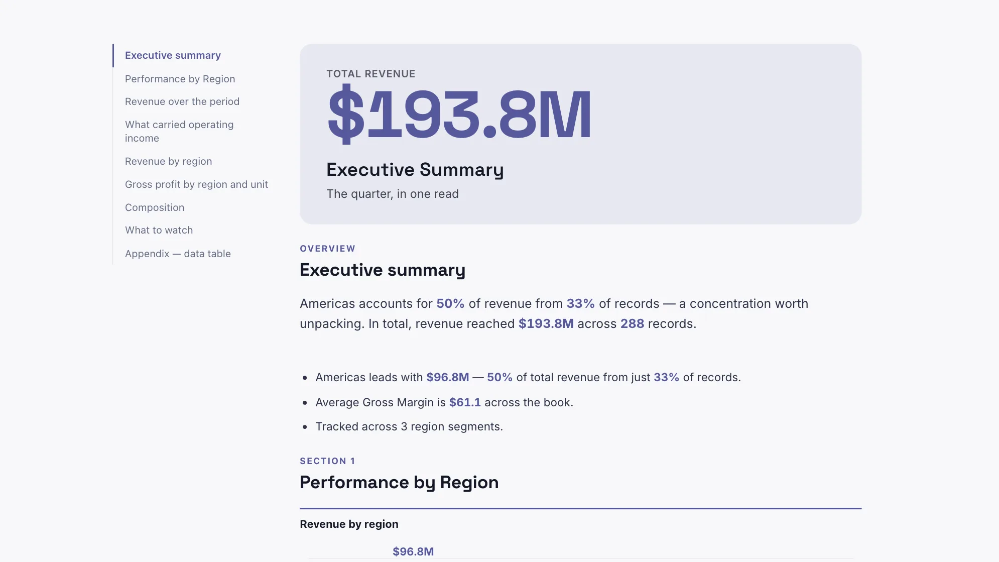
Sample data: illustrative figures, not business results. Executive Summary
What does the quarter say, in one read?
The quarter in one read: what the numbers did, where, and against plan.
Finance · Document
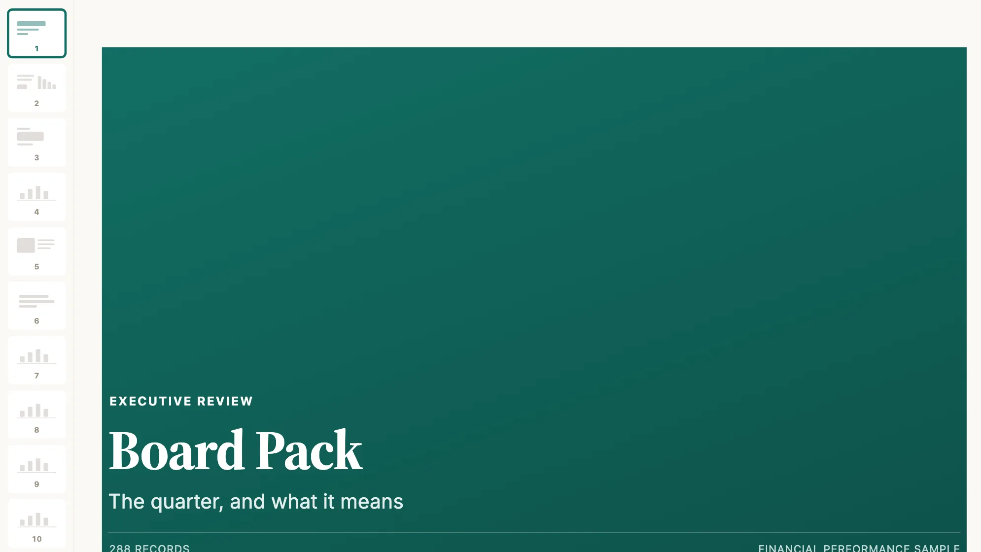
Sample data: illustrative figures, not business results. Board Pack
What goes in front of the board?
The quarter for a board audience: revenue, margin, plan and what is next.
Finance · Presentation
Proof
Finance and reporting teams already running on Mammoth
Published customer stories, linked rather than summarised. None of them is a dashboard from this page. They are about the half nobody photographs: many systems, reconciled once, on a schedule.
- MUFGCapital adequacy, credit risk and compliance metrics spread across more than fifteen legacy systems in treasury, lending and compliance, reconciled by hand each quarter.
- BacardíOn-trade and off-trade data from 170+ markets arriving as Excel files, SAP extracts and CSV drops, every one of them formatted differently.
- Arla FoodsA central team hand-processing over a billion rows a month into static spreadsheets that took up to twenty days to prepare: the month-end problem at scale.
From example to live dashboard
Pretty is easy. Current and true is the hard part.
Any of these can be drawn in a slide. What makes one worth keeping is the five steps underneath it, and they are the same five whichever example you start from.
- 01
Connect the source
The dashboard reads the system, not an export somebody saved to their desktop. 100+ tested connectors, plus anything with a REST API.
- 02
Prepare it once
Cleaning, joining and reshaping are recorded as steps you can read, change and re-run, not a formula buried three sheets deep.
- 03
Check it before anyone sees it
Data checks run with the refresh and flag the rows that fail, so a broken upstream file shows up as an alert rather than as a wrong number in a meeting.
- 04
Put it on a schedule
Refresh on a schedule and the dashboard stays current on its own. Starter refreshes weekly, Team daily, and Pro every three hours.
- 05
Publish it and send the link
Public, password-protected or sign-in only. Every sharing mode is available on every plan, including the free one.
Already have the data in a spreadsheet? Turn it into a dashboard with the AI dashboard generator.
Sharing
Everyone can see it.
Nobody pays to look.
Most dashboard tools charge for every person who opens one, which is why so many dashboards end up as a screenshot pasted into a message. Mammoth charges for the people who build. Viewers are unlimited and free on every plan, including the free one.
You pay for
The people who build
Anyone connecting a source, preparing data or publishing a dashboard counts as a platform user.
You never pay for
The people who look
Viewers are unlimited and free on every plan, including the free one. A board, a client list or a whole company: the number does not change the bill.
Plans differ in how many builders and published dashboards a workspace gets. Drafts, viewers and every sharing mode are unlimited and free on all four. Full pricing.
Financial dashboard questions
What should a financial dashboard include?
How do I create a financial dashboard?
Which financial dashboard should I start with?
What is the difference between a financial dashboard and a financial report?
How is a CFO dashboard different from an executive dashboard?
Where does the data come from?
How do I stop the numbers going stale?
Can I share it with people who are not finance?
Last reviewed against the template catalogue.





Build the financial dashboard you actually need.
Connect a source, prepare it once, and publish. Everyone who needs to see it can, at no per-viewer cost.
- ✓ 14-day Pro trial
- ✓ No credit card
- ✓ Viewers always free