HR dashboards
HR dashboard examples
In short
What an HR dashboard is
An HR dashboard is a single screen showing the state of the workforce: headcount, joiners and leavers, tenure, absence and what it all costs. Teams also call it an HR metrics dashboard or a people dashboard. It answers whether the organisation is holding together, which is a question about shape rather than average. Average tenure describes nobody, and the spread behind it is where the problem lives. Each of the four below states the question it answers and what your data needs to contain.
The examples
Four HR dashboard examples
Real Mammoth templates on sample data. Every figure is illustrative, and people data is thin: a rate over a team of six moves on one leaver.
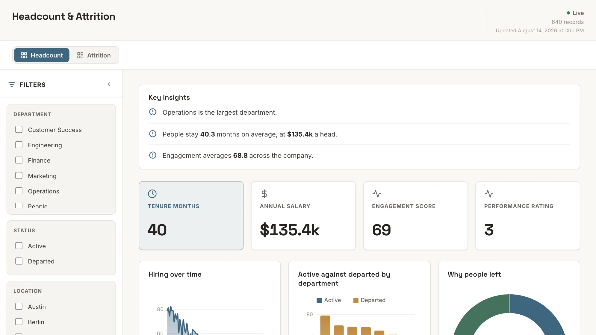
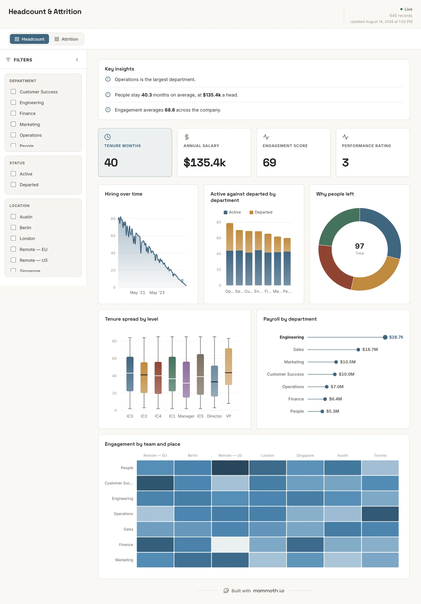
Example 01· Template: Headcount & Attrition
Headcount and turnover dashboard
Is that attrition rate real, or is it one leaver on a small team?
Headcount and attrition by department and level, with tenure alongside. HR data is thin enough that a single leaver swings a small team's rate, so the counts sit next to the percentages rather than behind them.
What is on it· 2 pages · Headcount / Attrition
- Hiring over time
- Active against departed by department
- Why people left
- Tenure spread by level
- Payroll by department
- Engagement by team and place
Your data needsDashboard
- a rate or percentage
- a category (~7 values)
Sample data: illustrative figures, not business results. Example 02· Template: HR Scorecard
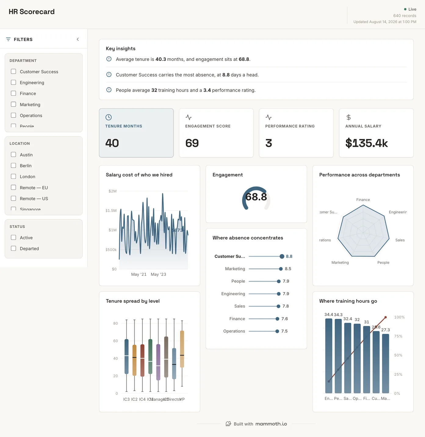
HR scorecard
What are the people numbers a leadership review opens with?
The short list on one screen, for the meeting that starts with a question rather than a deep dive. Sparse deliberately: a scorecard that lists everything has become a report, and the report is the separate artifact below.
What is on it
- Salary cost of who we hired
- Engagement
- Performance across departments
- Tenure spread by level
- Where absence concentrates
- Where training hours go
Your data needsDashboard
- a revenue or money column
- a category (~7 values)
Sample data: illustrative figures, not business results. Example 03· Template: HR Analytics
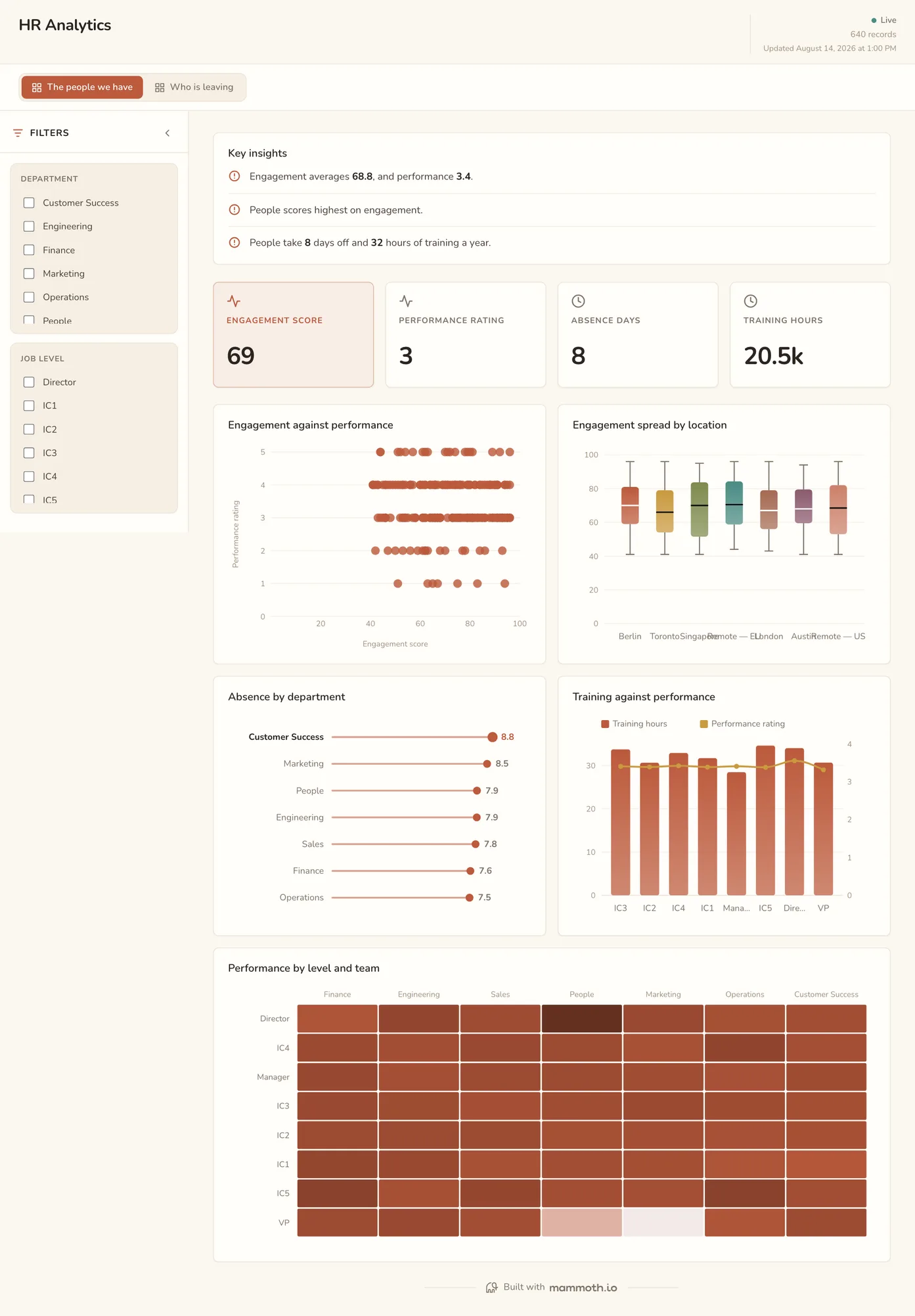
HR analytics dashboard
Which teams are the outliers, and on what?
Engagement, performance and absence read together rather than in three separate reviews. A team with rising absence and falling engagement is telling you something that neither metric says alone, which is the entire reason to put them on one page.
What is on it· 2 pages · The people we have / Who is leaving
- Engagement against performance
- Engagement spread by location
- Absence by department
- Training against performance
- Performance by level and team
Your data needsDashboard
- a score column
- a category (~7 values)
Sample data: illustrative figures, not business results. Example 04· Template: Compensation Review
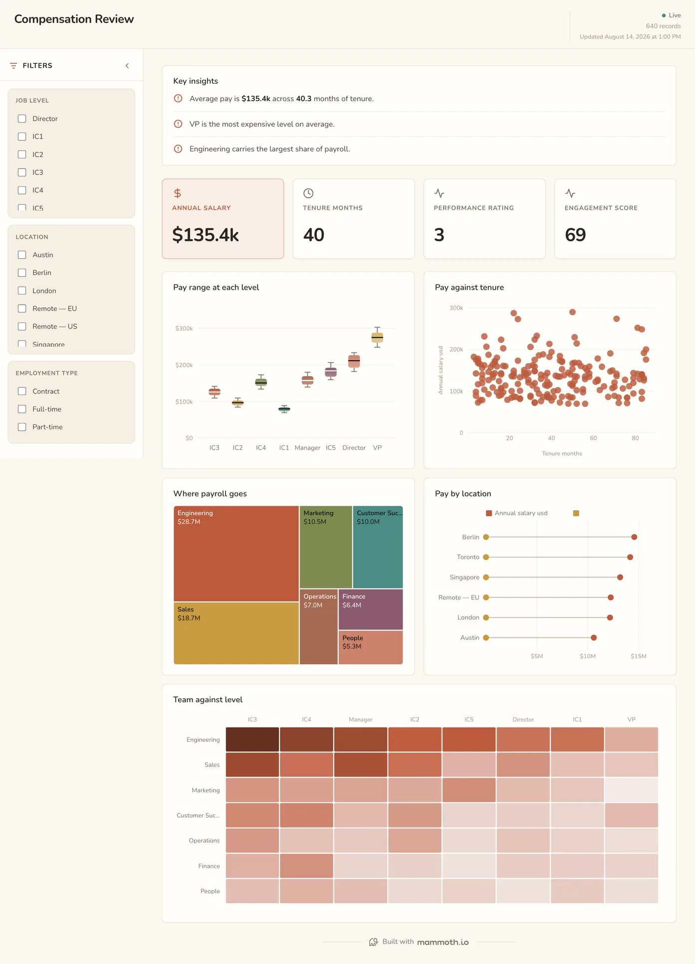
Compensation dashboard
What does each level cost, and where does pay sit against tenure?
Cost by level and location, with pay plotted against tenure so the people who have quietly fallen behind the band are visible. The view a compensation review works from rather than the summary it reports afterwards.
What is on it
- Pay range at each level
- Pay against tenure
- Where payroll goes
- Pay by location
- Team against level
Your data needsDashboard
- a revenue or money column
- a category (~8 values)
Sample data: illustrative figures, not business results.
The metrics
The metrics an HR dashboard is built from
Twelve numbers, and the reason most of them go wrong is a definition rather than a calculation. Half the work is deciding what counts as a person, a leaver and a working day before anything is plotted.
| Metric | What it answers | What your data needs |
|---|---|---|
| Headcount | How many people are there, as at when? | An as-at date and a stated rule for contractors, part-timers and people serving notice. Heads and full-time equivalents are two different numbers and both get called headcount. |
| Joiners and leavers | What is the flow through the organisation? | Start and end dates, with internal moves excluded. A promotion recorded as a new role reads as one leaver and one joiner, which inflates both sides of the chart. |
| Attrition rate | Are we losing people faster than we were? | Leavers over average headcount for the same window, with regretted and unregretted separated. A monthly rate on a small team swings on one resignation, so roll it over twelve months. |
| Tenure distribution | How long do people stay, and who is about to hit the cliff? | A start date per person, shown as a spread rather than an average. Average tenure describes nobody: two years can be a stable team or a churning one on top of a long-serving core. |
| Absence rate | How much time is lost, and is it concentrated? | Absence days against working days, pro-rated for part-timers, with leave types separated. Parental leave counted as absence turns a team's figure into noise. |
| Compensation spread by level | Is pay consistent for the same work? | Salary at one stated effective date, currency-normalised, banded by level rather than by title. Titles drift between teams; levels are the only comparable unit most HR systems hold. |
| Engagement score | How do people feel about working here, and where is that changing? | Survey responses with a team and a date, and a minimum group size before a score is shown. A score for a team of three identifies the people in it. |
| Training hours per employee | How much is going into developing people? | Training records with hours and a person, against average headcount for the same window. Mandatory compliance courses counted with development make the number look generous. |
| Time to fill | How long does an open role stay open? | Requisition opened and offer accepted dates from the recruiting system. A role put on hold without a status change inflates it for months. |
| Cost per hire | What does it cost to fill a role? | Recruiting spend for the period, agency fees, advertising and recruiter time, divided by hires in the same period. Leaving out internal recruiter time makes in-house hiring look free. |
| Revenue per employee | Is the business getting more productive as it grows? | Revenue from finance and average headcount from HR over the same period, with contractors either in or out on both sides. Two systems with two period boundaries is the usual reason this number jumps. |
| Pay gap by level | Do people at the same level get paid the same? | Salary, level and the comparison group for each person, compared within a level rather than across the company, with a minimum group size before a figure is shown. A company-wide average mixes seniority with pay and hides both. |
Other formats
The same numbers, written up
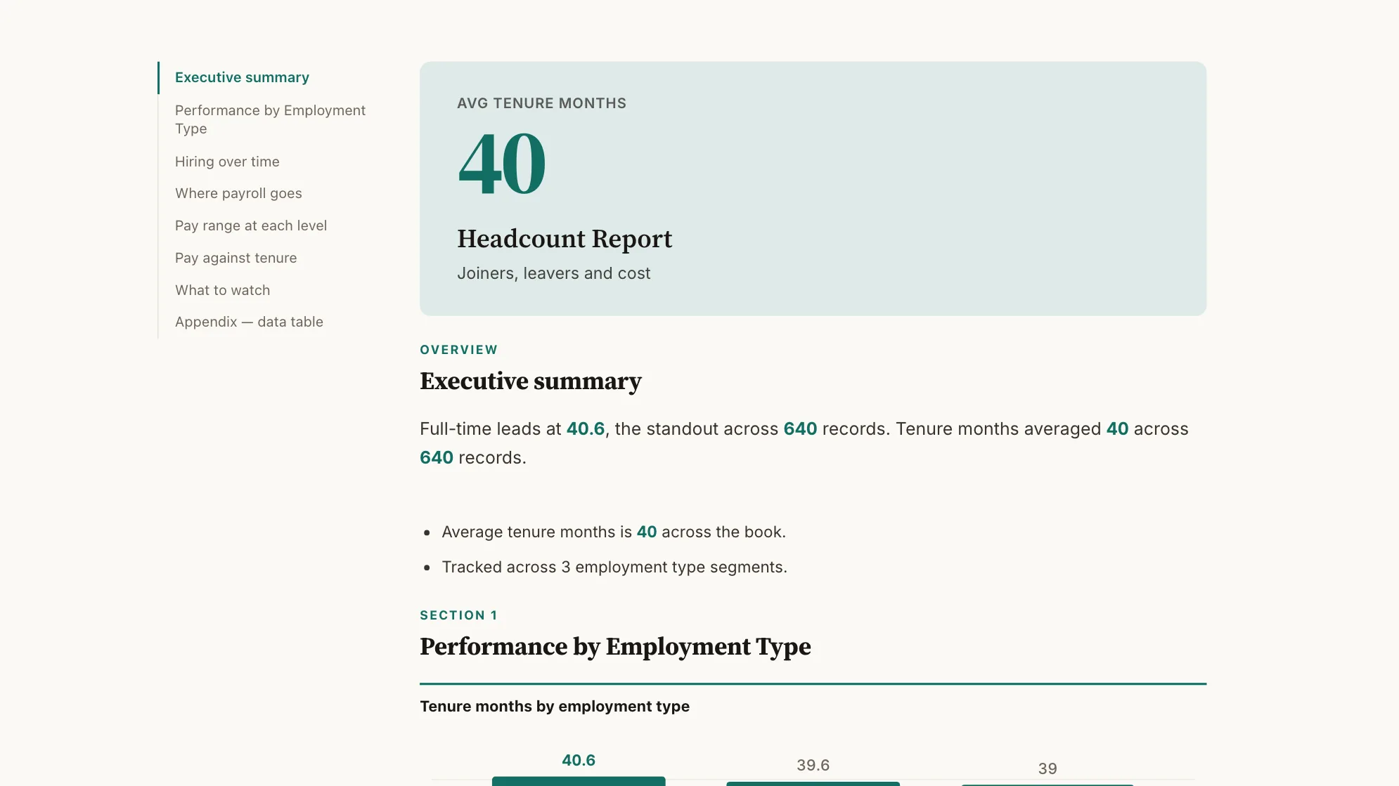
Who joined, who left, and what it costs: as a document rather than a screen. Built from the same 640 rows as the four dashboards above.
Sample data: illustrative figures, not business results. Headcount Report
Can the people picture be written up rather than presented?
The people picture written up: who joined, who left and what it costs.
People · Document
From example to live dashboard
Pretty is easy. Current and true is the hard part.
Any of these can be drawn in a slide. What makes one worth keeping is the five steps underneath it, and they are the same five whichever example you start from.
- 01
Connect the source
The dashboard reads the system, not an export somebody saved to their desktop. 100+ tested connectors, plus anything with a REST API.
- 02
Prepare it once
Cleaning, joining and reshaping are recorded as steps you can read, change and re-run, not a formula buried three sheets deep.
- 03
Check it before anyone sees it
Data checks run with the refresh and flag the rows that fail, so a broken upstream file shows up as an alert rather than as a wrong number in a meeting.
- 04
Put it on a schedule
Refresh on a schedule and the dashboard stays current on its own. Starter refreshes weekly, Team daily, and Pro every three hours.
- 05
Publish it and send the link
Public, password-protected or sign-in only. Every sharing mode is available on every plan, including the free one.
Already have the data in a spreadsheet? Turn it into a dashboard with the AI dashboard generator.
Sharing
Everyone can see it.
Nobody pays to look.
Most dashboard tools charge for every person who opens one, which is why so many dashboards end up as a screenshot pasted into a message. Mammoth charges for the people who build. Viewers are unlimited and free on every plan, including the free one.
You pay for
The people who build
Anyone connecting a source, preparing data or publishing a dashboard counts as a platform user.
You never pay for
The people who look
Viewers are unlimited and free on every plan, including the free one. A board, a client list or a whole company: the number does not change the bill.
Plans differ in how many builders and published dashboards a workspace gets. Drafts, viewers and every sharing mode are unlimited and free on all four. Full pricing.
HR dashboard questions
What should be on an HR dashboard?
What are the key HR metrics?
What is the difference between an HR dashboard and a people analytics dashboard?
What is the difference between an HR dashboard and an HR scorecard?
What is the difference between an HR dashboard and an HR report?
How do I build an HR dashboard?
- Connect the HR system and any spreadsheet someone keeps by hand alongside it.
- Agree the definitions before anything is plotted: who counts as an employee, what counts as a leaver, and which window attrition is measured over.
- Decide which fields are sensitive and leave them out of the dataset managers will see.
- Build headcount and turnover first, cut by department and level, then add engagement, absence and pay as separate boards.
- Schedule the refresh and share it with managers, so nobody is reading last quarter's export.
Can I build an HR dashboard in Excel?
Can it read from our HR system?
How do we handle sensitive fields?
Do managers need a licence to see their team's numbers?
Last reviewed against the template catalogue.





Build the HR dashboard you actually need.
Connect a source, prepare it once, and publish. Everyone who needs to see it can, at no per-viewer cost.
- ✓ 14-day Pro trial
- ✓ No credit card
- ✓ Viewers always free