Judgment Can't Be Prompted: Eight Tests for a Dashboard You Can Trust
Anyone can generate a dashboard from a sentence now. Trusting one is a different matter. Trust comes from judgment about what to count and what to claim, and judgment has to be built into the tool, because a prompt can only ask for it.
Jump to a section
- Three correct sums that should never have been done
- Why judgment has to be built in, not asked for
- Eight tests for a dashboard you can trust
- 1. Does the dashboard aggregate by meaning, not by type?
- 2. Do the dashboard's words come from its numbers?
- 3. Does a filter say what it touched?
- 4. Can every chart show its work?
- 5. Does the dashboard know when a period isn't over?
- 6. Does the dashboard know when to show nothing?
- 7. Can you fix the dashboard by hand?
- 8. Can you take the dashboard with you, and does it stay private?
- One test no tool can pass for you
- Building judgment is slow, and it compounds
A few years ago a dashboard took a week. Someone gathered requirements, someone modelled the data, someone dragged fields onto a canvas, and eventually a board appeared that mostly answered the question it was built for.
Now it takes a sentence. Describe what you want and a finished-looking board arrives in under a minute, with a title, four KPI cards, six charts and a paragraph of insights. It looks done. It's often wrong in ways nobody notices.
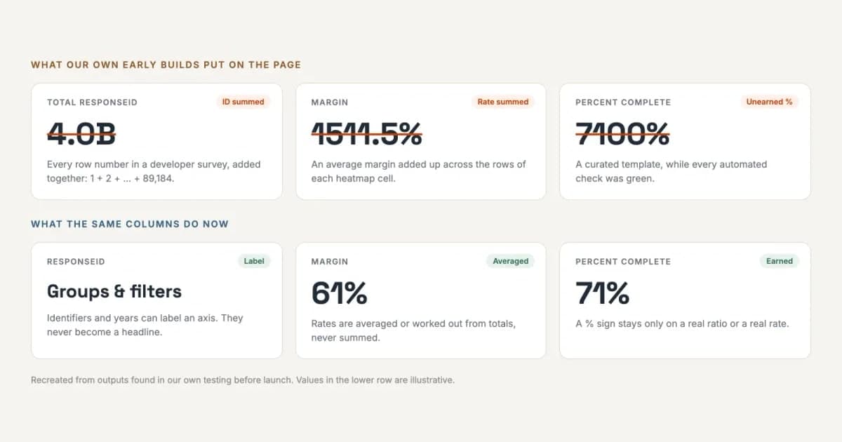
The struck-through cards at the top of this page came from our own early builds, and every one of them was computed correctly. That's the problem this post is about. Making dashboards got cheap. Making ones you can act on without re-checking every number didn't, because that takes judgment, and judgment is the one ingredient you can't get by asking for it.
The short answer
A dashboard is worth trusting when you can act on its numbers without re-checking them. That depends on judgment: what to count, what to claim and when to show nothing. A prompt can ask a model for judgment but can't guarantee it, so it has to be built into the tool as rules that run on every board, and shown on the board so you can check it. Below are eight tests for whether a tool has done that, each drawn from a mistake we made first.
Three correct sums that should never have been done
Look at the top row of the picture above.
Total ResponseId: 4.0B was every respondent's row number in a public developer survey, added together: 1 + 2 + 3, all the way to 89,184. Margin: 1511.5% was an average margin added up across rows. Percent complete: 7100% came from a curated template, while every automated check we had was green.
None of these is an arithmetic error. Each is the right maths applied to the wrong question: an ID summed, a rate summed, a percentage that was never a percentage. Generated dashboards rarely fail by getting a sum wrong. They fail by confidently doing sums that shouldn't be done at all.
This isn't new with AI. Out of the box, Power BI "aggregates numeric fields (the default is sum)", and Tableau's measures "are automatically aggregated as sums". Microsoft's own guidance warns authors about boards that end up showing "a grand total of years". What changed is who picks the measures. A person dragging a field onto a canvas usually notices a total of years. A model writing six charts from one sentence may not, and nobody looks closely until the board is in a meeting.
Why judgment has to be built in, not asked for
By judgment I mean the calls an experienced analyst makes without noticing. A row number isn't a quantity. A filter shouldn't silently skip half the page. A month that isn't over isn't a trend. Analysts carry hundreds of these around and rarely write them down, because to them they're obvious.
The obvious fix is to write them into the prompt: "never sum an identifier". That works most of the time, and most of the time is the problem. A prompt is a request. A model follows it on most boards and drifts on some, and you can't tell which ones by looking at them. A rule in code runs the same way on every board, and it can be tested.
Language models have a second failure that no instruction fixes. Asked to write about your data, a model will sooner or later state a figure that isn't in it, fluently and with total confidence. Put one wrong number in a board pack and every other number on it becomes a question. Trust takes months to build and one meeting to lose.
So the split I'd insist on is structural. Let the model suggest what to look at and how to say it. Never let it write the number.
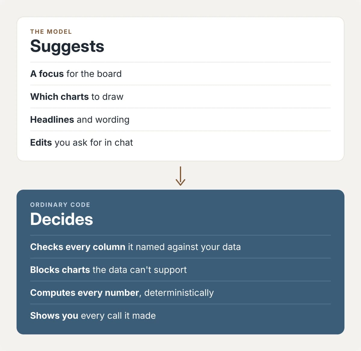
(We've made the longer case for this split in AI you can check.)
Rules in code are half of trust. The other half is being able to see them working, so you're checking the reasoning instead of redoing the arithmetic. The tests below cover both halves.
Eight tests for a dashboard you can trust
These are the questions I'd ask of any generated dashboard, or of the tool that made it, before letting anyone act on it. Each one comes from a mistake. Most of the examples are boards built in Mammoth, because those are the mistakes I can show you, and where Mammoth only partly passes a test I've said so.
- Look at
- How each column is aggregated
- Watch for
- A total of IDs, years or percentages
- Look at
- Where each figure in a sentence came from
- Watch for
- A sentence that claims more than its number shows
- Look at
- Which panels changed after a click
- Watch for
- Some numbers move, others don't, and nothing says which
- Look at
- Grouping, aggregation and filters on each chart
- Watch for
- You have to open the data model to find out
- Look at
- The last period in every trend
- Watch for
- A sharp fall in the most recent month
- Look at
- Empty sections and missing denominators
- Watch for
- A 0 where "no data" belongs
- Look at
- Editing one chart directly
- Watch for
- Every change has to be described in chat
- Look at
- Exports and link previews
- Watch for
- Numbers in a preview anyone can see
1. Does the dashboard aggregate by meaning, not by type?
A trustworthy board aggregates by what a column means, not what type it is. Money is summed. A peak takes the maximum. A balance like headcount or cash is read at the latest period instead of added across months; analysts call these semi-additive measures, and summing them is one of the oldest mistakes in reporting. Identifiers and years are labels. They can group a board but never headline it.
Rates are where it gets subtle. A margin should never be summed, and a plain average isn't always right either, because it gives a $10 order the same weight as a $10,000 one. The honest margin is total profit over total revenue. Mammoth works a rate out from its parts that way when the parts are in the data, and averages a percentage column that arrives with no parts beside it. If you can, give a tool the parts.


Nobody told either board not to add up magnitudes or conversion rates. The right default came from the data, not from someone remembering.
2. Do the dashboard's words come from its numbers?
A fluent sentence with a made-up number in it is the most dangerous thing a dashboard can show, because it reads like it was checked. The standard is simple to state: every figure in a sentence is computed first, then placed in the sentence.

That standard isn't enough on its own, and this example shows why. Both numbers are right. But "the most seismically active region" claims more than the data does. What the data shows is that Indonesia has the most recorded quakes in this dataset, which is a narrower thing to say. The figure was checked. The adjective wasn't.
Mammoth now holds back wording that brings in a subject the board and the data can't support; a "contribution margin" on a retail board is the example in our own docs. Superlatives like this one are harder, and I haven't seen a tool that handles them well, ours included. So this test is a reading test as much as a data test. For each sentence, ask what it claims and whether the number beside it proves that much.
Definitions help here. What "active customer" means at your company usually lives in an analyst's head, and a tool can only use the words it has been given.
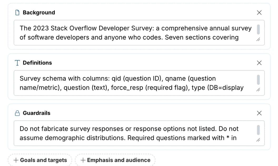
Keep that reference material to words. A table of numbers belongs with the data, where it can be checked. Paste last quarter's report in as context and last quarter's figures quietly become standing facts.
Unlimited free dashboard viewers.
3. Does a filter say what it touched?
Click a filter on most boards and some numbers change while others quietly don't. Nothing tells you which is which, and that's how the wrong sentence ends up in a meeting.
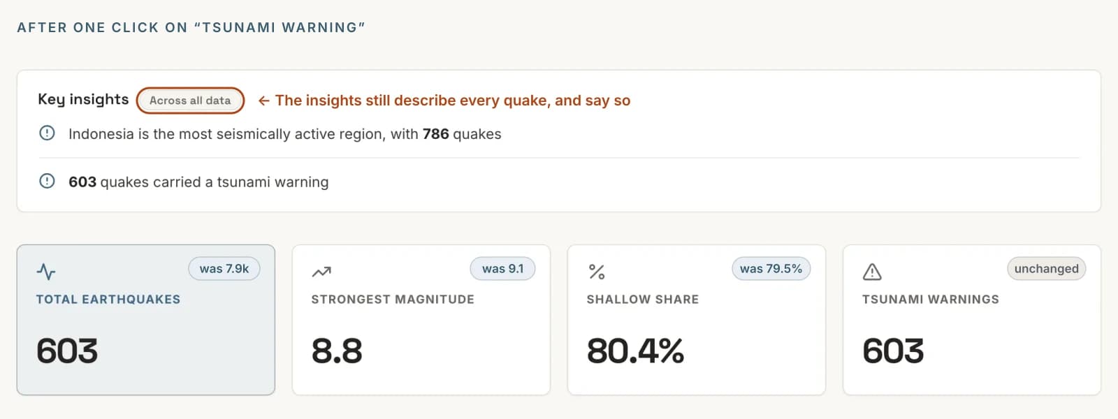
Three cards recalculated. The tsunami count stayed at 603, because every quake left on the board carried a warning by definition. The insights still describe every quake, so they carry two small words: "Across all data". I'd rather they recalculated too. Until they do, the label is the minimum, and it's the difference between a reader understanding the board and a reader misquoting it.
4. Can every chart show its work?
The first question an analyst asks about someone else's chart is how was this made? The answer shouldn't require opening a data model.
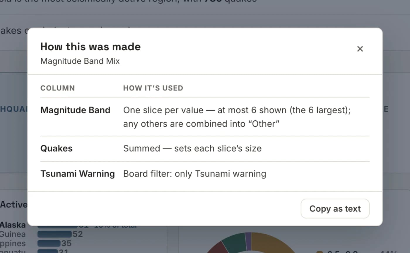
A receipt like this answers the question that eats hours on anyone else's dashboard: is this number filtered or not? In Mammoth it's on added charts today. KPI cards don't have one yet, and it doesn't report how many rows were used or dropped, which is the next thing I'd want to know. Those are fair questions for any tool, ours included.
The same goes for the calls a tool makes on your behalf, such as an assumed currency, an unweighted average or a join that might double-count. Every tool makes calls like these. A trustworthy one lists them where you can see and overrule them.
5. Does the dashboard know when a period isn't over?
One of our boards announced that earthquakes had fallen 64% over the period. They hadn't. The last month in the data wasn't finished, and the chart was comparing part of a month with whole ones. A careful analyst would have caught it in a second.
The software had a guard for this, and the guard was the more interesting failure. It dropped the last month whenever it came in below 55% of the month before: a guess about size standing in for a fact about the calendar. It was wrong both ways. A month two-thirds recorded passed it. And a real 60% collapse would have been deleted without a word, which is worse, because the guard would have removed the news the chart existed to show.
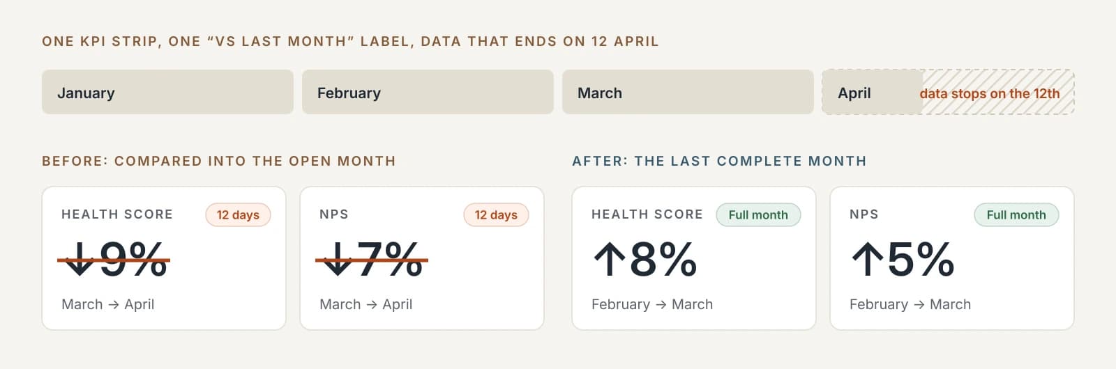
The same fix turned up a quieter version. On a sample SaaS dataset that ends on 12 April, one KPI strip under a single "vs last month" label was comparing two different pairs of months. The guard had caught the summed measures, because twelve days of revenue looks short. It missed the averages, because twelve days of an average looks normal. Health score and NPS reported falls of 9% and 7% that weren't real. On complete months, both had risen.
The fix, on 19 September, was to stop guessing and ask the calendar: does the data's last date reach the end of its last period? If it doesn't, that period stays out of the comparison. Completeness is knowable, so there's no reason to estimate it.
6. Does the dashboard know when to show nothing?
The hardest discipline is leaving a blank where a confident-looking value would be easier.

A ratio with nothing to divide by should say "no data", not 0, or a trend line plunges for no reason. A month with no rows is a missing month. Treat it as zero and a chart can announce "−100% over the period" about a quiet patch. An "Updated" stamp should show when the data changed, not when the page loaded, and nothing at all if it can't be sure. A comparison should be shorter rather than padded with charts that can't honestly be drawn.
Empty is honest. Plausible is dangerous.
7. Can you fix the dashboard by hand?
Describing what you want is a good way to get a first draft. It's a poor way to move a chart two columns to the left, change a sum to a median or fix one word in a title. Nobody wants to describe a change they could make in one click, and a tool that only offers the sentence is asking people to narrate their own clicks.
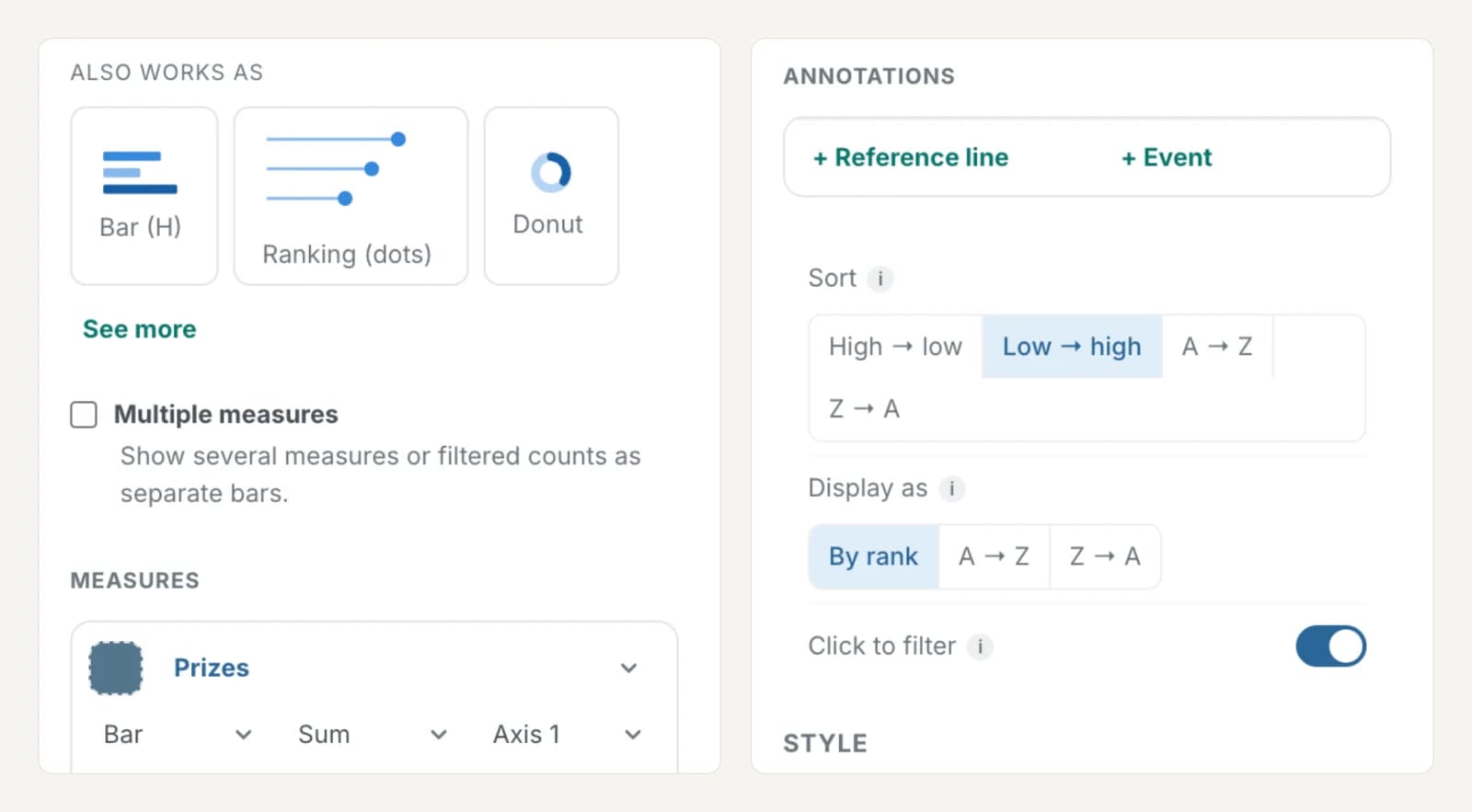
A good editor offers only the chart types the data can support, and lets you set the aggregation, the axis and the top N directly. It keeps sort order separate from display order, and lets you pin a target line or an event to a real point on a chart.
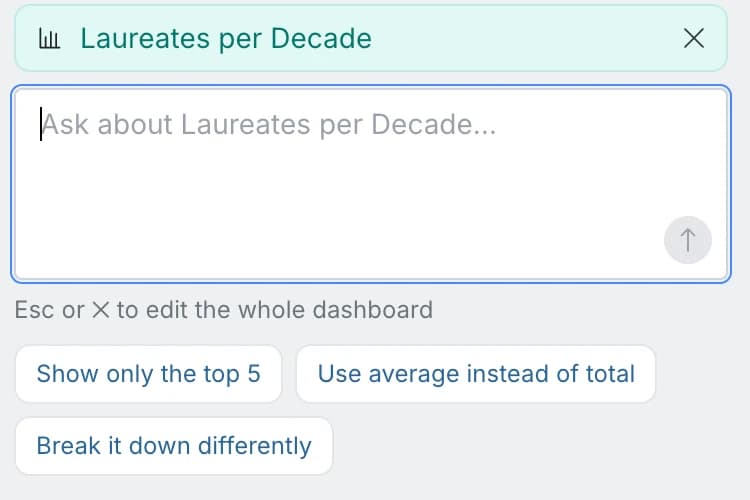
When you do use chat, it should be scoped to what you've selected, so a request about one chart can't quietly restyle another.
8. Can you take the dashboard with you, and does it stay private?
Your work should be portable. If a board can't leave in a form your organisation's other tools can open, you're renting your own analysis. Mammoth exports a dashboard as a Power BI project or a Tableau workbook with the data packed inside, and says before it writes the file how many of the board's visuals will translate.
A board also shouldn't leak. When a link is pasted into a chat channel, the preview is the one part nobody can take back. Tableau's Slack integration can share an image visible to the channel "regardless of their access level". In Mammoth the preview image never carries data. It shows the board's title, theme and layout.
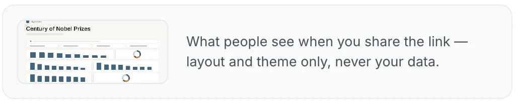
The preview text is the part to check. On an ordinary board it carries the board's subtitle, which can include a computed figure. On a board that restricts rows per viewer it falls back to a generic line. Whatever tool you use, paste a link into a private channel first and read what unfurls.
One test no tool can pass for you
Pick a number you already know from somewhere else, such as last month's revenue or this quarter's headcount, and find it on the board. If it doesn't tie out, nothing else on the page matters until you know why.
Analysts have done this since the first spreadsheet, and generated dashboards haven't changed it. They've made it matter more, because a board now arrives looking finished before anyone has checked anything.
Building judgment is slow, and it compounds
Every test above was found the same way: staring at real boards until something looked off, working out what a careful analyst would have done, and making that the default so no future board repeats it. The −64% chart took one rule to fix and a second rule to fix the first.
Soon every tool will produce dashboards, and that will be about as impressive as producing a spreadsheet. What will matter is which boards you can put in front of the people making decisions without checking every number yourself. That's what judgment buys, and it has to be built.
Mammoth is how we've tried to build it. The templates show these standards on real boards, and The Dashboard Layer goes further into how the numbers stay honest.