Change a dashboard's title band and add a cover page
The title band is the header at the top of every page of a dashboard: the title, a subtitle, optional header lines and a backdrop. A cover page is an optional title page that opens the dashboard, with a headline, the period and links to every other page. You edit both on the canvas in the dashboard editor, and anyone with edit access to the board can change them.
Open and save the title band panel
- Click the title band at the top of the canvas. The Title band panel opens with the note "Applies to every page of this dashboard."
- Make your changes. Nothing is saved yet.
- Click Save changes to keep them, or Discard to throw them away.
If you close the panel with unsaved changes, you're asked "Save your changes?". You can keep editing, discard or save.
The panel has three groups: What it says, What a reader can ask and Appearance.
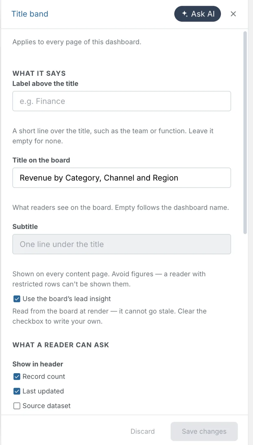
Change the dashboard title, subtitle and label
Under What it says:
| Option | What it does |
|---|---|
| Label above the title | A short line over the title, such as the team or function (up to 60 characters). Leave it empty for none. |
| Title on the board | What readers see on the board. Leave it empty to follow the dashboard name. |
| Subtitle | One line under the title, shown on every content page. Avoid figures in it: a reader with restricted rows can't be shown them. |
| Use the board’s lead insight | Replaces the subtitle with the board's top insight. It's read each time the board renders, so it never goes stale. Clear the checkbox to write your own. If the board has no insight yet, the panel says "This board hasn't found an insight to use yet." |
When the subtitle uses the lead insight, the Key insights section leaves that insight out of its list. See Tables, KPI cards, insights and text.
Show the record count, last updated date and owner in the header
Under What a reader can ask, go to Show in header and tick the lines you want under the title:
| Line | What it shows |
|---|---|
| Record count | How many records the board covers. |
| Last updated | When the board was last built. |
| Source dataset | The dataset name. Disabled when the board doesn't know which dataset it came from. |
| Who to ask | A contact. Ticking it opens a box for "A name, a team, or a channel", shown in the header to anyone who opens the board. If you write a name but leave the box unticked, the panel reminds you: "Written, but not shown — tick the row above." |
These lines still show in the In the tab bar layout.
Publish a glossary is in the same group. See Publish a glossary of terms with a dashboard.
Add an icon beside the dashboard title
- Under Appearance, go to Icon.
- Click Add an icon (or Change icon) to open Pick an icon, and choose one.
- Optionally tick Tinted background to put a coloured tile behind it.
Remove clears the icon. The icon is optional, and most boards do better without one. If the board shows a brand logo, the logo takes the icon's place.
Choose a title band layout
Layout has four options: Standard (the default), Centered, Display and In the tab bar. With In the tab bar, the band gives up its own row and the title sits in the tab bar.
In the tab bar shows only the title and the header lines. It hides the label above the title, the lead-insight option, and the backdrop and tone controls, because they have nowhere to render. It also disables Title size. The subtitle doesn't show in the tab bar.
Choose a backdrop, tone, title size and accent colour
Backdrop sets what sits behind the title: None, Accent rule, Tint, Fill, Glow, Mesh, Grid, Dots, Lines, Wash, or Use a photograph. A Fill backdrop gives the band its own text colour rather than the page's.
| Option | What it does | When it shows |
|---|---|---|
| Tone | Auto, Light, Dark or Soft. Soft is a shade off the board's own surface. Light follows your theme's surface, so it stays light in light mode and dark in dark mode. | Painted backdrops: Fill, a photo, Glow, Mesh, Grid, Dots, Lines and Wash. |
| Title size | Small, Medium or Large. | Every layout. Disabled for In the tab bar. |
| Accent | Accent, Soft, Ink or Paper. These are positions in the style, not fixed colours, so they re-tint when the style changes. | When the backdrop is anything but None or a photo, or when the icon has a tinted background. |
The style itself comes from the Design tab. See Change a dashboard's theme.
Put a photo behind the dashboard title
- Under Backdrop, choose Use a photograph and pick an image. The panel shows "Processing…" while it works.
- Check the meter. It shows how much of the image budget the photo uses (up to 900 KB). Large images make the board slower to open.
- Set Image strength with the slider. The word beside it reads Faint, Light, Strong or Auto, and Auto resets it. If you push it too low, it stops with "Kept readable — the title needs this much behind it".
- Set the Focal point on the 3 × 3 grid so the important part of the photo stays in view.
- Click Save changes.
Images are scaled to 1,600 px on the long edge. Replace swaps the photo and Remove deletes it (the band falls back to Glow). Once a photo is stored, its chip under Backdrop selects it again without uploading it again.
Add a cover page to a dashboard
A cover is a title page with a headline, a period and record-count line, an optional hero metric, and one card for each other page. Clicking a card jumps to that page. Covers carry no filters.
- Click Add in the editor header, then Page.
- Choose Cover ("Open with a cover").
- Click Create page.
The cover goes first, and Edit cover opens in the right panel. To edit it later, click the cover.
In the Doc and Slides formats the cover is part of the document rather than a page. Click it to edit it. See Docs and slides.
Write the cover title, subtitle and hero metric
Edit cover ends with Cancel and Save changes. The content options are:
| Option | What it does |
|---|---|
| Title | The headline. Pre-filled with what the cover shows now. |
| Subtitle | Defaults to the period and record count. Hidden for the Metric type. |
| Description | What this board covers, and what it doesn't. |
| Hero metric | Metric type only. Auto · top metric, or any measure. |
Pick a cover type: Standard, Metric or Masthead
Type sets the layout of the cover:
- Standard
- Metric: the cover leads with the hero metric instead of a subtitle. Not offered for Slides.
- Masthead
Choose a cover backdrop and colour
Backdrop has 16 options on dashboards and docs: None, Plain, Dots, Waves, Mesh, Grid, Low-poly, Arcs, Bands, Diagonal, Line, Area, Bars, Scatter, Gradient and Image. None draws no cover surface and hides Color and every option below it.
Slides have no None. They add Auto, Trend, Ranking and Composition, drawn from the board's own data. With Auto, a hint names what it is drawing.
Color isn't shown for Image or None. Its choices are Default, Brand, Brand light, Brand dark, Paper, then Teal, Indigo, Coral, Slate, Amber, Purple, Rose and Forest, and Custom color to pick any colour.
With the Image backdrop, use Upload image (or Replace image) and Remove. The same Image strength slider as the title band sets how strong the image is.
Set the cover stat, ornament, font and size
| Option | Choices | What it does |
|---|---|---|
| Stat | None, Inline, Block, Badge | Shows the headline metric on the cover: in the meta line, as a block under the title, or in a badge. Disabled for the Metric type, which already leads with it. |
| Ornament | None, Rule, Bar, Divider | Adds a rule, bar or divider as decoration. |
| Font | Modern, Editorial | The cover's typeface. |
| Height | S, M, L | How tall the cover is. |
| Width | Inset, Full-bleed | Inset keeps the cover in a boxed card. Full-bleed spans edge to edge with no card. |
| Alignment | Left, Center | Where the title block sits. |
For example, for a cover that leads with this quarter's revenue, set Type to Metric, Hero metric to Revenue, and Backdrop to Gradient with Brand colour.
Remove a cover page from a dashboard
The cover panel has no remove button. On a dashboard, the cover is a page, so you delete it like any page:
- In the editor, click the Manage pages pencil after the last page tab.
- Click Delete (the bin) on the cover's row.
- The row shows an Undo strip for a few seconds. Leave it to confirm the delete.
See Manage dashboard pages. In the Doc and Slides formats the cover isn't a page, so you can't delete it. In a doc, setting Backdrop to None drops the cover surface.
Limits
- A dashboard has one cover. Cover leaves the page list once one exists.
- Cover is only offered when the board has at least one content page, and not on Motion boards.
- Label above the title: up to 60 characters.
- Title band photo: up to 900 KB of image budget, scaled to 1,600 px on the long edge.
Related
- Edit with AI in the dashboard editor: the editor the title band and cover live in.
- Pages and navigation: add, reorder and delete pages, including the cover.
- Change a dashboard's theme: the style that the band's tones and accents follow.
- Tables, KPI cards, insights and text: key insights and the published glossary.
- Docs and slides: how covers work in the Doc and Slides formats.
Something wrong? support@mammoth.io